Calculated columns
The calculated columns feature enables you to create calculated columns within Insights dashboards. This allows you to perform custom data manipulations directly within the dashboard environment and eliminates the need for recipe-driven data processing. Calculated columns support arithmetic, comparison, and logical operators and numerous built-in datetime, mathematical, and string functions. This enables you to calculate date differences, report on calculated columns you define, manipulate strings, and more without leaving your Insights dashboards.
 Create a calculated column
How to create calculated columns
Creating a calculated column in Insights follows a similar process to other data manipulations. You can begin with an existing dashboard or create a new one and add calculated columns using the query builder. Calculated columns can be used on their own or combined with other queries to help you extract the specific information you require.
 Build a calculated column in the query builder
Supported operators and functions
Calculated columns support the following operators and functions:
- Operators: Use arithmetic, comparison, and logical operators to manipulate your data.
- Datetime functions: Extract, modify, and calculate time-based values.
- Mathematical functions: Round and manipulate numerical values.
- String functions: Manipulate, format, and analyze text-based values.
Example use case: Resume screening automation
This use case illustrates how to create a series of calculated columns to track and report on an automated resume screening process. In this example, we log all activities related to this workflow in a data table called Resume screening, and capture key details such as ticket IDs, statuses, start dates, and more. All calculated columns in our dashboard rely on this underlying data source.
 Use Calculated columns to report on a resume screening automation
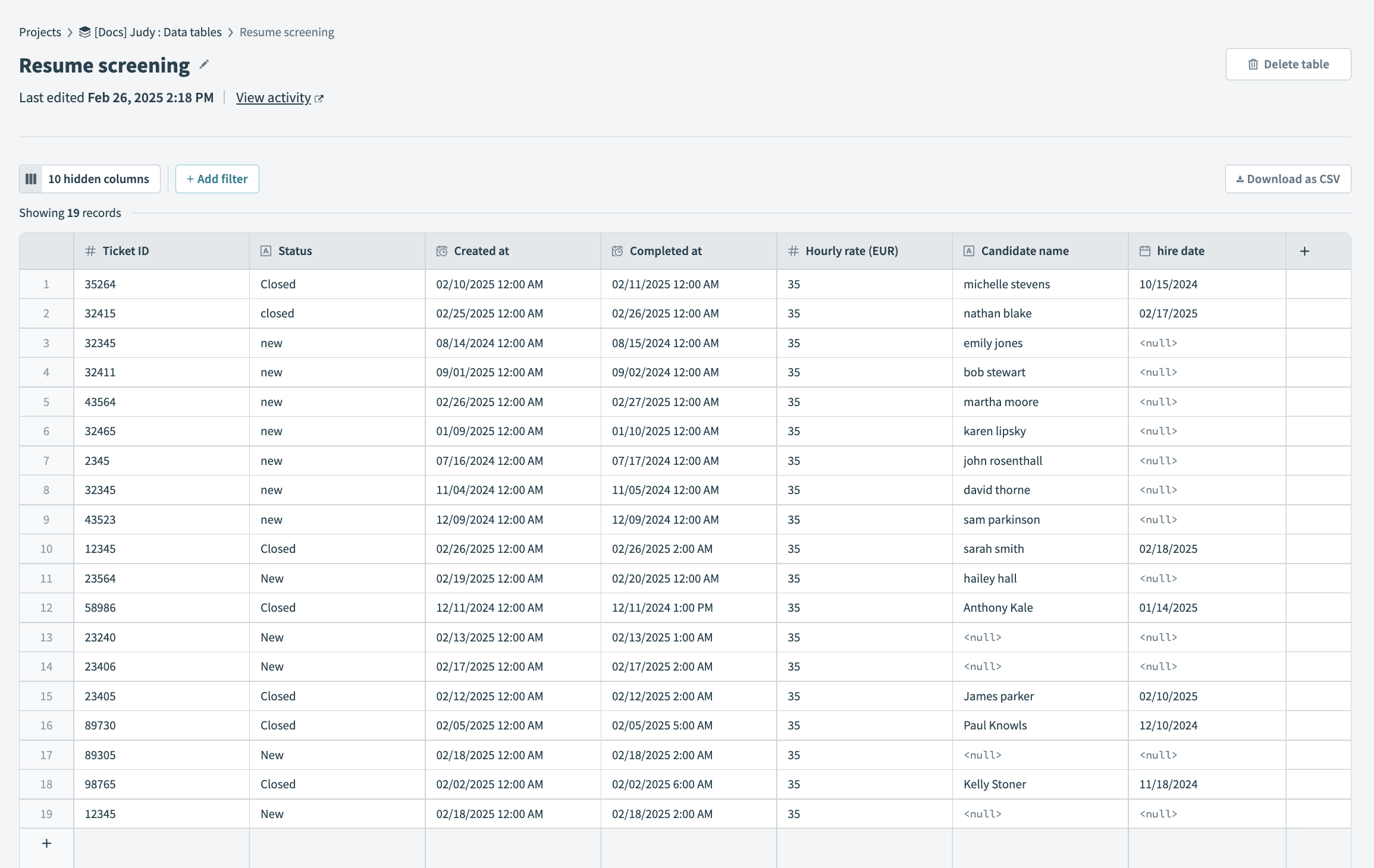 The
The This example use case includes instructions on how to create calculated columns that accomplish the following tasks:
- Report total time saved in hours
- Convert currency
- Get open vs. resolved tickets as a ratio
- Show new tickets per quarter
- Transform text
Getting started
The following steps are common to all calculated columns created in this use case. Complete these steps to get started:
Go to Platform > Insights. Create a new dashboard or select one of your existing dashboards.
Add a new chart component to your dashboard and click Edit chart data.
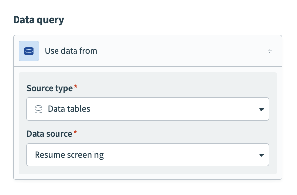
Select a data source
Select the event data source you plan to report on. Our example reports on the time saved from an automated resume screening process, which we capture in a data table.
In the Use data from field, select Data tables as the Source type and Resume screening as the Data source.
 Select a data source
Report total time saved in hours
Complete the following steps to create a calculated column that reports the total time saved in hours in your Insights dashboard:
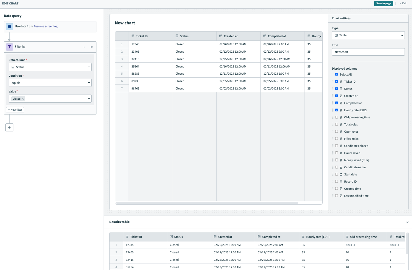
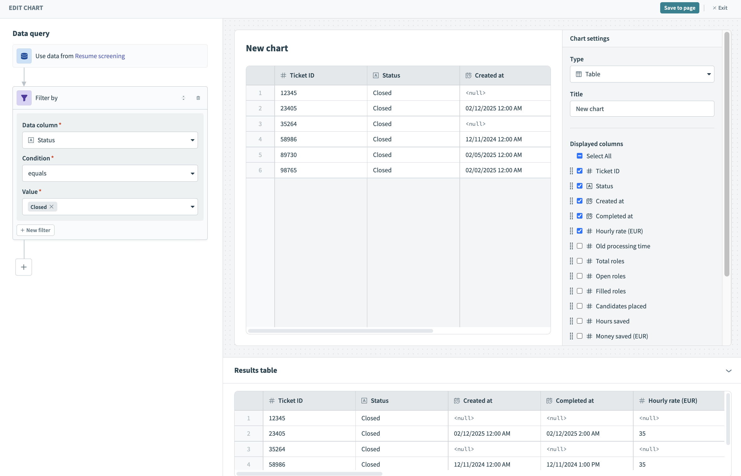
Click + (plus) and select the Filter step from the query builder.
Select Filter
Configure the filter to surface tickets with the Closed status only
Select Status as the Data column.
Select equals from the Condition drop-down.
Select Closed as the Value.
Preview your data in the Results table. This table displays tickets with the Closed status only.
 Preview your data in the Results table
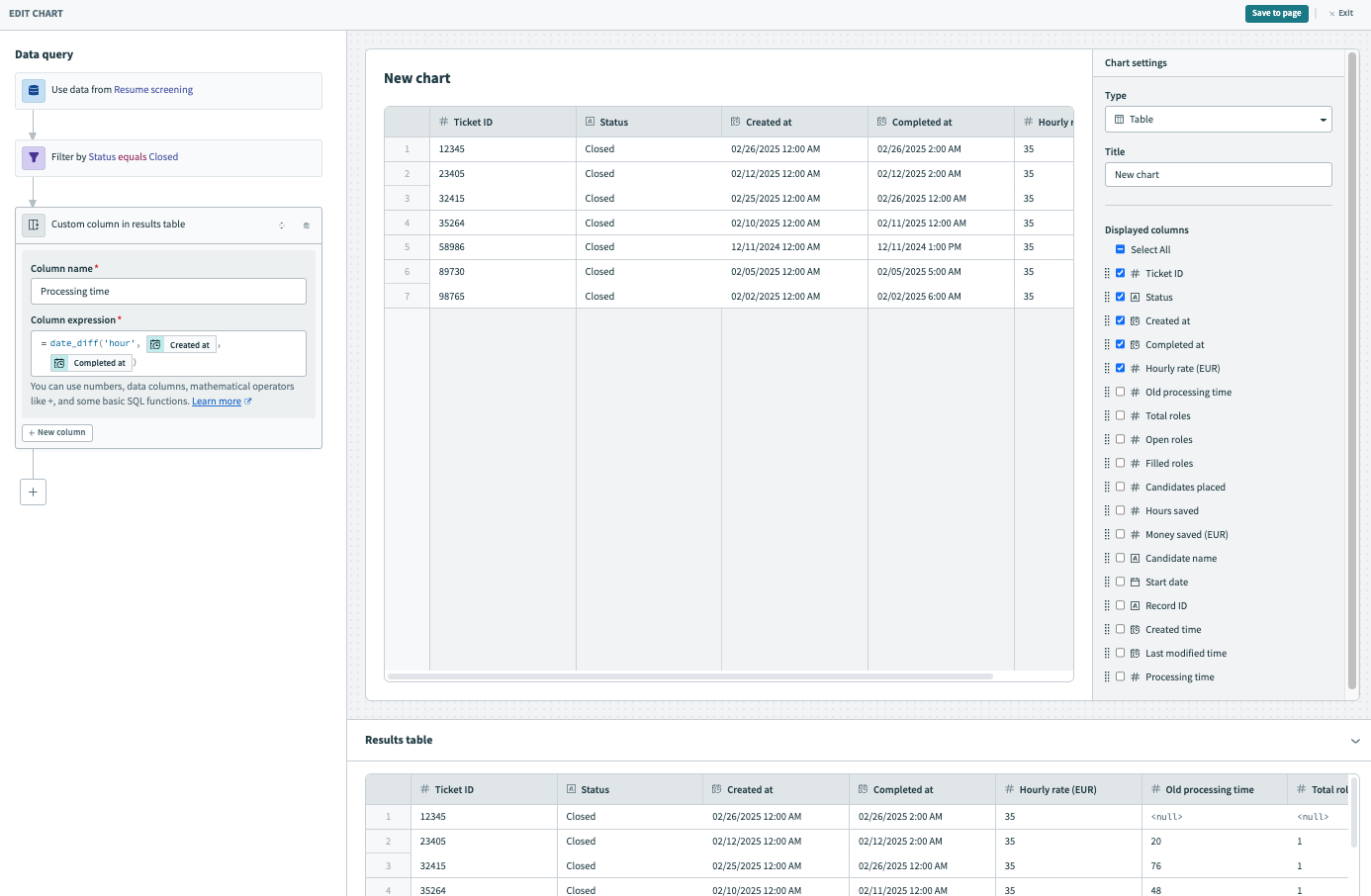
Click + (plus) and select Calculated column from the query builder.
Select Calculated column
Configure the calculated column
Provide a unique name for the new column, such as Processing time.
Create a custom Column expression. Select the date_diff function. Change the duration from "day" to "hour" and map in the Created at and Completed at datapills.

= date_diff("hour",Created at,Completed at)
Preview your data in the Results table. This table displays the time taken to complete a process.
 Preview your data in the Results table
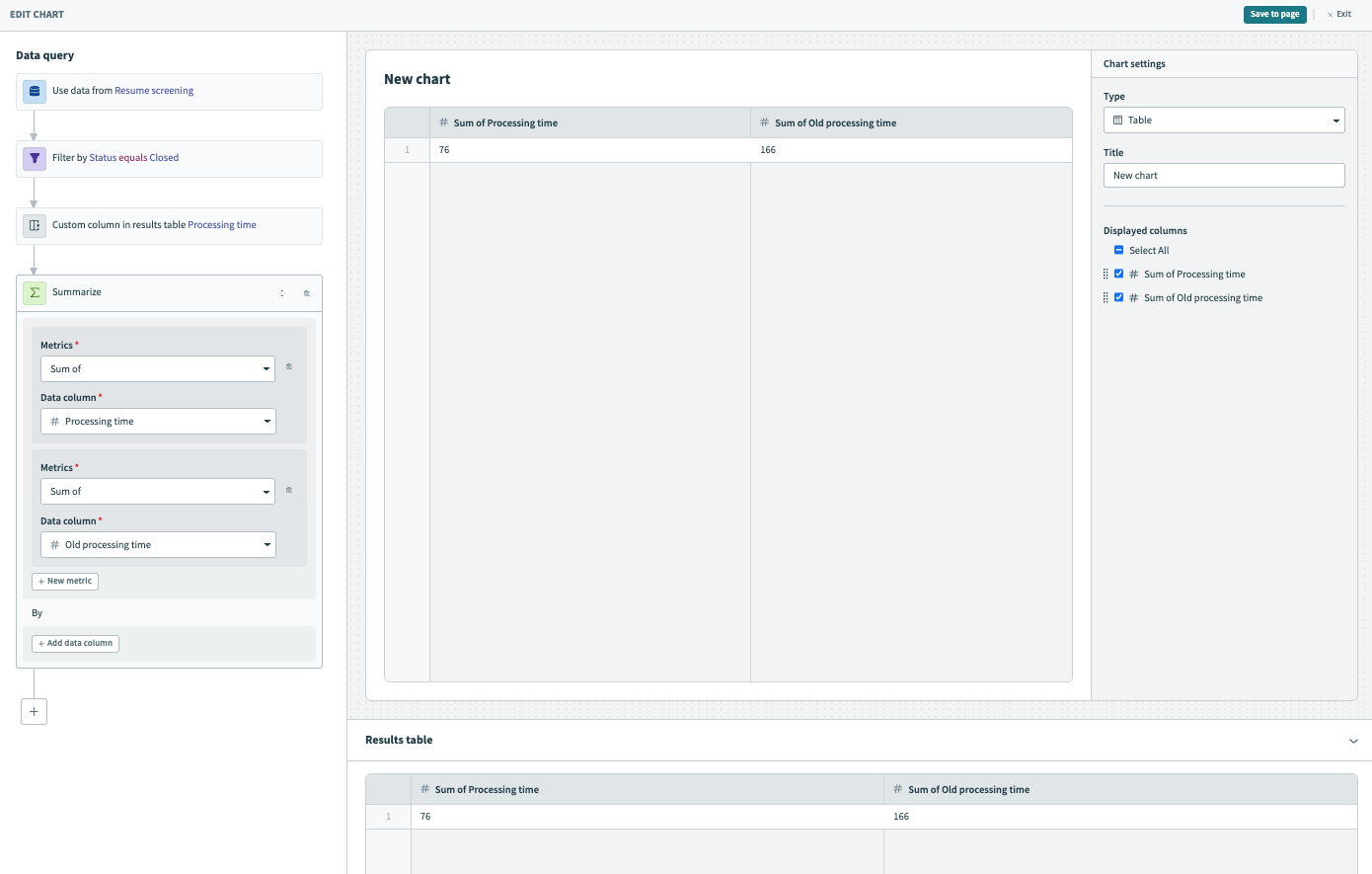
Click + (plus) and select Summarize from the query builder.
Select Summarize
Configure the summarize step
Select Sum of from the Metrics drop-down and Processing time from the Data column drop-down.
Click + New metric.
Select Sum of from the Metrics drop-down and Old processing time from the Data column drop-down.
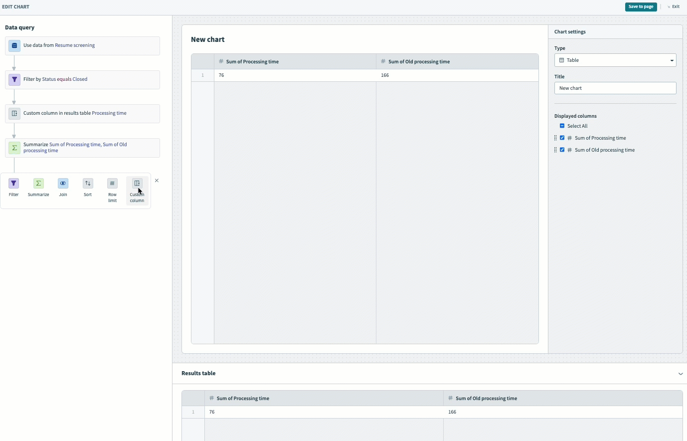
Preview your data in the Results table. This table displays the total old processing time in hours and the total new processing time in hours.
 Preview your data in the Results table
Click + (plus) and select Calculated column from the query builder.
Select Calculated column
Configure the calculated column
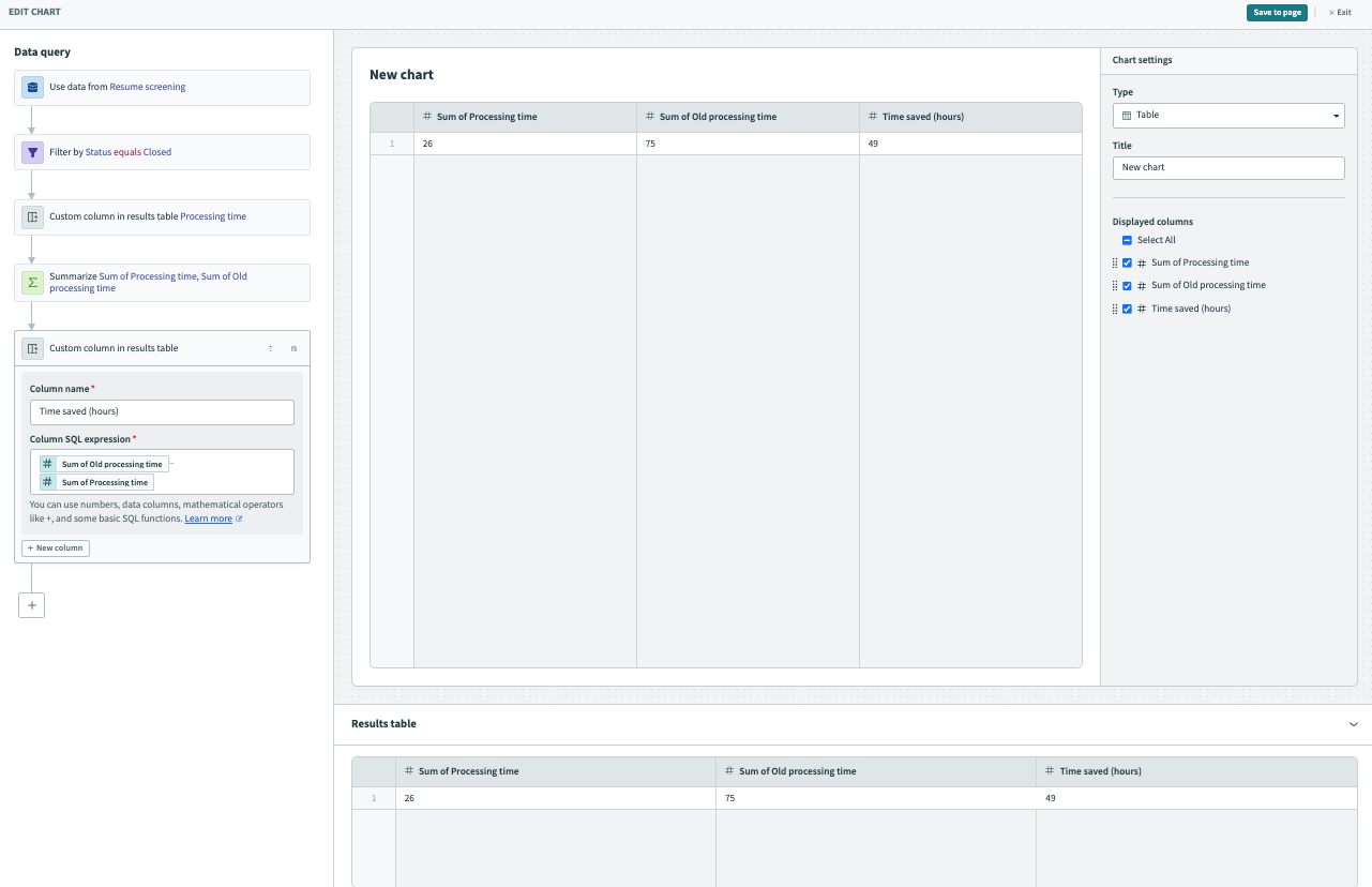
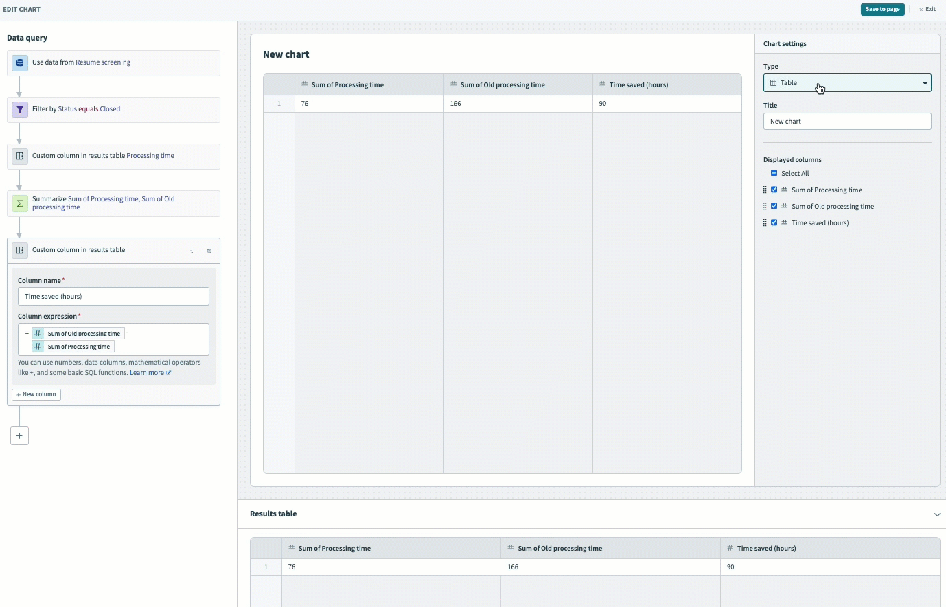
Provide a unique name for the new column, such as Time saved (hours).
Create a custom Column expression. Map in the Sum of Old processing time datapill, enter the - (subtract) operator, and map in the Sum of Processing time datapill:

= Sum of Old processing time- Sum of Processing time
Preview your data in the results table. The table displays the amount of time saved in hours.
 Preview your data in the Results table
Visualize your data
Use the Chart settings panel to visualize your data and customize your chart.
Select KPI from the Type drop-down.
Select Time saved (hours) from the Data column drop-down.
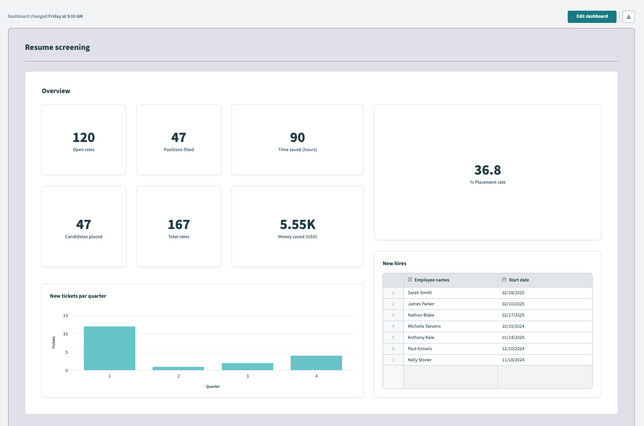
Optionally, provide a unique label for this chart, such as Total hours saved. When you leave this field blank, the label is the column name you selected in the previous step.
Click Save to page to save the chart to your dashboard.
 Visualize your data
Click Save to save your dashboard.
Convert currency
This example converts currency from EUR (Euros) to USD (US dollars) by multiplying a euro amount by a constant. This is helpful when your organization has multiple regional cost centers and must convert them to a common currency.
Complete the following steps to create a calculated column that converts currency from EUR to USD in your Insights dashboard:
Click + (plus) and select the Summarize query.
Select Summarize
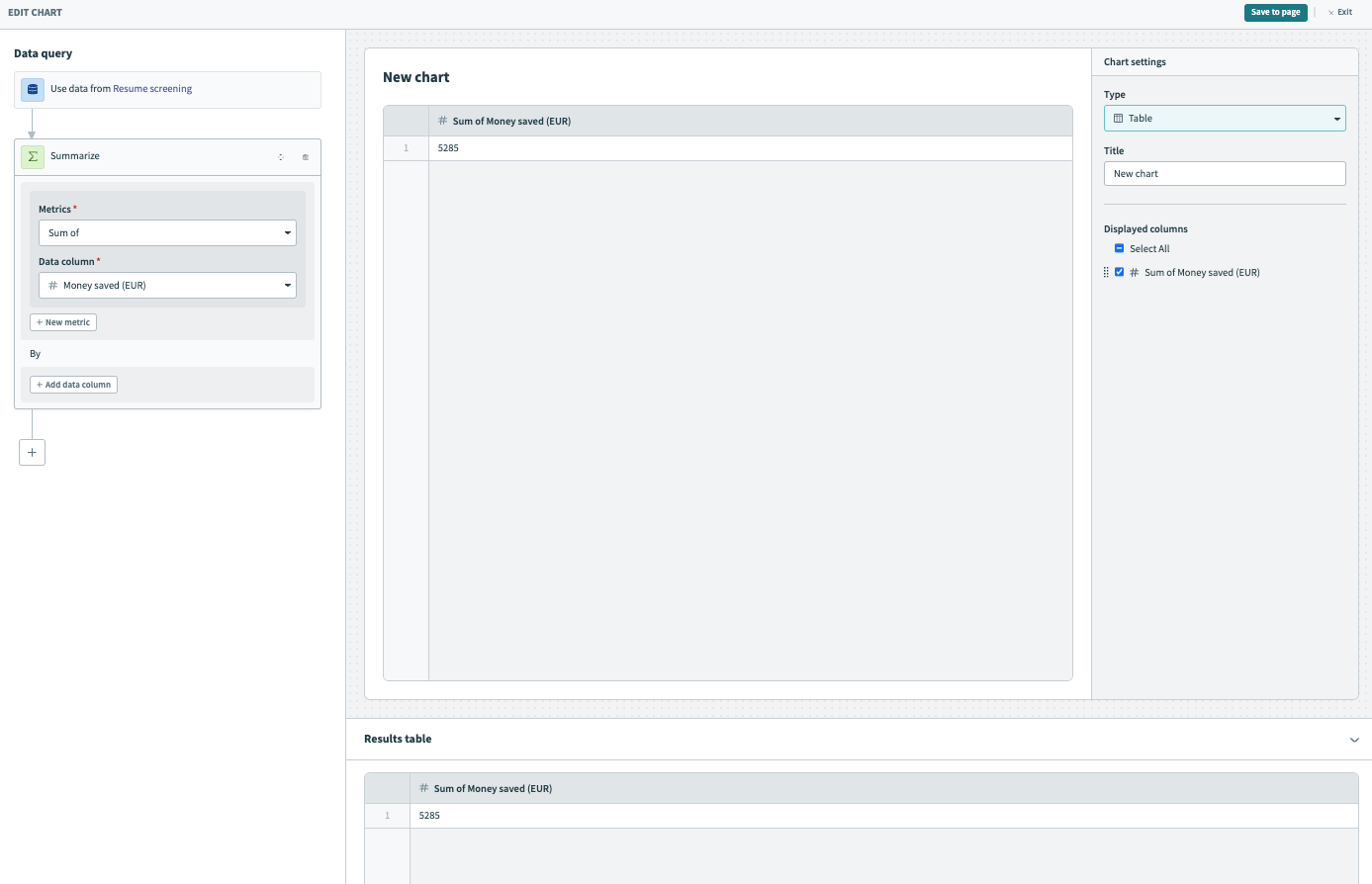
Configure the summarize step to get a sum of total money saved in EUR
Select Sum of from the Metrics drop-down.
Select Money saved (EUR) from the Data column drop-down.
Preview your data in the Results table. This table displays the new total sum of money saved in EUR.
 Preview your data in the Results table
Click + (plus) and select the Calculated column query.
Select Calculated column
Configure the calculated column
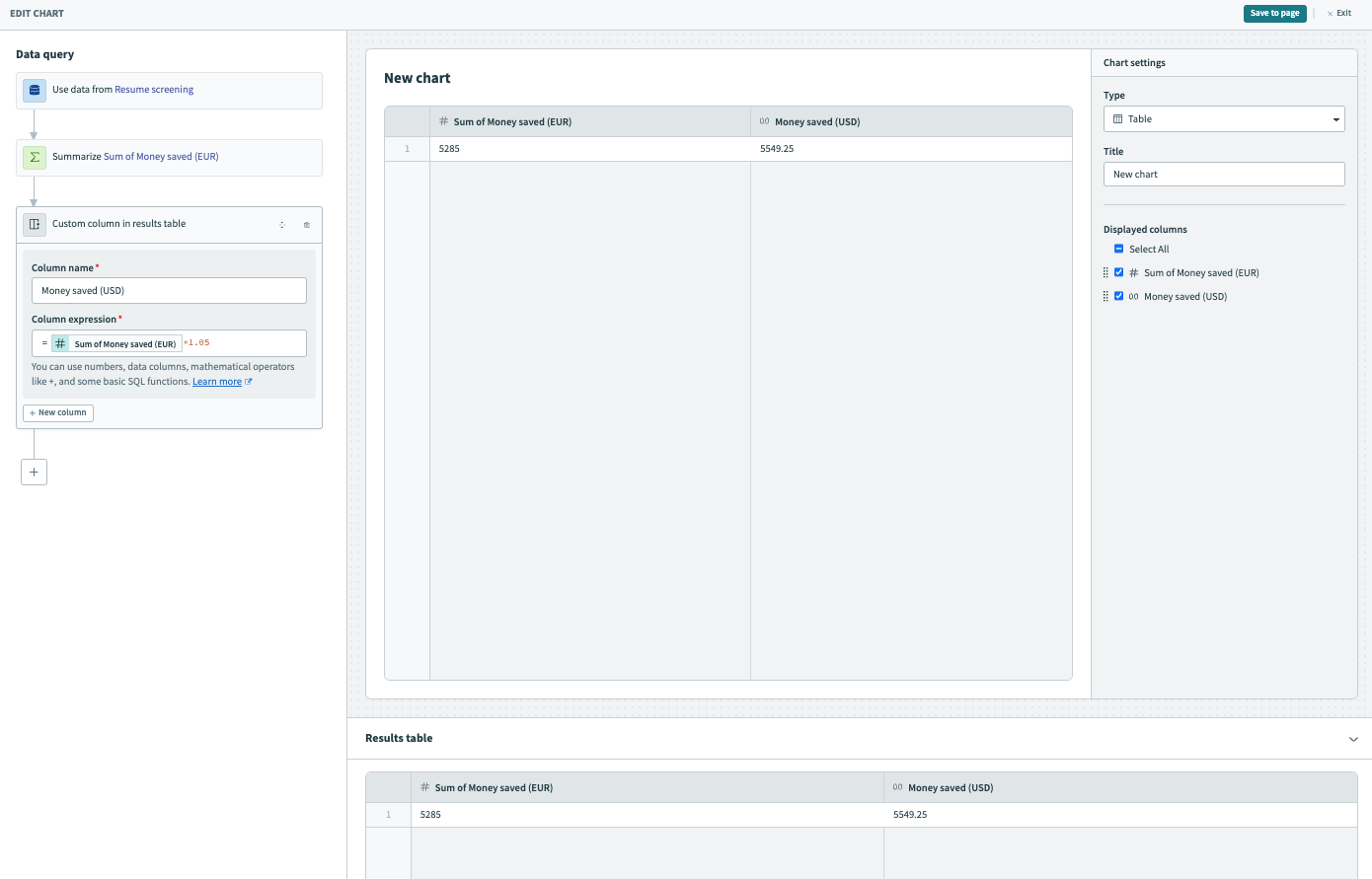
Provide a unique name for the new calculated column, such as Money saved (USD).
Map in the Sum of Money saved (EUR) datapill and multiply it by the exchange rate, 1.05.
= Sum of Money saved (EUR)*1.05
Preview your data in the Results table. This table displays the sum of money saved in USD.
 Preview your data in the Results table
Visualize your data
Select KPI from the Type drop-down.
Select Money saved (USD) from the Data column drop-down.
Optionally, provide a unique label for this chart, such as Money saved (USD). When you leave this field blank, the label is the column name you selected in the previous step.
Click Save to page to save the chart to your dashboard. 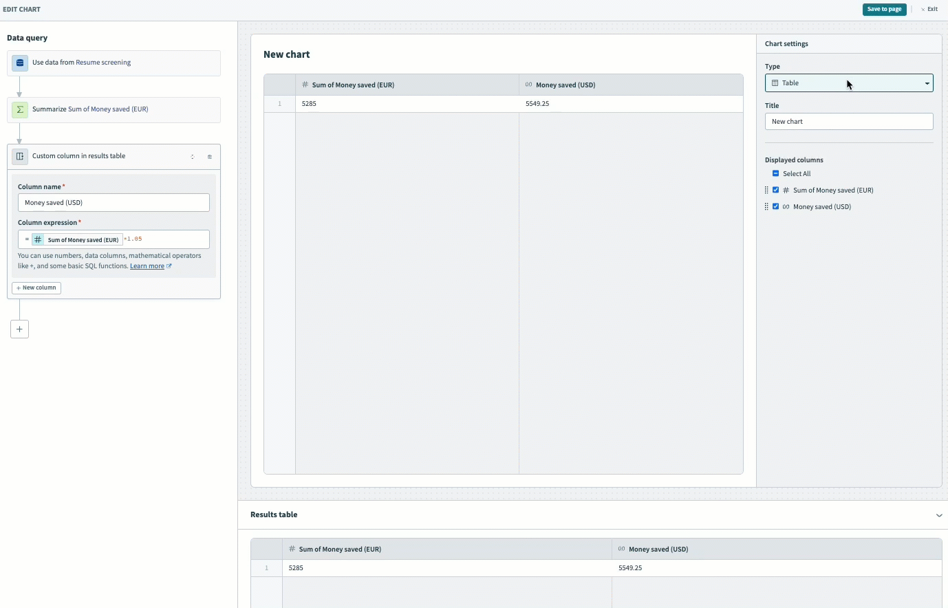 Visualize your data
Click Save to save your dashboard.
Get resolution rate as a percentage
This example demonstrates how to get a resolution rate as a percentage. In this example, we are interested in reporting on the efficiency of our resume screening process as it relates to our effectiveness in filling positions. To accomplish this, we track each position in a data table, where tickets with the closed status are filled and tickets with the new status are open.
Complete the following steps to create a calculated column that displays the ticket resolution rate as a percentage:
Click + (plus) and select the Summarize step.
Select Summarize
Configure the summarize step to get a count of rows
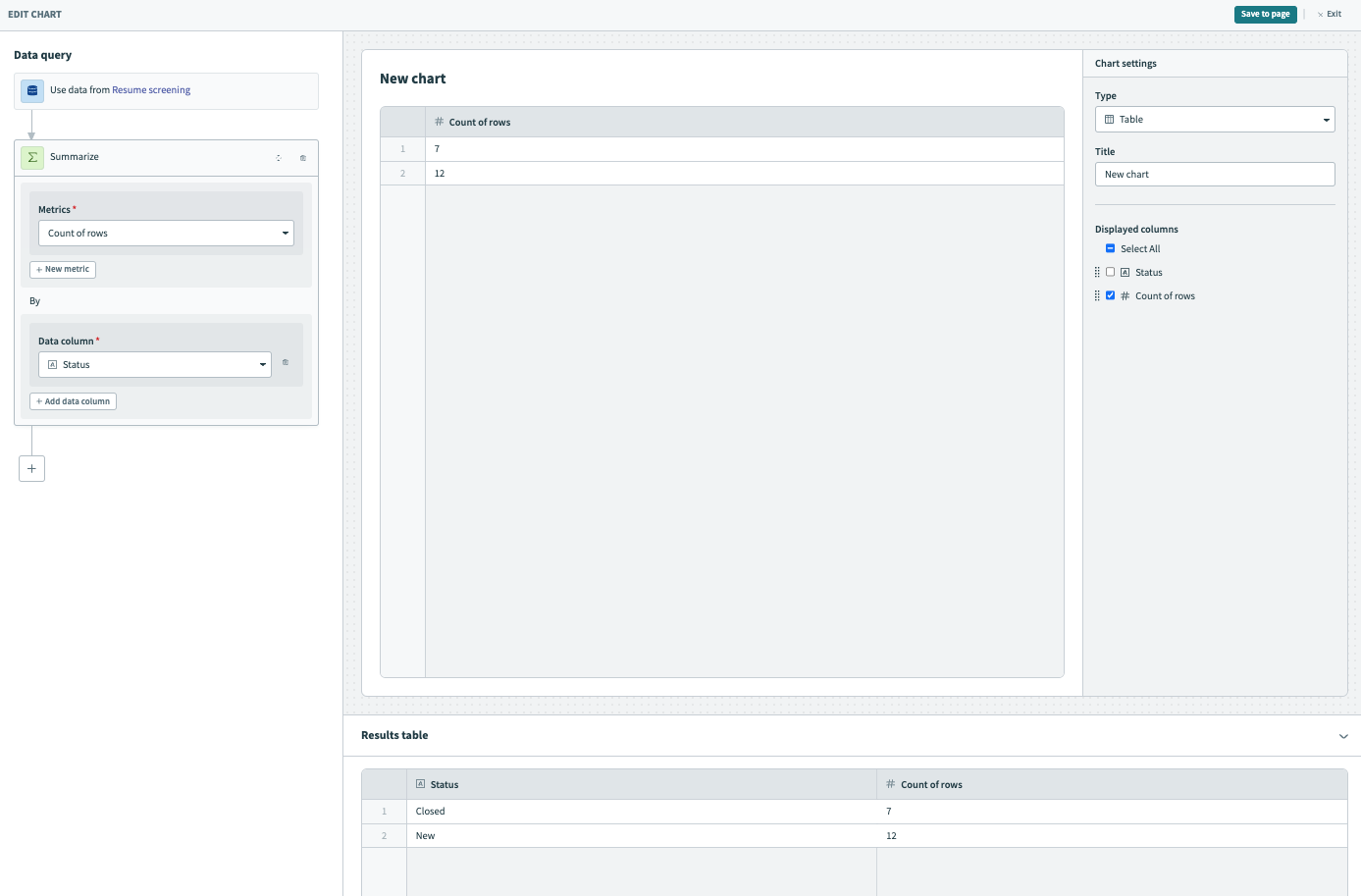
Select Count of rows from the Metrics drop-down.
Select Status from the Data column drop-down.
Preview your data in the Results table. This table displays the number of closed and open tickets.
 Preview your data in the Results table
Click + (plus) and select the Summarize step.
Select Summarize
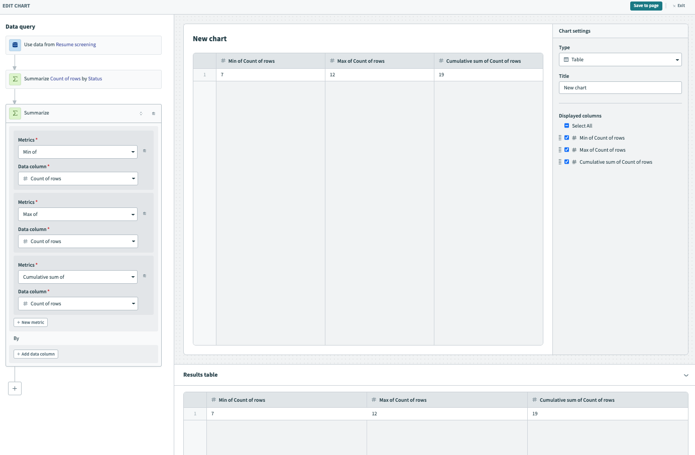
Configure the Summarize step to obtain the minimum, maximum, and cumulative row count
This step operates under the assumption that there are fewer resolved tickets than open tickets. If the contrary is true for your use case, adjust the logic accordingly. You can view the distribution of statuses in the results table of the preceding step.
Select Min of from the Metrics drop-down and Count of rows from the Data column drop-down. This step counts the number of resolved tickets (tickets with the closed status).
Click + New metric.
Select Max of from the Metrics drop-down and Count of rows from the Data column drop-down. This step counts the number of open tickets (tickets with the new status).
Click + New metric.
Select Cumulative sum of from the Metrics drop-down and Count of rows from the Data column drop-down. This step adds the number of open and closed tickets together to obtain the total number of tickets.
Preview your data in the Results table. This table displays the number of closed, open, and total tickets.
 Preview your data in the Results table
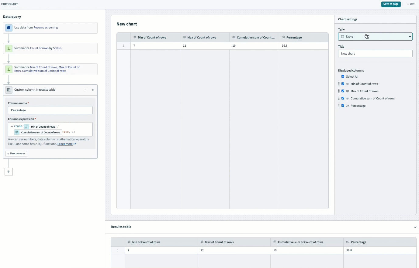
Click + (plus) and select the Calculated column step.
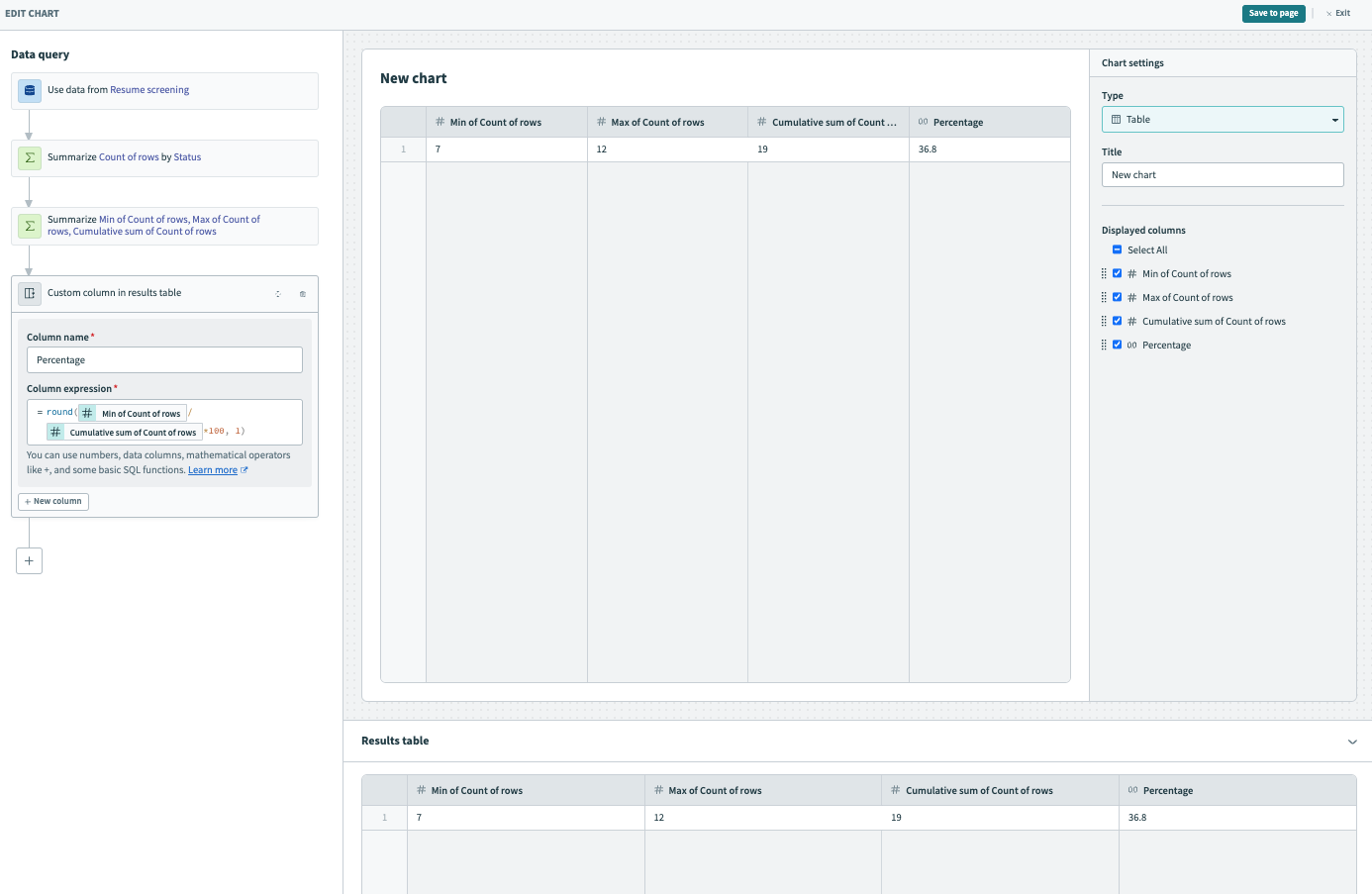
Configure the calculated column to calculate the percentage of resolved tickets
Provide a Column name, such as Percentage.
Select the round function, divide the number of closed tickets (Min of Count of rows) by the number of total tickets (Cumulative count of rows), and multiply the result by 100.
= round(Min of Count of rows/Cumulative count of rows*100, 1)
Preview your data in the Results table. This table displays the number of resolved tickets as a percentage.
 Preview your data in the Results table
Visualize your data
Select KPI from the Type drop-down.
Select Percentage from the Data column drop-down.
Optionally, provide a unique label for this chart, such as % Placement rate. When you leave this field blank, the label is the column name you selected in the previous step.
Click Save to page to save the chart to your dashboard.
 Visualize your data
Click Save to save your dashboard.
Show new tickets per quarter (custom date unit)
Calculated columns enable you to create custom date units, allowing you to track business events quarterly, regardless of when your fiscal year begins (January, February, or March).
Complete the following steps to create a calculated column that displays new tickets per quarter:
Click + (plus) and select the Calculated column query.
Select Calculated column
Configure the calculated column
Provide a unique name for the new calculated column, such as Quarter.
Select the floor and month function and map in the Created at datapill. This expression extracts the month from the date the ticket was created, rounds the input down, and divides the result to determine the quarter.
= floor((month(Created at)-2+12)/3%4)+1
Preview your data in the Results table. This table displays the quarter in which each ticket was created.
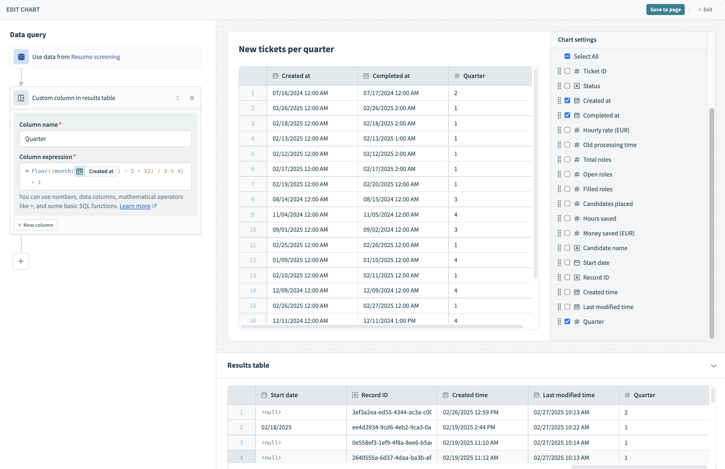 Preview your data in the Results table
Click + (plus) and select the Summarize query.
Select Summarize
Configure the Summarize query to get the number of tickets created each quarter
Select Count of rows from the Metrics drop-down.
Select Quarter from the Data column drop-down.
Preview your data in the Results table. This table shows the number of tickets created each quarter.
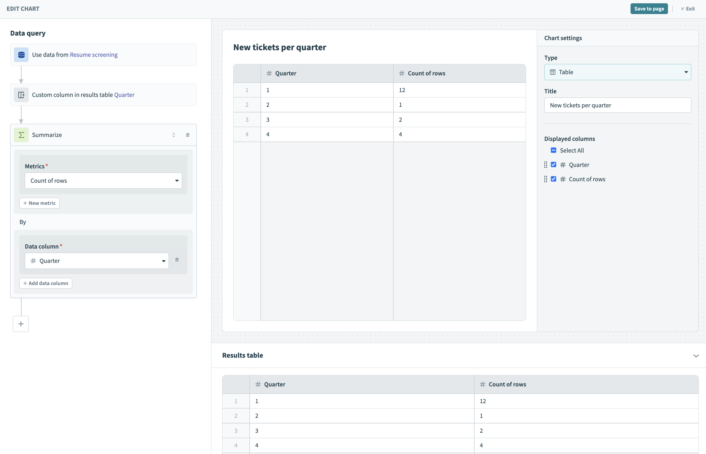 Preview your data in the Results table
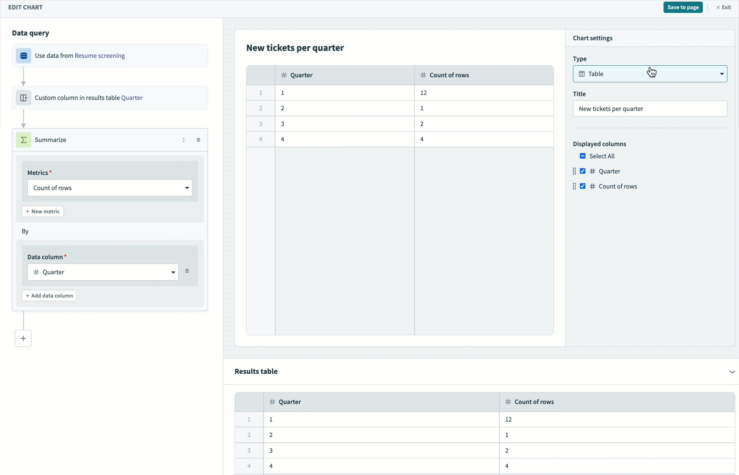
Visualize your data
Select Bar from the Type drop-down.
Provide a unique title for this chart, such as New tickets per quarter.
Optionally, customize your X- and Y-axis labels. Otherwise, the label is the data column name.
Click Save to page to save the chart to your dashboard.
 Visualize your data
Click Save to save your dashboard.
Transform text
In this example, we plan to display each new hire's name and start date. However, our data contains a mix of lowercase and title case names.
Complete the following steps to create a calculated column that transforms text from lowercase to title case:
Click + (plus) and select the Filter query.
Select Filter
Configure the filter step to get closed tickets
Select Status from the Data column drop-down.
Select equals from the Condition drop-down.
Select Closed as the Value.
Preview your data in the Results table. This table displays closed tickets only.
 Preview your data in the Results table
Click + (plus) and select the Calculated column query.
Select Calculated column
Configure the calculated column
Provide a unique name for the new calculated column, such as Employee names.
Select the titleize function and map in the Candidate name datapill.

= titleize(Candidate name)
Preview your data in the Results table. This table displays the names of the new hires in title case.
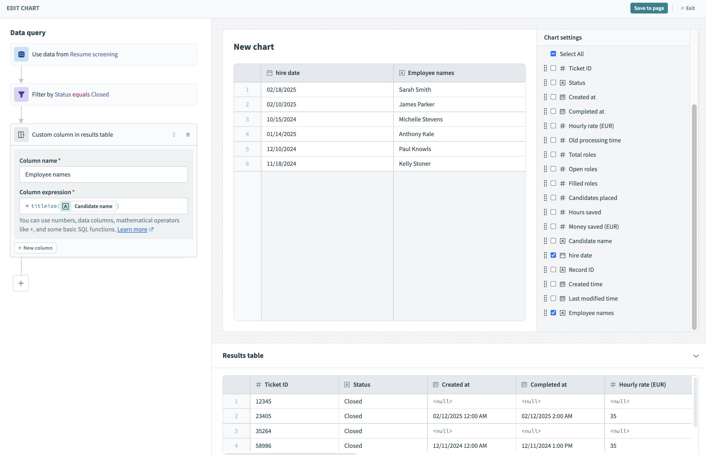 Preview your data in the Results table
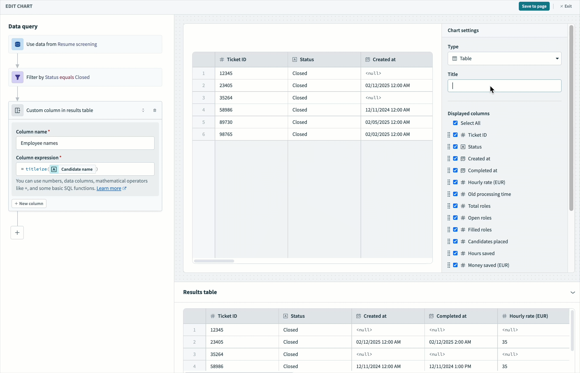
Visualize your data
Select Table from the Type drop-down.
Provide a unique title for this chart, such as New hires.
Select which columns to display in your table.
Optionally, rearrange columns to customize the order in which they appear in the table.
Click Save to page to save the chart to your dashboard.
 Visualize your data
Click Save to save your dashboard.
Last updated: