Styling dashboards
Use display components such as text, containers, and dividers to customize the visual appearance of your dashboard.
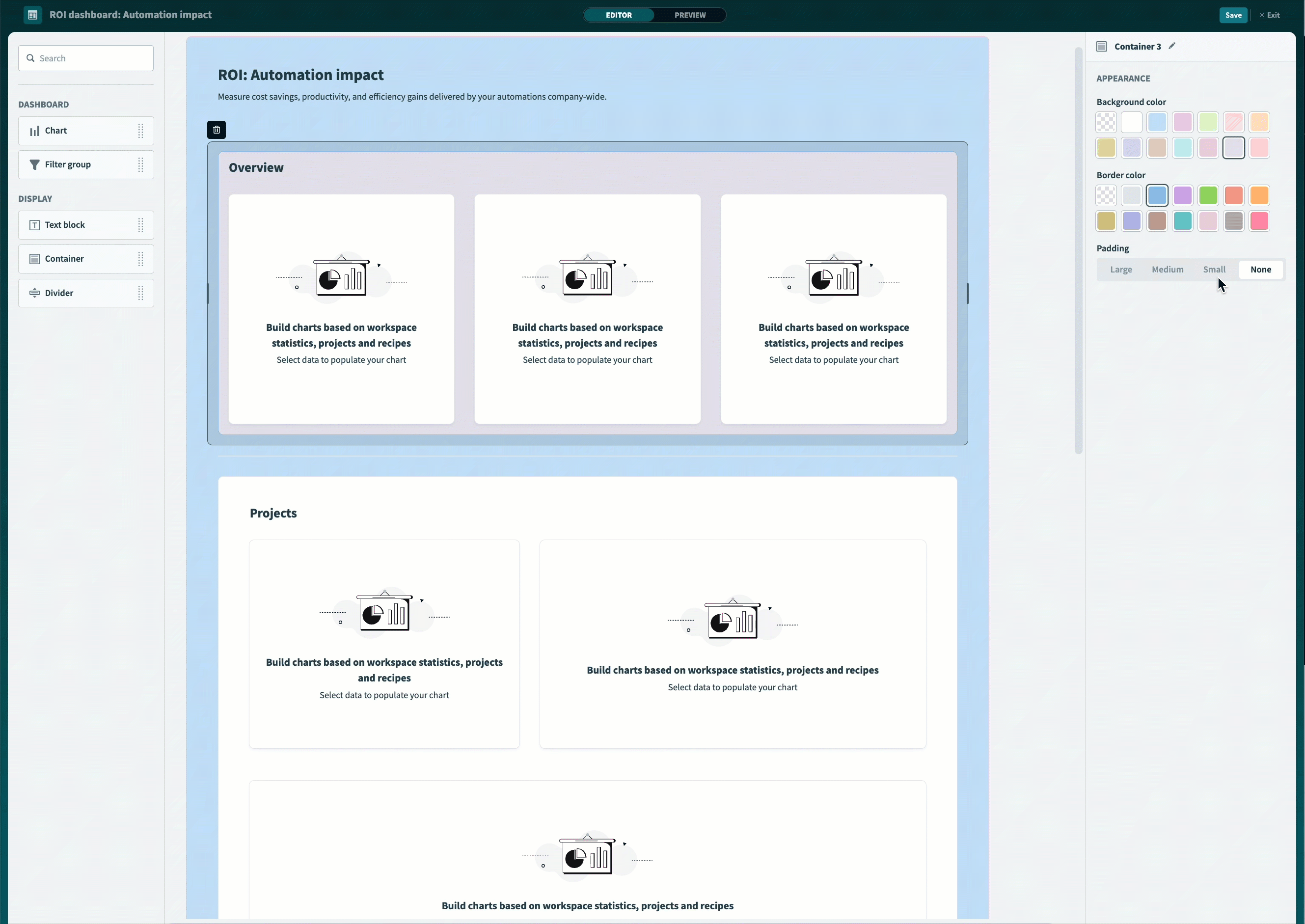
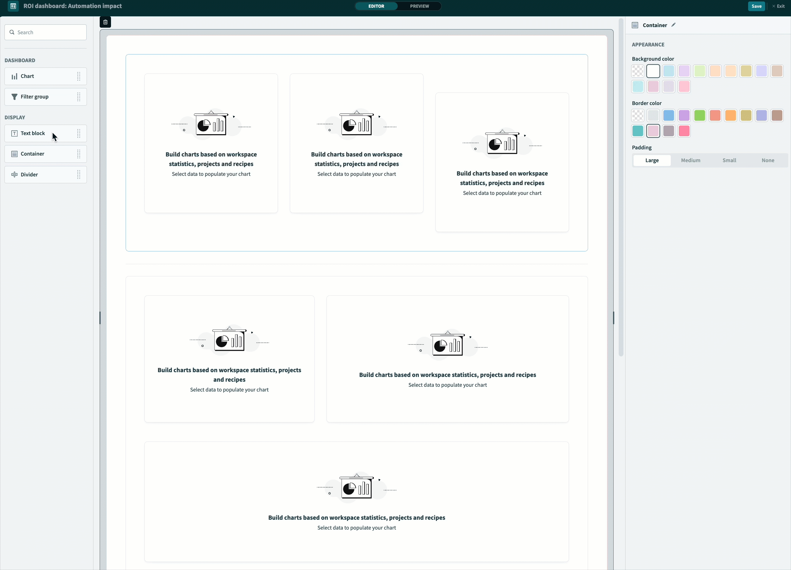
Containers, dividers, and padding
Use containers to group related charts together. Use dividers and padding to separate components.
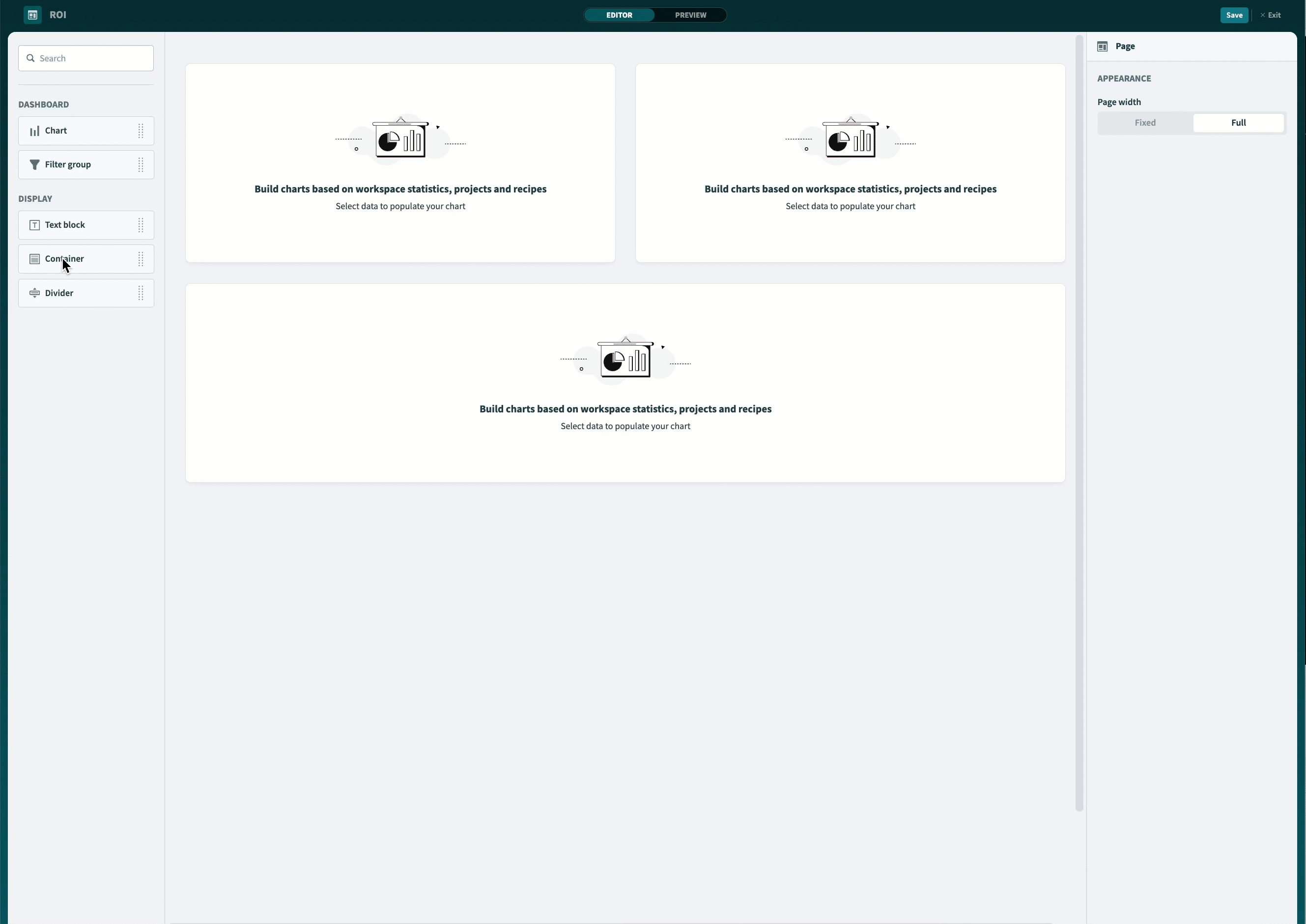
Add a container
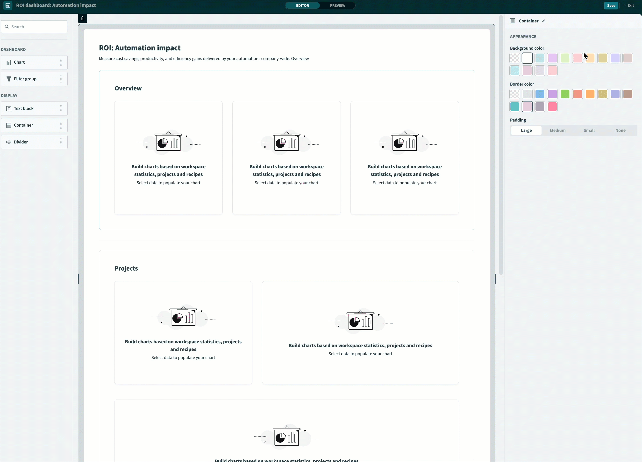
Complete the following steps to add and customize containers in your dashboard:
Drag and drop a Container from the components panel onto the dashboard canvas.
Click and drag the edge of the container to resize it.
 Customize containers
Add additional containers to the dashboard canvas as necessary.
Add a divider
Complete the following steps to add and customize dividers in your dashboard:
Drag and drop a Divider from the components panel onto your dashboard.
 Add and customize dividers
Use the Component properties panel to customize the divider's color.
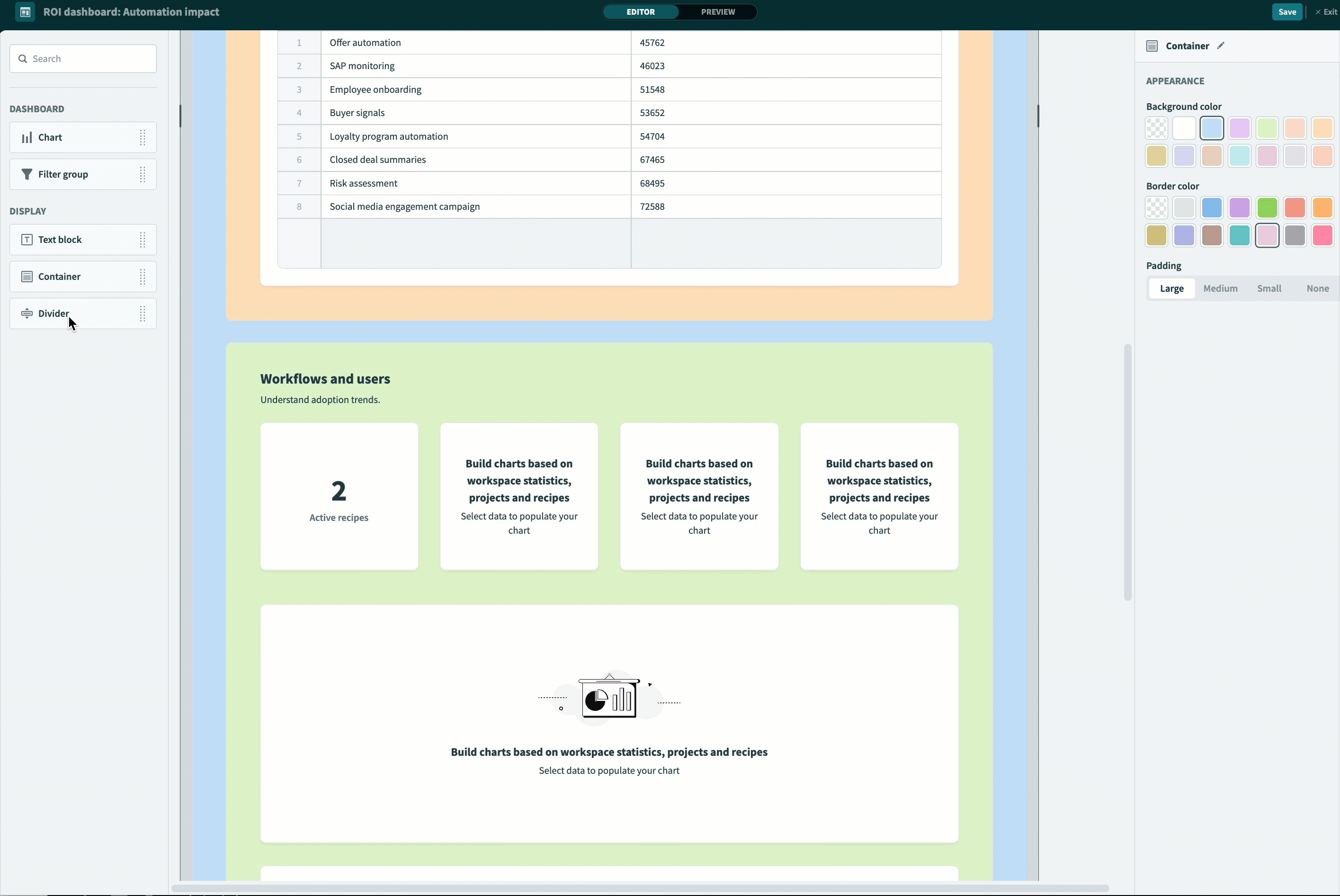
Customize padding
You can customize the padding of chart and container components.
Complete the following steps to customize padding in your dashboard:
Select a Container on the dashboard canvas.
Modify the padding using the properties panel. Available options are Large, Medium, Small, and None.
 Customize padding
Text
Use text to add context or instructions to your dashboard. Text components support specific Markdown syntax.
Customize text
Complete the following steps to add and customize text in your dashboard:
Drag and drop a Text component from the components panel onto your dashboard.
Enter your text in the properties panel. Text components support specific markdown syntax.
Supported markdown syntax
| Markdown element | Markdown syntax | Description |
|---|---|---|
| H1 | # | Use H1 headings for structured hierarchies, such as dashboard titles. |
| H2 | ## | Use H2 headings for structured hierarchies, such as container titles. |
| Bold | **bold text** | Use bold text to emphasize important information. |
| Italic | *italic text* or _italic text_ | Use italic text to emphasize important information. |
| Hyperlink | [link text](https://www.example.com) | Use hyperlinks to add links to external resources or related content. |
| Ordered list | 1. First item1. Second item1. Third item | Use ordered lists to group sequential information into numbered steps. |
| Unordered list | - First item- Second item- Third item | Use unordered lists to group related information into bulleted lists. |
 Add and customize text
Customize the text alignment. Available options are Left, Center, and Right.
Customize the text color by choosing from a range of pre-defined options.
Color
Customize colors for containers, text, and charts to improve readability and visual consistency.
Customize colors
Complete the following steps to customize colors in your dashboard:
Select a container component on your dashboard.
Customize the container's background and border color by selecting pre-defined options from the properties panel.
 Customize container colors
Best practices for dashboard design
Follow these best practices to design dashboards that are both functional and easy to read:
- Give your dashboard meaningful titles, headings, and chart labels so your audience immediately understands what they're looking at. For example, label a metric
Number of jobsinstead of the defaultCount of Rows. - Use color to convey meaning so your dashboard is intuitive. For example, use green for successful jobs and red for failures.
- Group related charts in containers, and use dividers and padding to separate components and reduce visual clutter. For example, group high-level job and recipe metrics in one container and usage data in another.
- Apply filters at the dashboard or container level so your audience can focus on a specific project, recipe, or date range.
Last updated: