Chart types
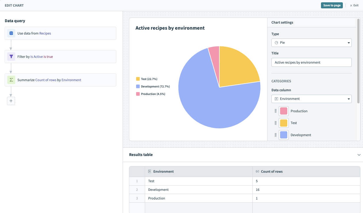 Chart editor
You can create custom charts with your data after you've chosen a data source and prepared it by performing queries. Visualizing your data involves determining the metrics and dimensions you plan to represent.
- Metric: Quantitative values that you plan to analyze, track, and present visually. Metrics can be aggregated to find the sum, average, or count. It's typically the key performance indicator (KPI) or main value you plan to report on.
- Dimension: Categorical variables that give context or descriptive information to the metrics in your report. Dimensions are used for slicing, grouping, and filtering data.
For example, you might plan to analyze the number of successful and failed jobs (metric) by Environment (dimension). You can use the Environment dimension to determine if integrations are performing well in your DEV, TEST, or PROD environments. Similarly, you can analyze money saved (metric) by project (dimension) to understand which projects are saving you the most money.
Insights displays your data as a table by default. You can use the Type drop-down menu to select a chart and customize it. Insights supports the following chart types for data visualizations:
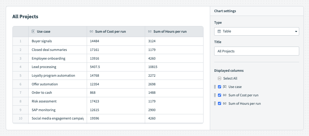
Table
Tables are a structured way to present organized information with rows and columns. They are particularly useful when presenting data with multiple dimensions, comparisons, or detailed information.
For example, the following table contains data for all business processes and provides detailed, exact data on the cost for each workflow run.
 Table
Table
By default, Insights displays your data as a table. To customize this table, configure the following input fields:
Title
Name your chart. The name you enter here displays on your Insights dashboard.
Displayed columns
Select the columns you plan to display in your chart. Click Select all to select/deselect all columns for display or select columns individually. Reorganize your columns by dragging and dropping them into place. This output is dynamic and depends on the data source you select. See the available data table for a description of the data available, organized by source.
Line graph
Line graphs are best suited for displaying trends and changes over time. They are particularly effective at illustrating how a variable or multiple variables change in relation to each other as time progresses.
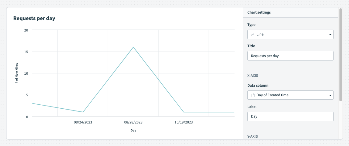 Line graph
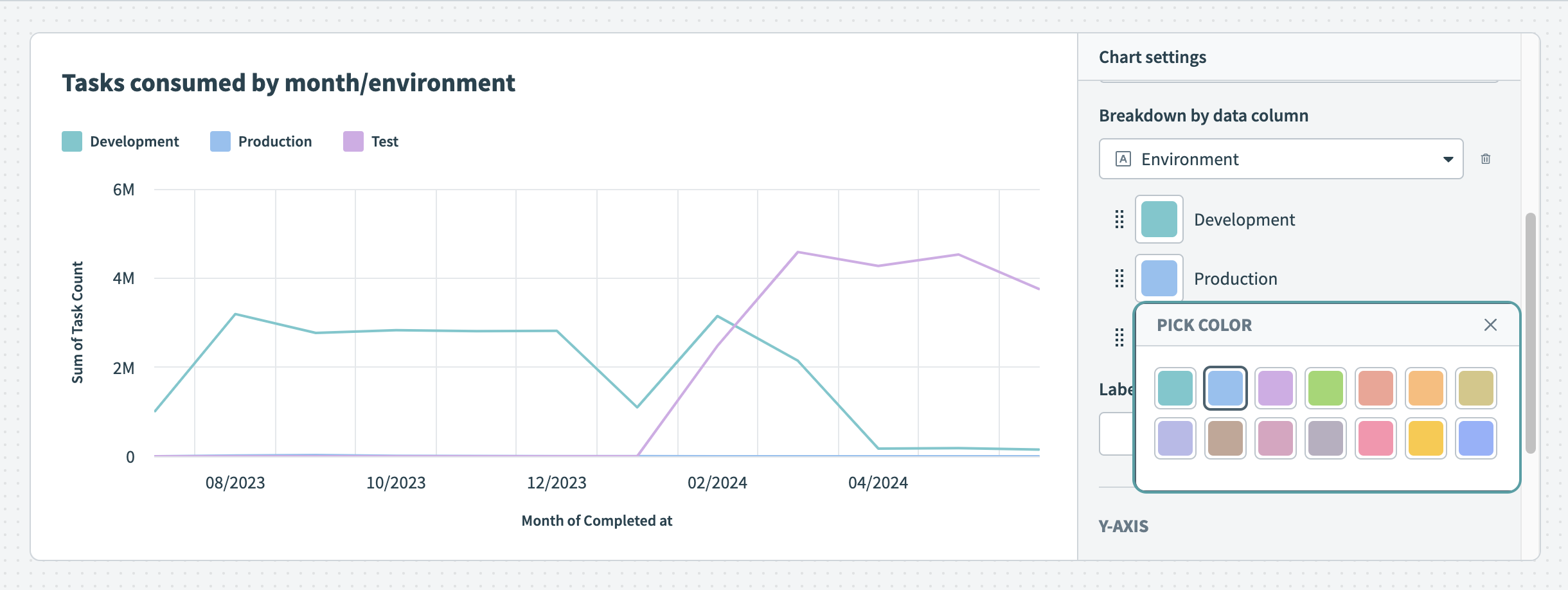 Customize the colors of your line graph
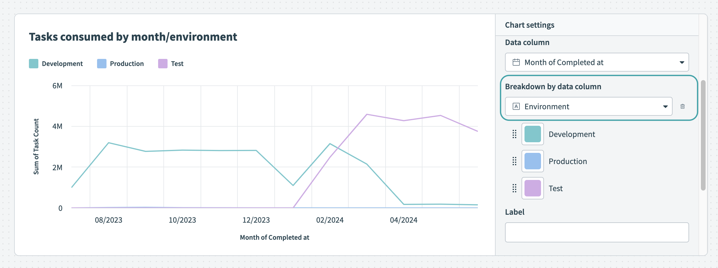 Break down your data by data column
 Hover over your chart to view the exact distribution of data
To customize your line graph, configure the following input fields:
Title
Name your chart. The name you enter here displays on your Insights dashboard.
X-axis
Data column
Determine a dimension column. The option you select here appears as categories on the x-axis.
Breakdown by data column
Optional. Line graphs can display segments of your data in different colors, enhancing understanding by visually distinguishing between categories or groups. This facilitates quick comparisons and highlights trends or patterns, making it useful for displaying job success and error rates, as well as trends over time, such as task consumption across environments.
Label
Provide a label for the x-axis. If you do not enter a label, Insights supplies the name of the data column you selected in the Data field.
Y-axis
Data column
Determine a measure column. The option you select here appears as values on the y-axis. Insights only displays numeric data columns (integer or decimal) for the y-axis.
Label
Provide a label for the y-axis. If you do not enter a label, Insights supplies the name of the data column you selected in the Data field.
Area graph
Area graphs are useful for displaying quantitative data over time, typically illustrating how values change in relation to one another. They are particularly suited to displaying trends, such as task consumption over time.
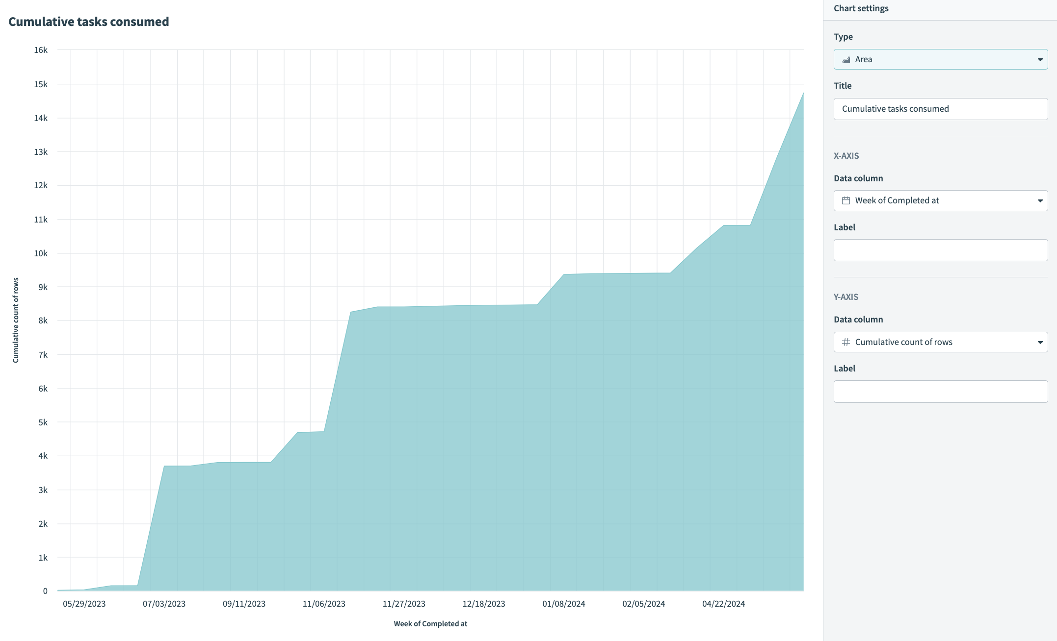 Use an area graph to visualize task consumption
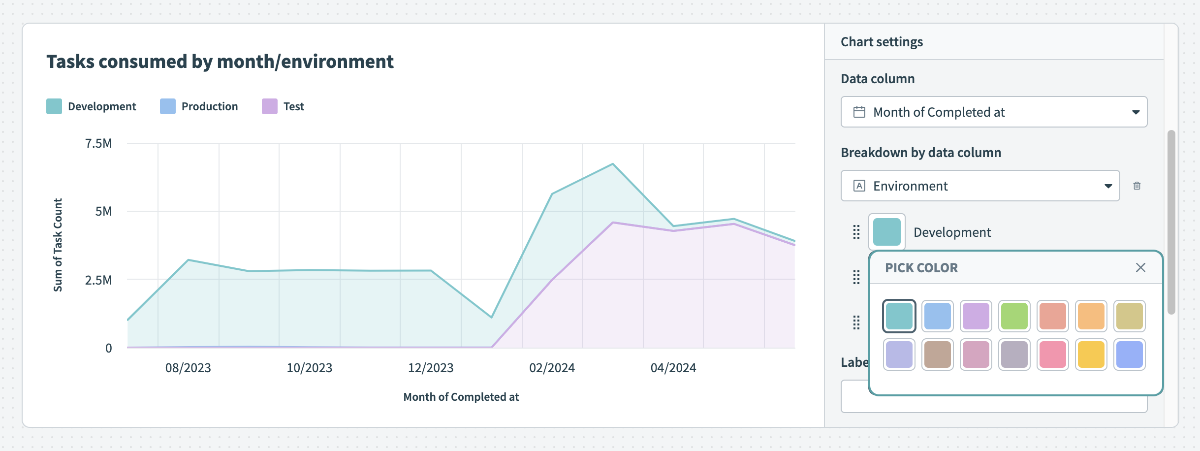 Customize the colors of your area graph
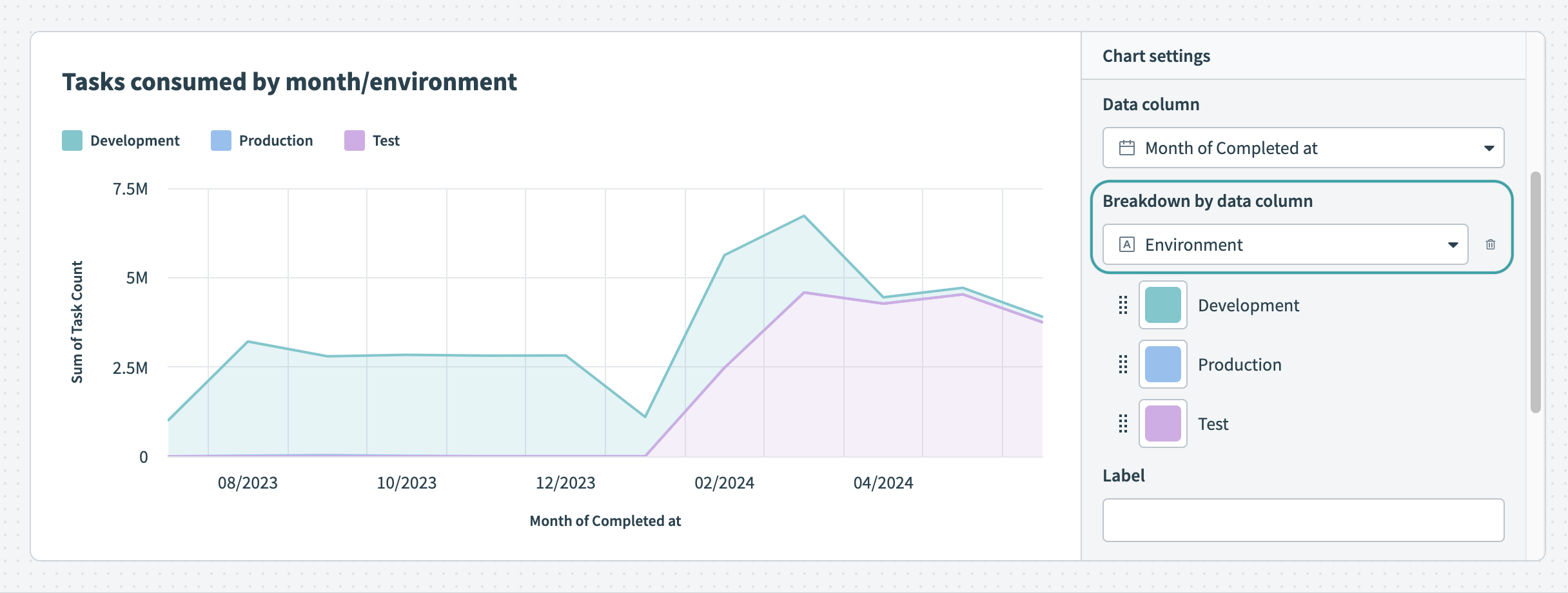 Break down your data by data column
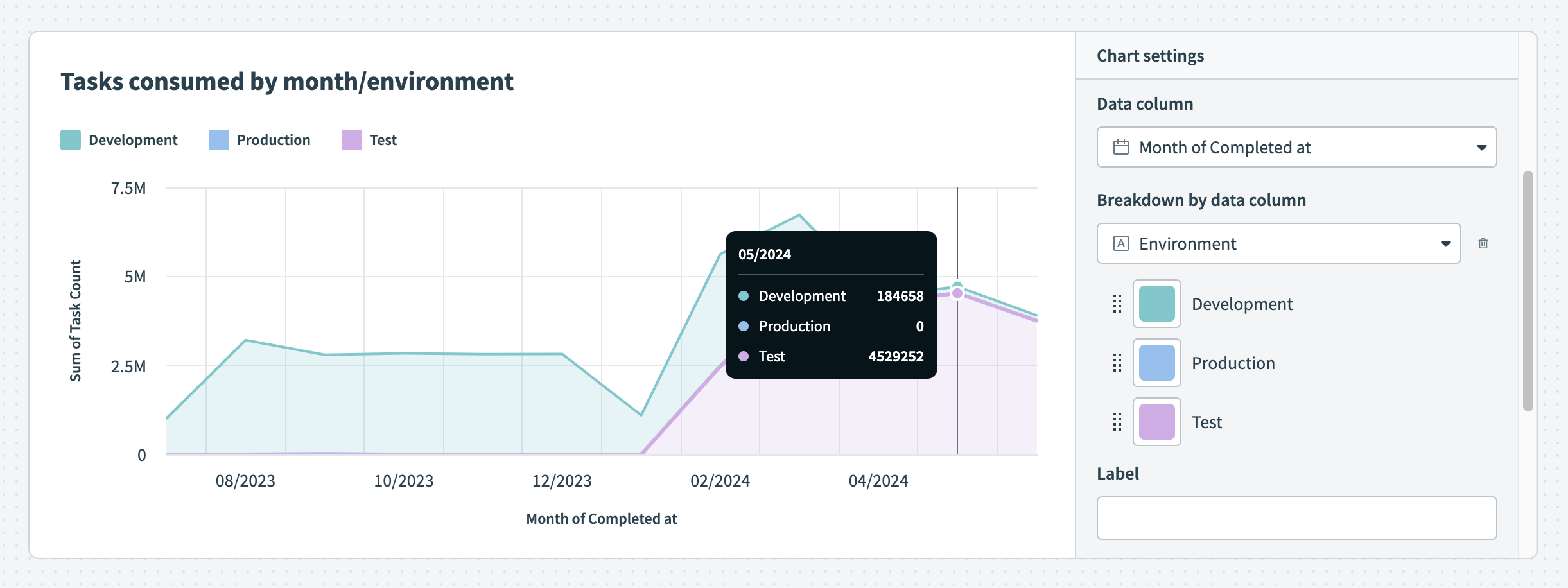 Hover over your chart to view the exact distribution of data
To customize your area graph, configure the following input fields:
Title
Name your chart. The name you enter here displays on your Insights dashboard.
X-axis
Data column
Select a column to measure. The column you select is represented as a block of color on the x-axis.
Breakdown by data column
Optional. Area graphs can display segments of your data in different colors, enhancing understanding by visually distinguishing between categories or groups. This facilitates quick comparisons and highlights trends or patterns, making it useful for showing job success and error rates, as well as trends over time, such as task consumption across environments.
Label
Provide a label for the x-axis. If you do not enter a label, Insights supplies the name of the data column you selected in the Data column field.
Y-axis column
Data column
Select a column to use to measure the category you selected for the x-axis. The data column you select determines the area of the graph that is filled. Insights only displays numeric data columns (integer or decimal) for the y-axis.
Label
Provide a label for the y-axis. If you do not enter a label, Insights supplies the name of the data column you selected in the Data column field.
Bar graph
Bar graphs are particularly effective for representing categorical data and comparing discrete values across different categories.
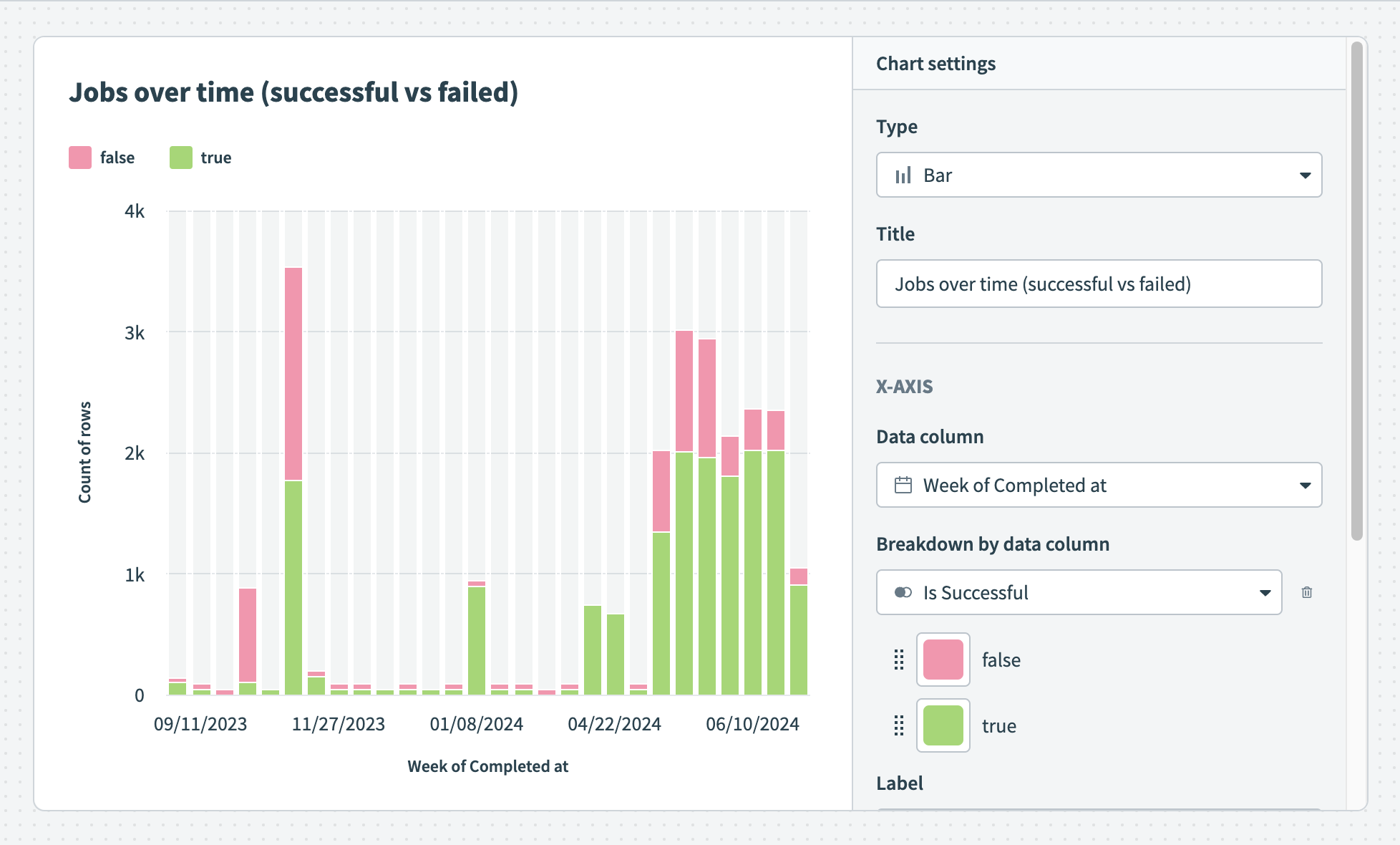 Successful and failed jobs over time
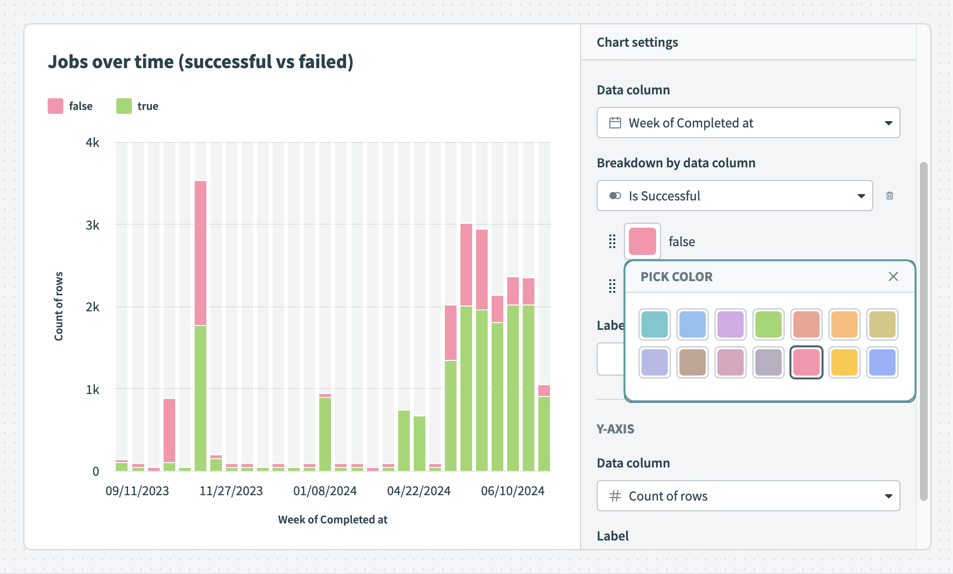 Customize the colors of your bar graph
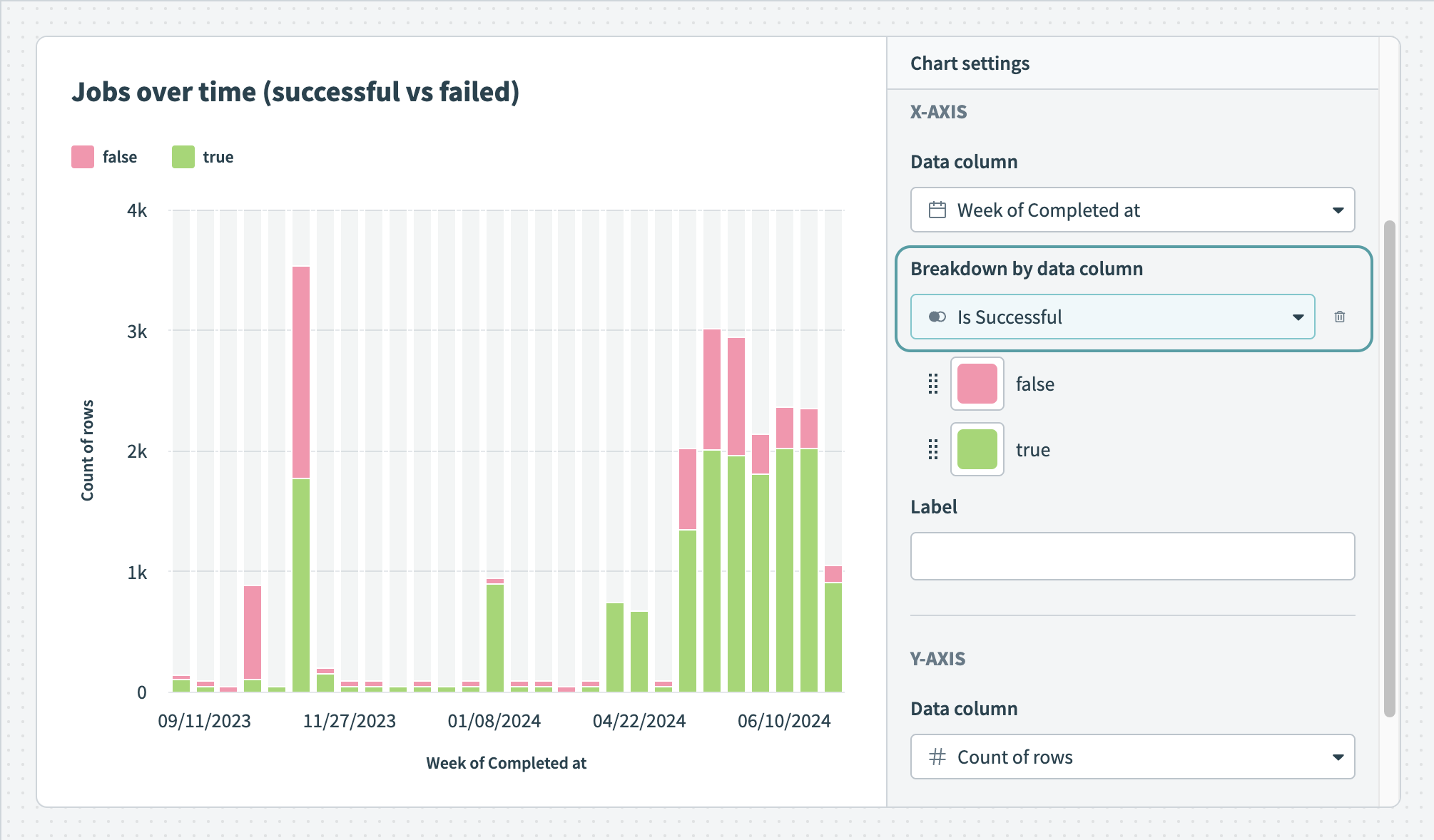 Break down your data by data column
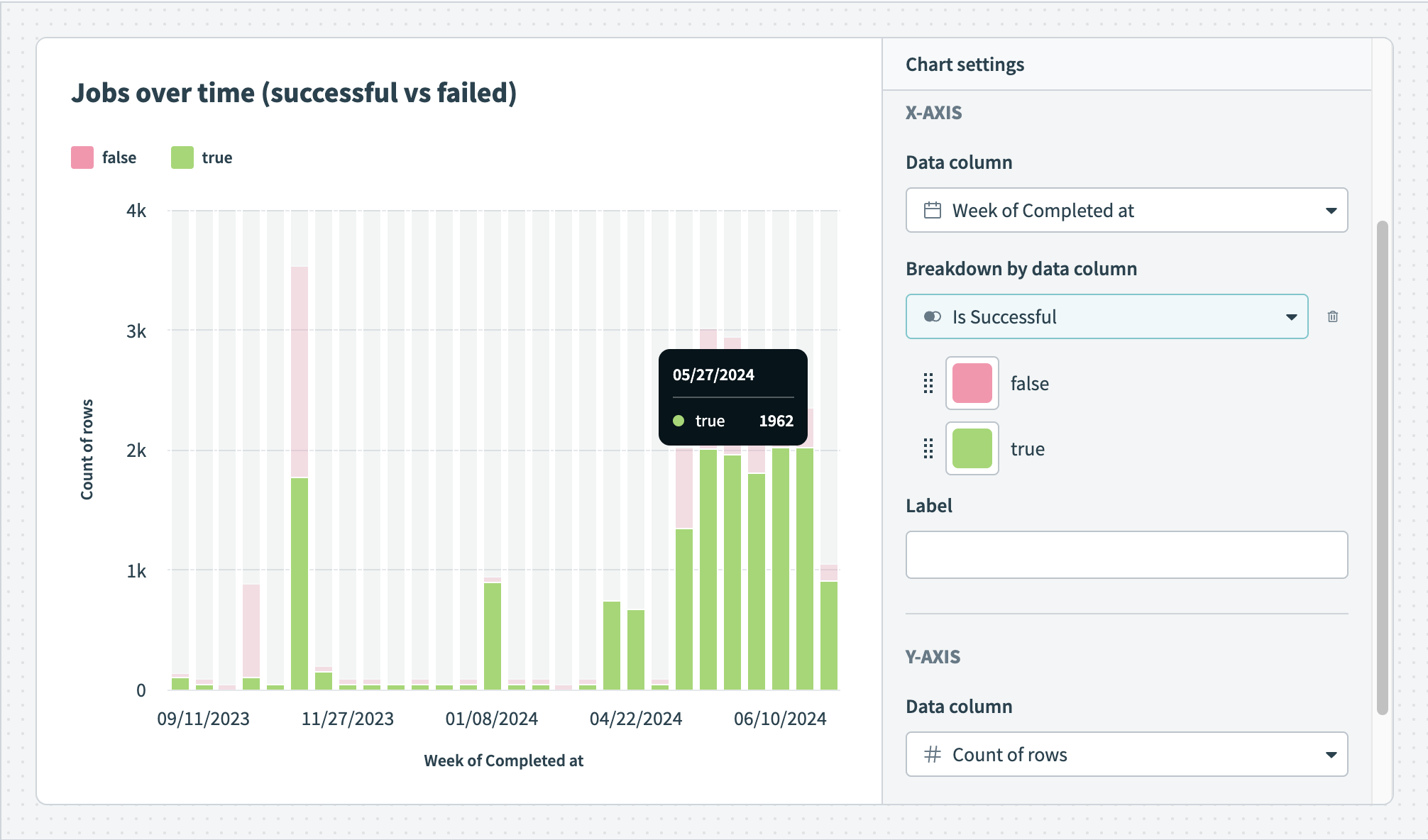 Hover over your chart to view the exact distribution of data
To customize your bar graph, configure the following input fields:
Title
Name your chart. The name you enter here displays on your Insights dashboard.
X-axis
Data column
Determine a dimension (category) column. Each category is represented as a bar on the x-axis.
Breakdown by data column
Optional. Bar charts can display segments of your data in different colors, enhancing understanding by visually distinguishing between categories or groups. This facilitates quick comparisons and highlights trends or patterns, making it useful for showing job success and error rates, as well as trends over time, such as task consumption across environments.
Label
Provide a label for the x-axis. If you do not enter a label, Insights supplies the name of the data column you selected in the Data column field.
Y-axis
Data column
Determine a measure column. The data column you select dictates the size of the bars in your graph. Insights only displays numeric data columns (integer or decimal) for the y-axis.
Label
Provide a label for the y-axis. If you do not enter a label, Insights supplies the name of the data column you selected in the Data column field.
Pie chart
Pie charts are ideal for displaying parts of a whole, emphasizing the proportion of each category relative to the total. They are especially effective for showing the distribution of a single data set into different categories.
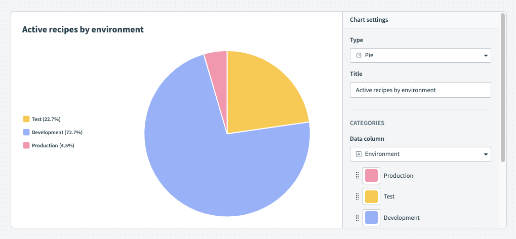 Pie chart
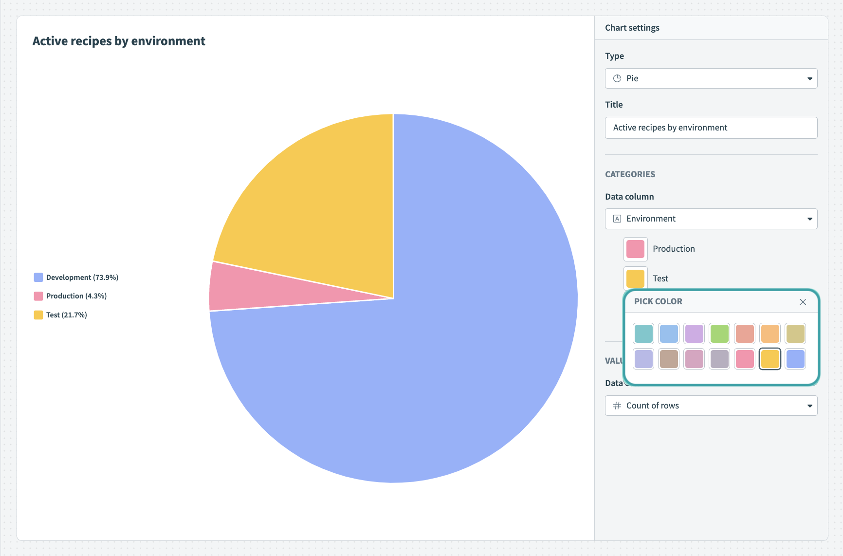 Customize the colors of your pie chart
To customize your pie chart, configure the following input fields:
Title
Name your chart. The name you enter here displays on your Insights dashboard.
Dimension
Determine the value you plan to measure.
Measure
Determine the measure. The measure determines the angle of each slice in a pie chart. This value must be an integer or decimal column.
KPI chart
KPI charts draw attention to data you plan to emphasize in your dashboard, such as conclusions, outliers, or high-performing metrics.
For example, the following KPI chart represents average task consumption per month for the last 365 days.
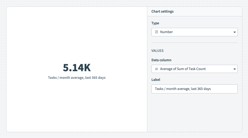 KPI chart
To customize your KPI chart, configure the following input fields:
Title
Name your chart. The name you enter here displays on your Insights dashboard.
Measure
Determine the measure, which is a column containing the value you plan to display on the chart. This value must be an integer or decimal column.
FURTHER READING
Last updated: