Adaptive card blocks for Microsoft Teams
Adaptive cards are customizable cards that can contain any combination of text, speech, images, buttons, and input fields.
With Adaptive card blocks, you can build simple or rich messages by customizing the order and appearance of each block, including elements within them.
Blocks can be used in the following Microsoft Teams surfaces:
| Surface | Applicable actions |
|---|---|
| Messages | Post message Post reply |
Supported blocks
Adaptive card blocks in Workbot for Microsoft Teams support the following block types:
| Blocks | Description |
|---|---|
| Text block | Displays Header, Subheader or Body text. To fully customize text styles, choose Custom. Supports markdown. You can also mention users, in that case their names will be displayed in red color like shown below.  Example text block Example text block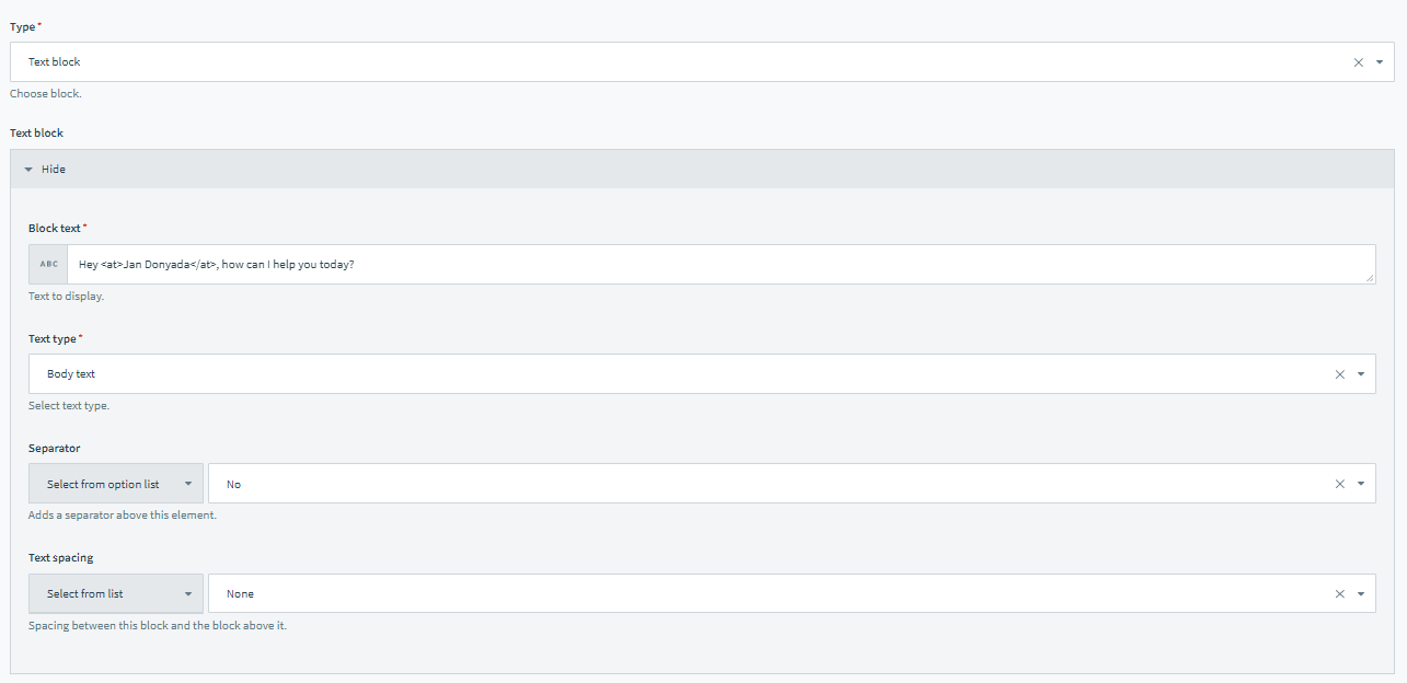 Recipe view Recipe view |
| Image block | Displays an image using a provided public URL. You can control the Image size and Image horizontal alignment. Example image block Example image block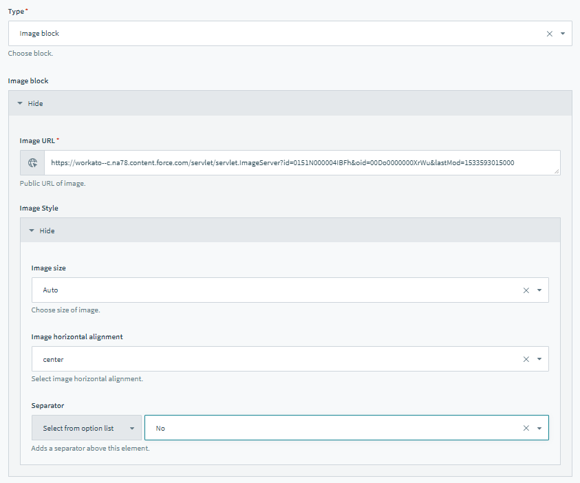 Recipe view Recipe view |
| Text with thumbnail | Displays text alongside an image thumbnail. Both header text and block text are optional, but at least 1 must be filled. Order can be changed. Example text with thumbnail block Example text with thumbnail block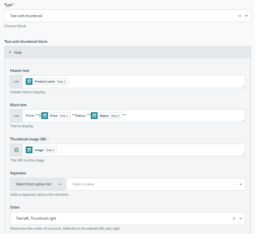 Recipe view Recipe view |
| Text with button | Displays text alongside a button to the right. A button can either invoke a command or open a URL. Order cannot be changed.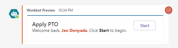 Example text block Example text block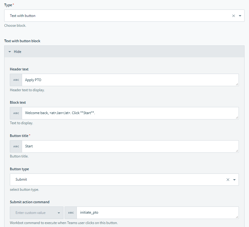 Recipe view Recipe view |
| Text with button & thumbnail | Displays a thumbnail, text and button in a single row. Both header text & block text are optional, but at least 1 must be filled. Order cannot be changed.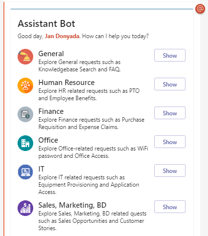 Example of a Text with button & thumbnail in a repeat block group Example of a Text with button & thumbnail in a repeat block group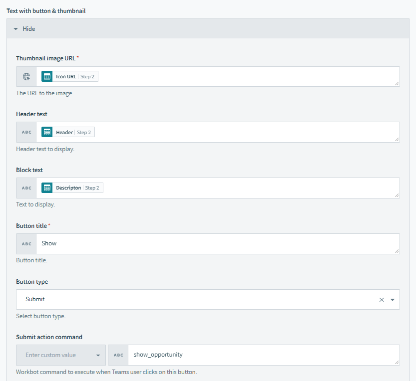 Recipe view Recipe view |
| Fact set | Displays name-value pairs in 2 columns.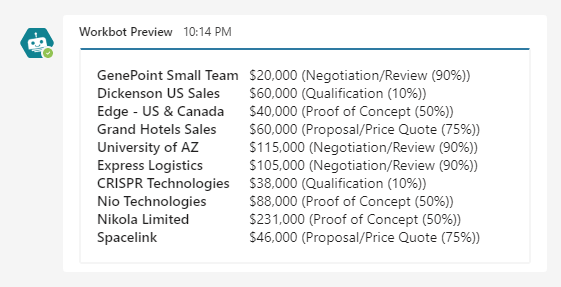 Example fact set block Example fact set block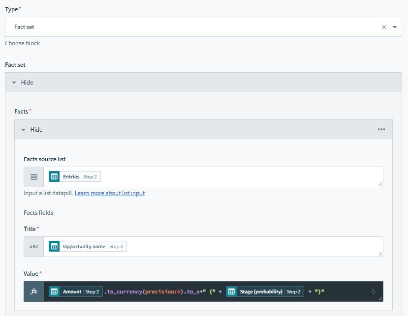 Recipe view Recipe view |
| Repeat block group | This special block type is only available only Workato. The repeat block group allows you to define a set of blocks to use as a pattern. By iterating through a list and mapping the list items to the blocks in the pattern, the pattern can be repeated for each item in the list. For example, display a different icon, details, and button for each category your bot can assist with. 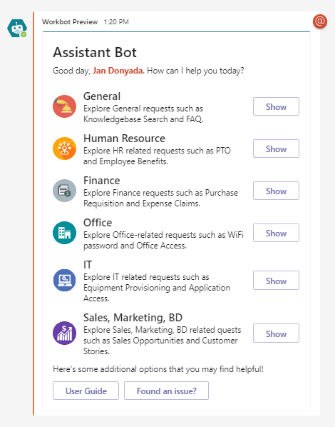 Example of a Text with button & thumbnail in a repeat block group Example of a Text with button & thumbnail in a repeat block group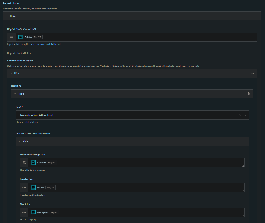 Recipe view Recipe view |
| Text input | Displays a single-line or multi-line text area for users to enter text input. On button submit, the text input is passed via the text input parameter.  Example text input Example text input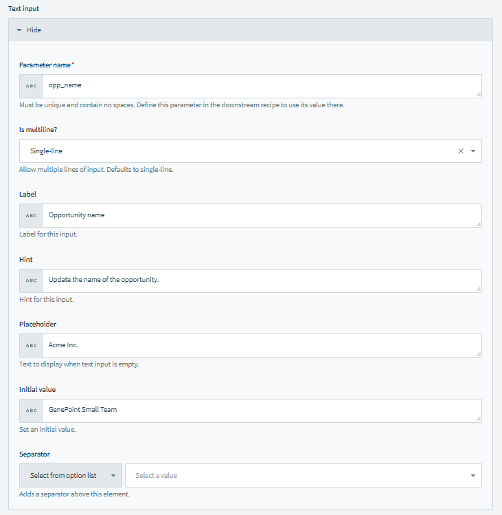 Recipe view Recipe view |
| Choice set | Displays radio button options, or drop-down menu options. Example choice set Example choice set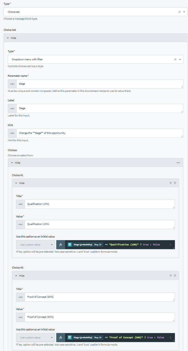 Recipe view Recipe view |
| Toggle input | Displays a single checkbox that passes true or false when checked and unchecked respectively.On submission, true or false is passed via the toggle input parameter. Example toggle input Example toggle input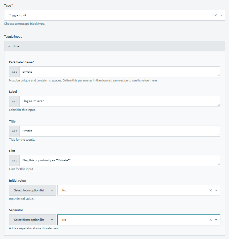 Recipe view Recipe view |
| Date input | Displays a date picker. On submission, the date picker is passed via a date parameter. You can customize the name of this date parameter. 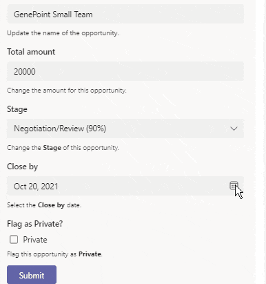 Example date input Example date input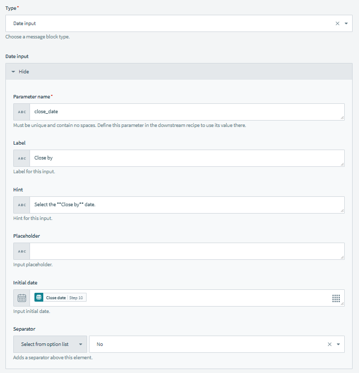 Recipe view Recipe view |
| Actions set | A block that can contain bot command buttons, URL buttons, or showcards. At least one bot command button is required if input blocks are present in your message. This is so that these parameters can be passed onto the downstream bot recipe on button submissions. Any bot command button will pass all input parameter values present in its containing message, regardless of the position of the button in the message.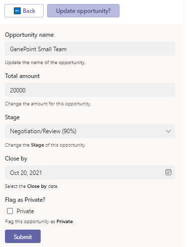 Example action set with button and show card Example action set with button and show card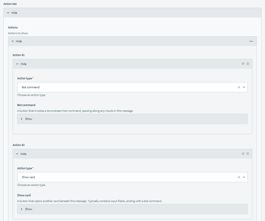 Recipe view Recipe view |
| Column set | Built for advanced users who want full customizability of their message. Each column set can hold multiple columns, occupying the entire row in the message. Each column can contain text blocks, image blocks, fact sets, or actions. Columns grow from left to right, based on the order they are in inside the column set.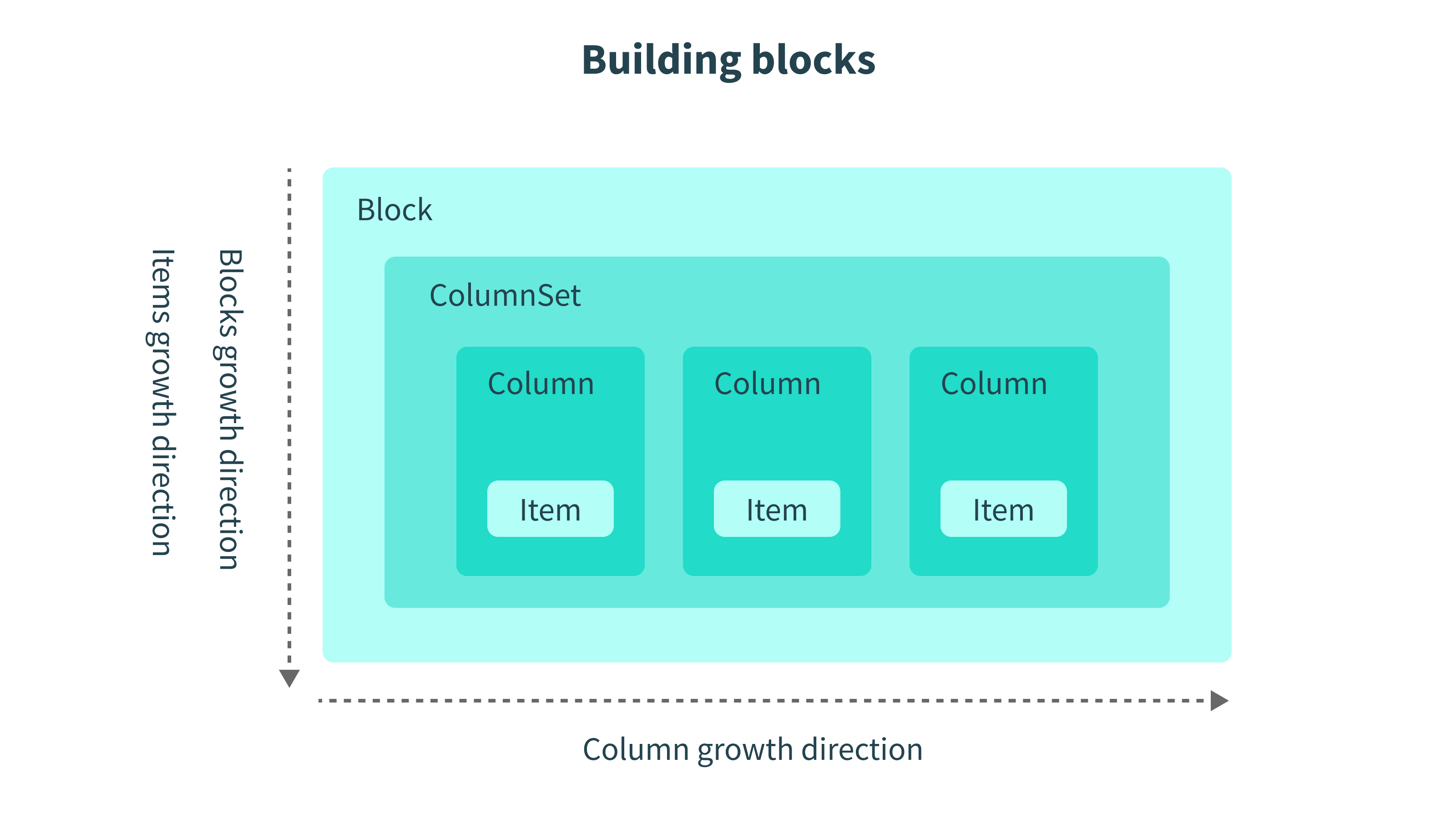 Anatomy of a column setExample column setRecipe view Anatomy of a column setExample column setRecipe viewTo see how column sets, columns, and column items can be arranged to form a message, head over to Microsoft's Adaptive Cards Designer. |
Best practices
Use column set and column blocks to fully customize message structure
You have limited control over content styles for the following Workato-only templates:
- Text with thumbnail
- Text with button
- Text with button & thumbnail
To fully customize message structure, use column set and column blocks.
Fix your columns
You can build columns dynamically. However, this approach can quickly become unmanageable because Workato does not set hard limits on the number of columns you can include. Microsoft Teams does not reject messages that exceed its rendering frame, but their appearance may be compromised.
We highly recommend an approach where you have a fixed set of columns and then build dynamic (or static) content inside the columns.
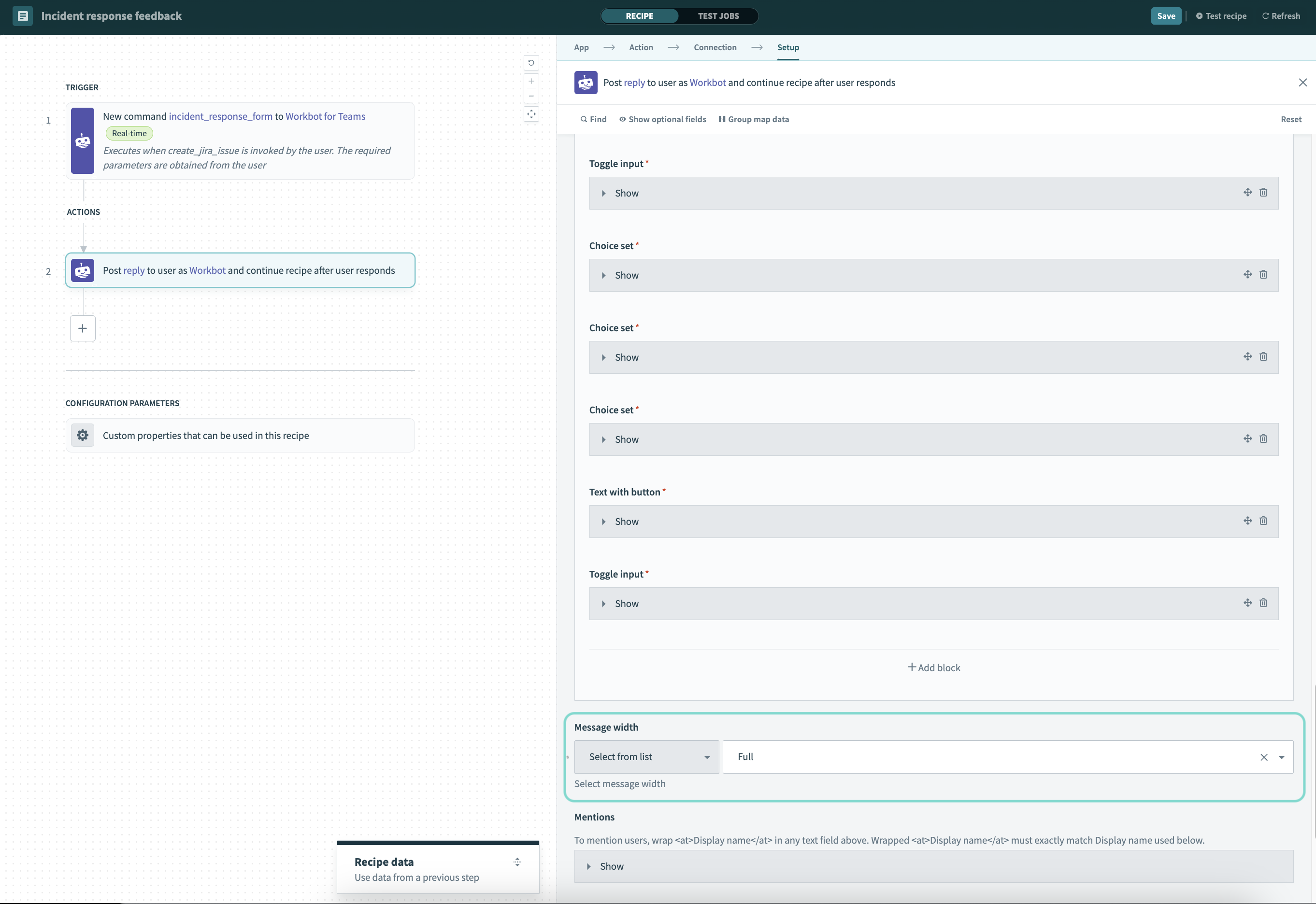
Determine message width
Select the width of your message from the available options. This setting is global and applies to all adaptive card blocks in your message.
Available options include:
- Default
- Full
 Determine message width
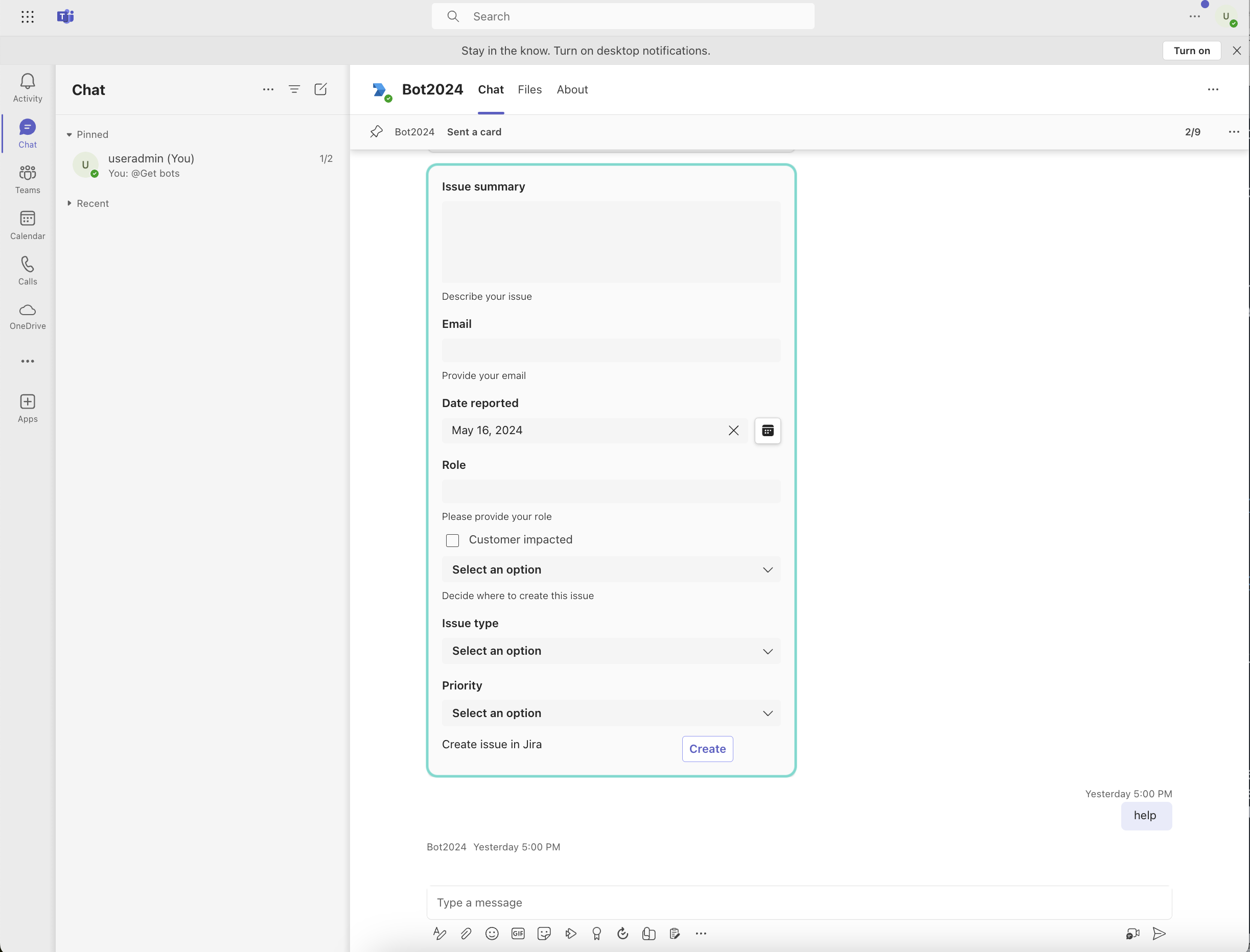 Default width message in Microsoft Teams
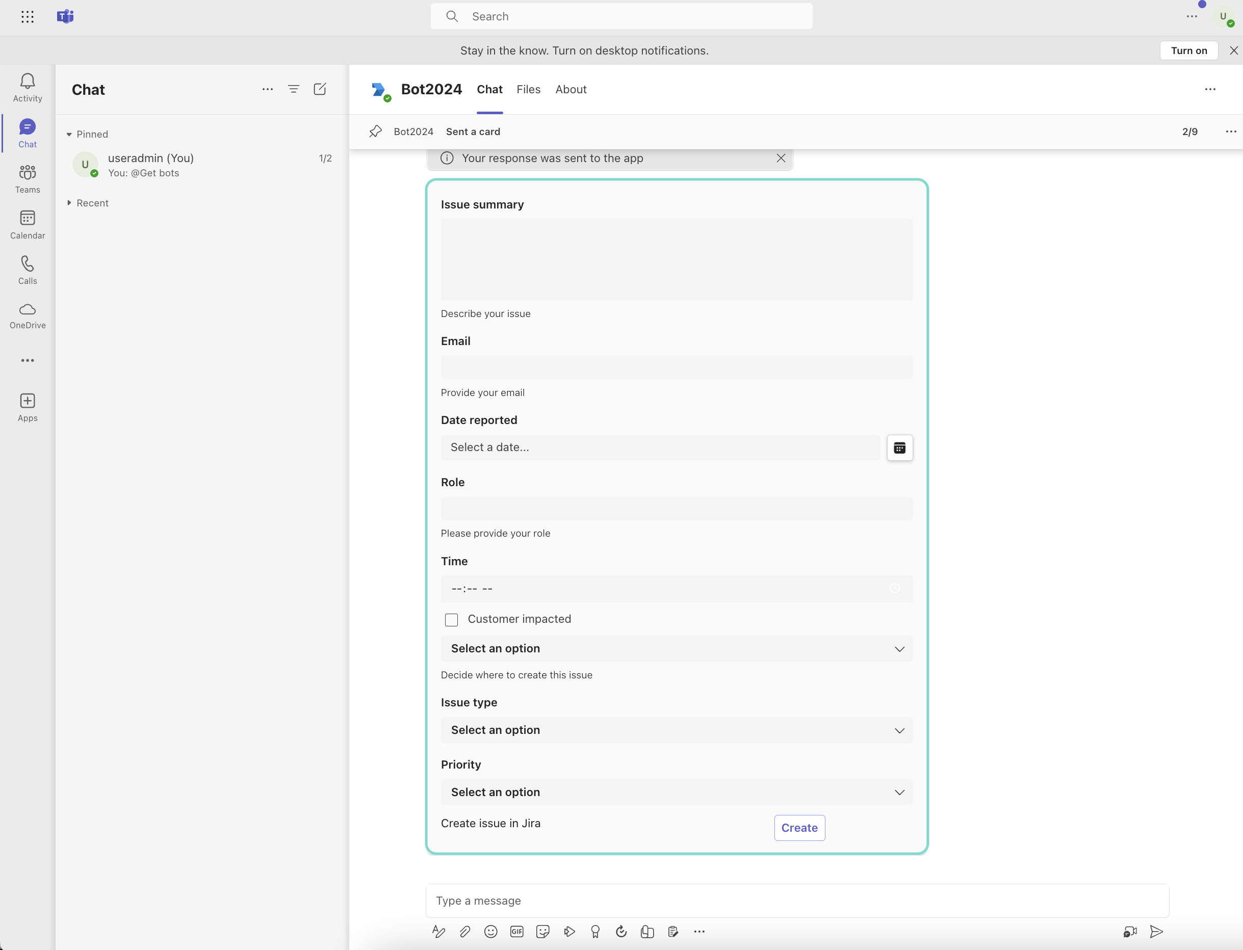 Full width message in Microsoft teams
Require user input
You can mark specific adaptive card block types that capture user input as required. If a user fails to provide input for a required field in these blocks, Workbot sends an error message. This feature supports marking fields as mandatory for the following block types:
- Text input
- Date input
- Time input
- Toggle input
- Choice set
Validate user input
Additionally, you can create logic to validate input to ensure it matches the expected format. The following adaptive block type supports user input validation:
- Text input
How to mark input as required and validate user input
The following example demonstrates how to mark input as required and configure Workbot to validate user input for Text input. This is useful when you must collect specific data from your users, such as email addresses, phone numbers, and more.
Add a Post reply or Post message step to your recipe.
Click + (plus) Add block, and select User input from the Type drop-down.
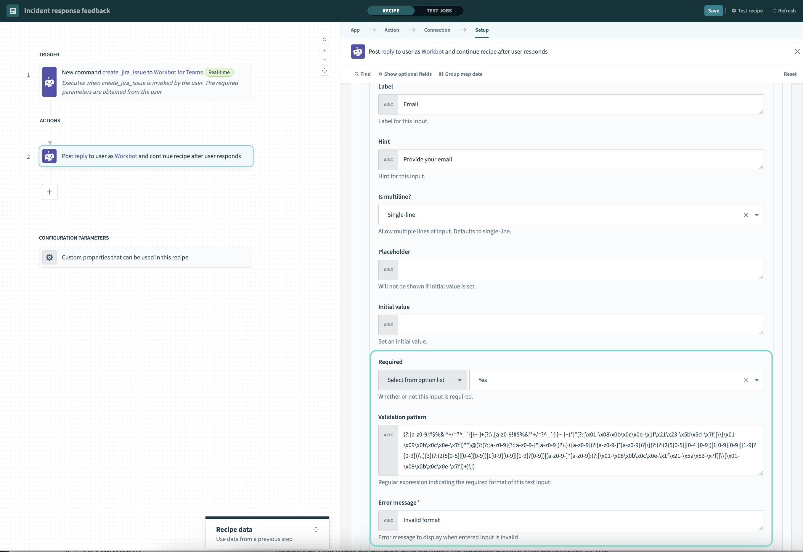
Fill in the following fields:
Parameter name
Required. This must be unique and contain no spaces. Define this parameter in the downstream recipe steps to use its value.
Label
Provide a label for this input.
Hint
Provide a hint for this input.
Is multiline?
Select Yes to allow multiple lines of input. Defaults to single-line input.
Placeholder
Determine a placeholder value. This is not visible if you set an Initial value.
Initial value
Set an initial value.
Required
Select Yes to set this input as mandatory.
Validation pattern
Regular expression (regex) indicating the required format of this text input. For example, you can use a regex to validate email addresses, phone numbers, and more. Learn more about configuring regex.
- Regex for email addresses:
^[a-zA-Z0-9._%+-]+@[a-zA-Z0-9.-]+\.[a-zA-Z]{2,}$- Regex for phone numbers:
^\+?\d{1,3}[\s-]?\(?\d{3}\)?[\s.-]?\d{3}[\s.-]?\d{4}$Error message
Create an error message. Workbot displays this message to users when required input is missing or invalid.
Separator
Add a separator above this input element.
 Validate user input and mark as required
Example in Microsoft teams
The following image demonstrates how error messages render in Microsoft Teams for missing or invalid input:
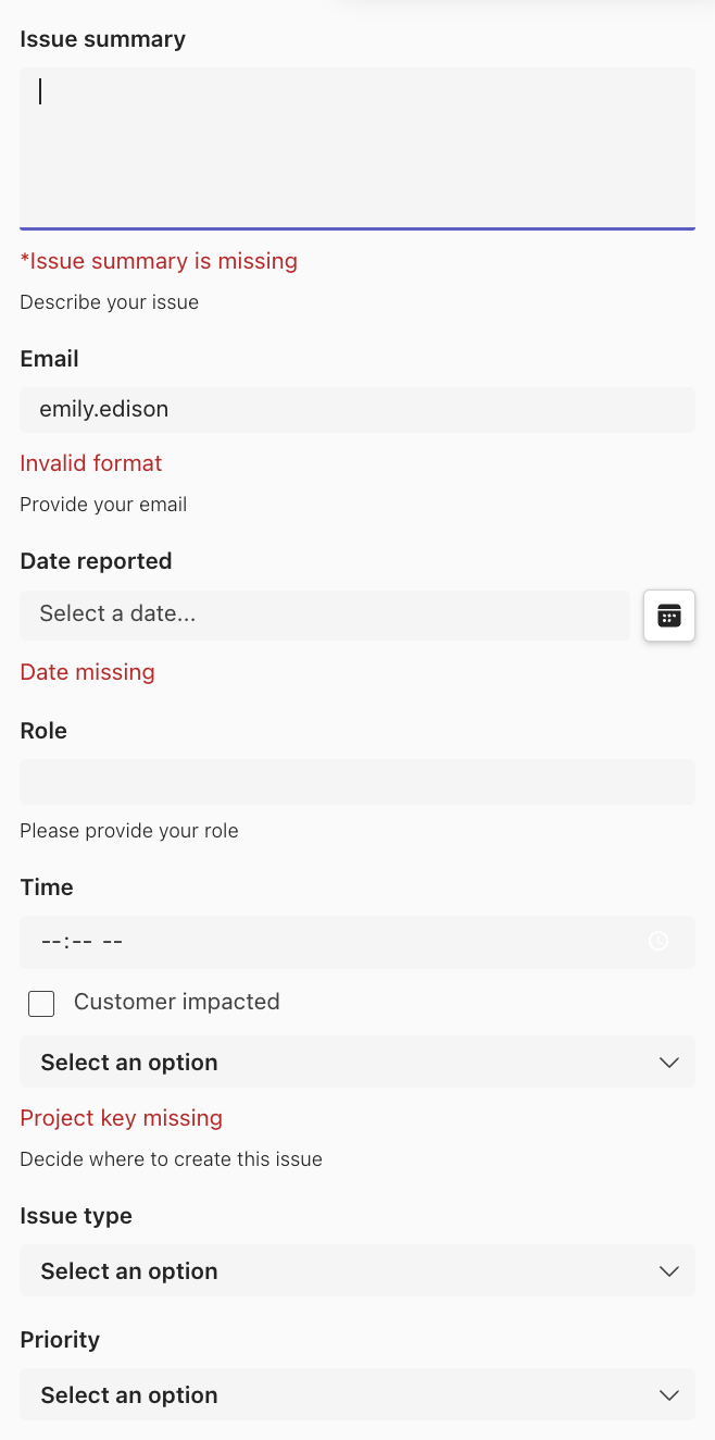 Example error messages
Limitations
Repeat blocks and input blocks
- Repeat blocks and input blocks are not available inside columns
- Repeat blocks are not available within repeat blocks
- Column sets are not available inside columns
Last updated: