Customize a page
The Workflow apps page editor features a drag-and-drop page builder. It allows you to determine the look and feel of your app and create dynamic pages that change in response to user input.
The page editor allows you to duplicate existing components and reuse them within your page. This saves time during app development by allowing you to quickly reuse and modify components while maintaining design consistency across your page. The page editor also allows you to undo or redo actions that modify page layout.
The page editor consists of the following parts:
- The Page canvas: Resize components, determine layout, and more in the central portion of the editor.
- The Content and Background panel: Drag and drop components onto your page from the left panel, add custom colors, and more.
- The Properties panel: Customize components by deciding how data displays on your page. You can determine whether components are read-only, editable, and more using the right panel.
- Page data: Map in datapills related to the request, application, or page components to create custom and dynamic forms that change in response to user input using the page data modal (similar to the datatree in the recipe editor).
- The preview button: Preview your designs in real-time to design quality user experiences.
 Workflow apps page editor
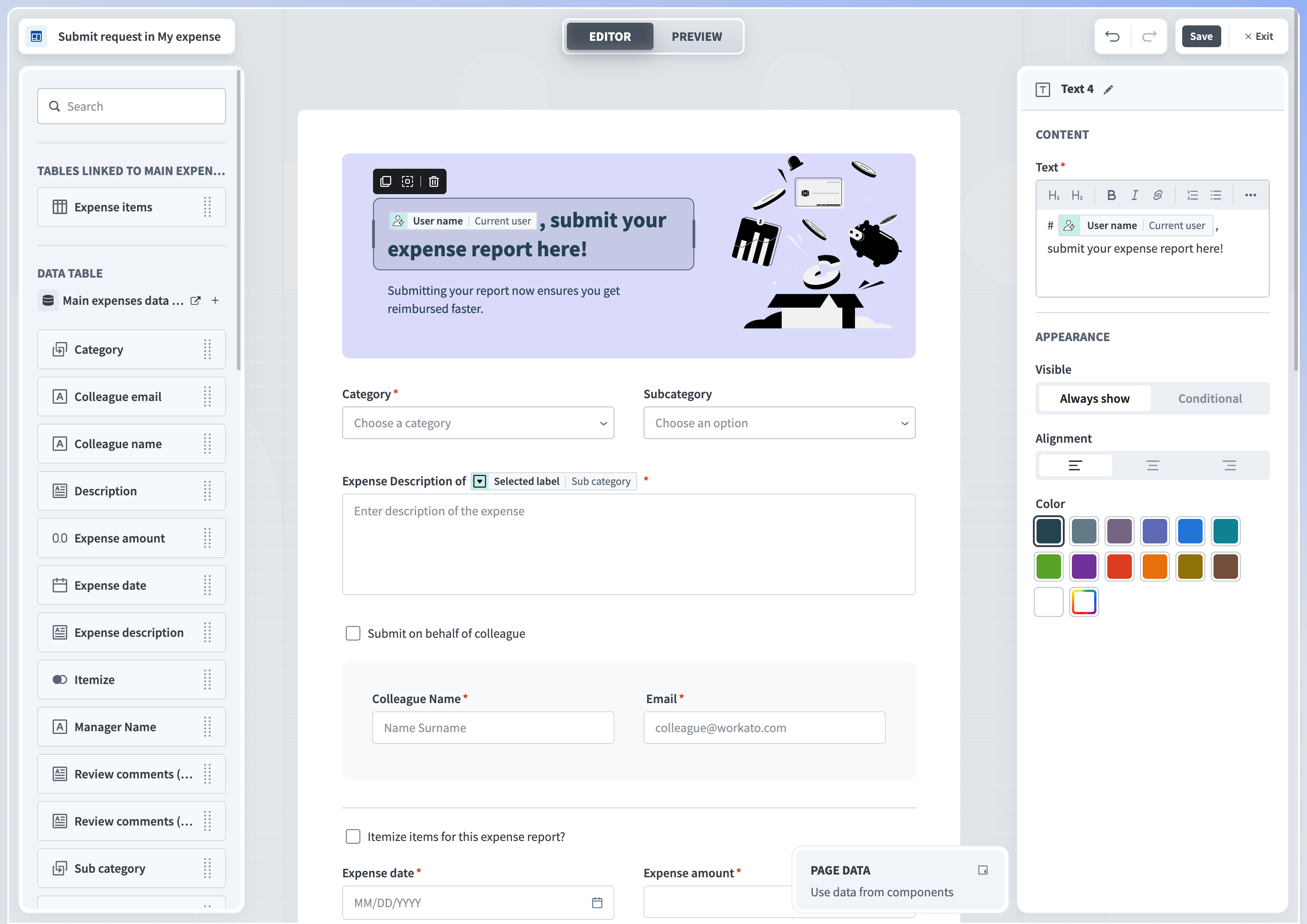
Page canvas
Pages have a grid-style canvas where you can drag and drop components from the palette on the left side of the page. The grid is always 12 columns wide and a fixed height. This enables you to easily align the components without adjusting every pixel.
 Drag and drop components to customize a Page
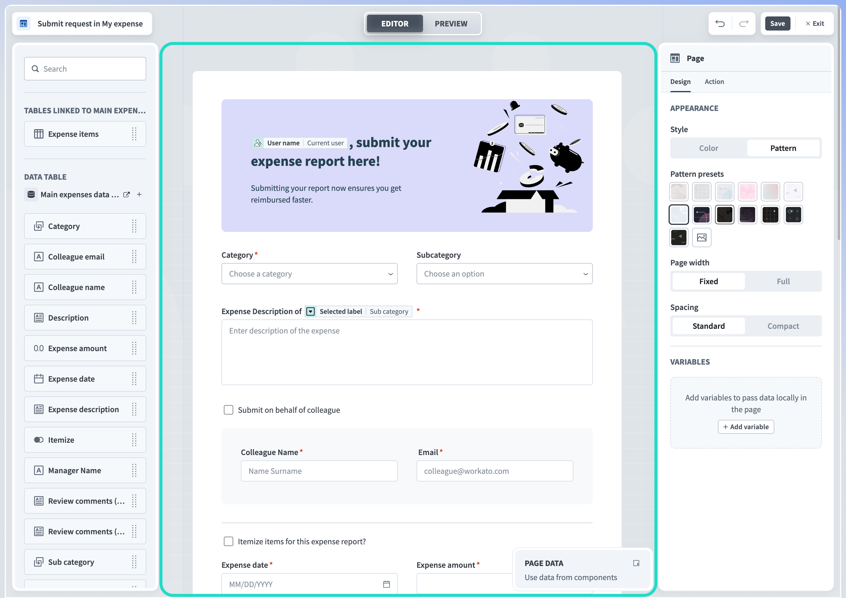
Content and Background panel
The left panel of the editor contains controls that enable you to determine the content and background of your applications. Read our page components guide to learn how to customize your Workflow app content.
 Content and background panel
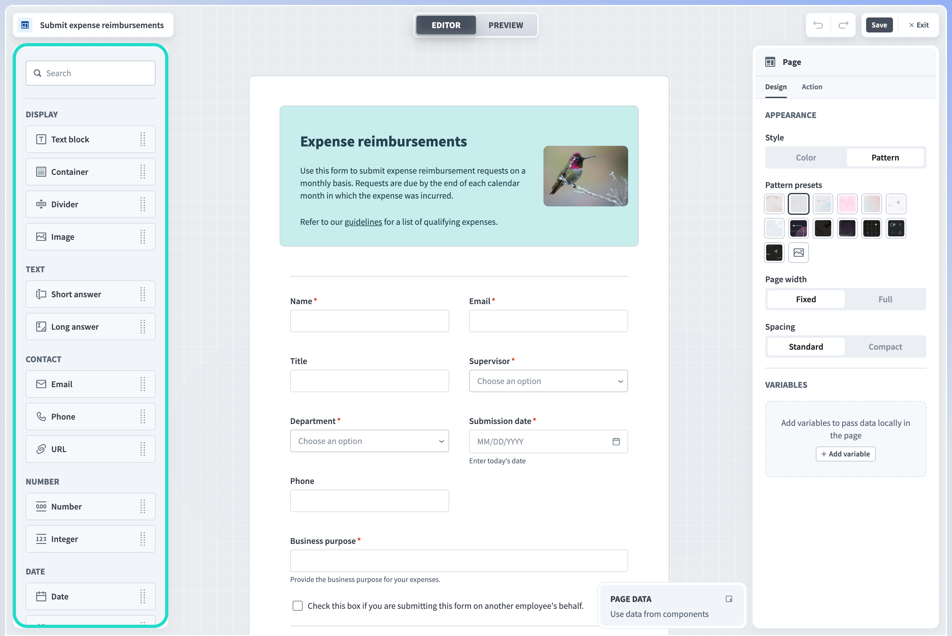
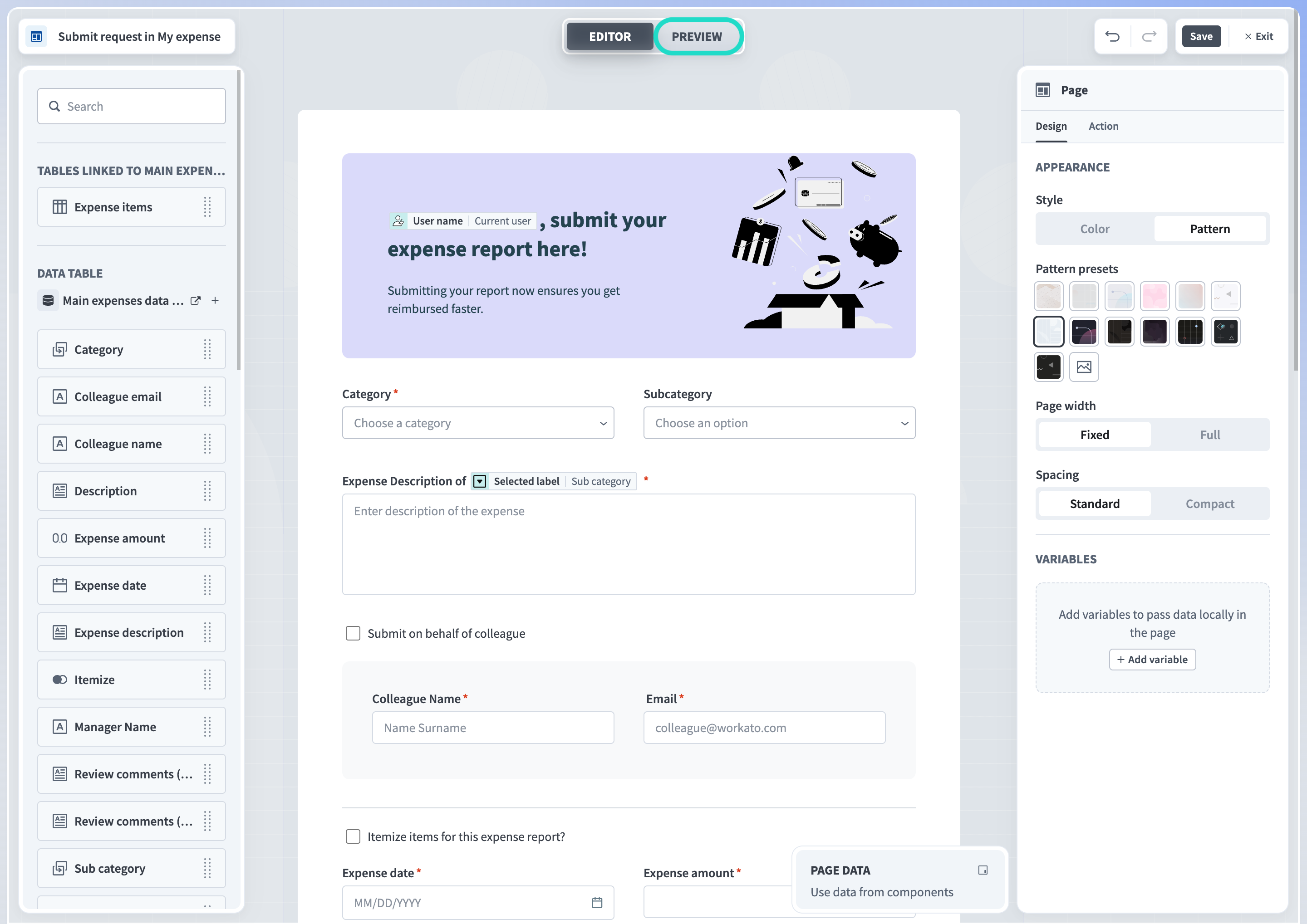
Properties panel
Customize page components using the Properties panel, which displays on the right side of the screen. Select an individual component from the canvas to view its properties.
 The properties panel
The set of available properties depends on the page component type you select. However, all components except display components have the mandatory Label property for the text displayed on the component.
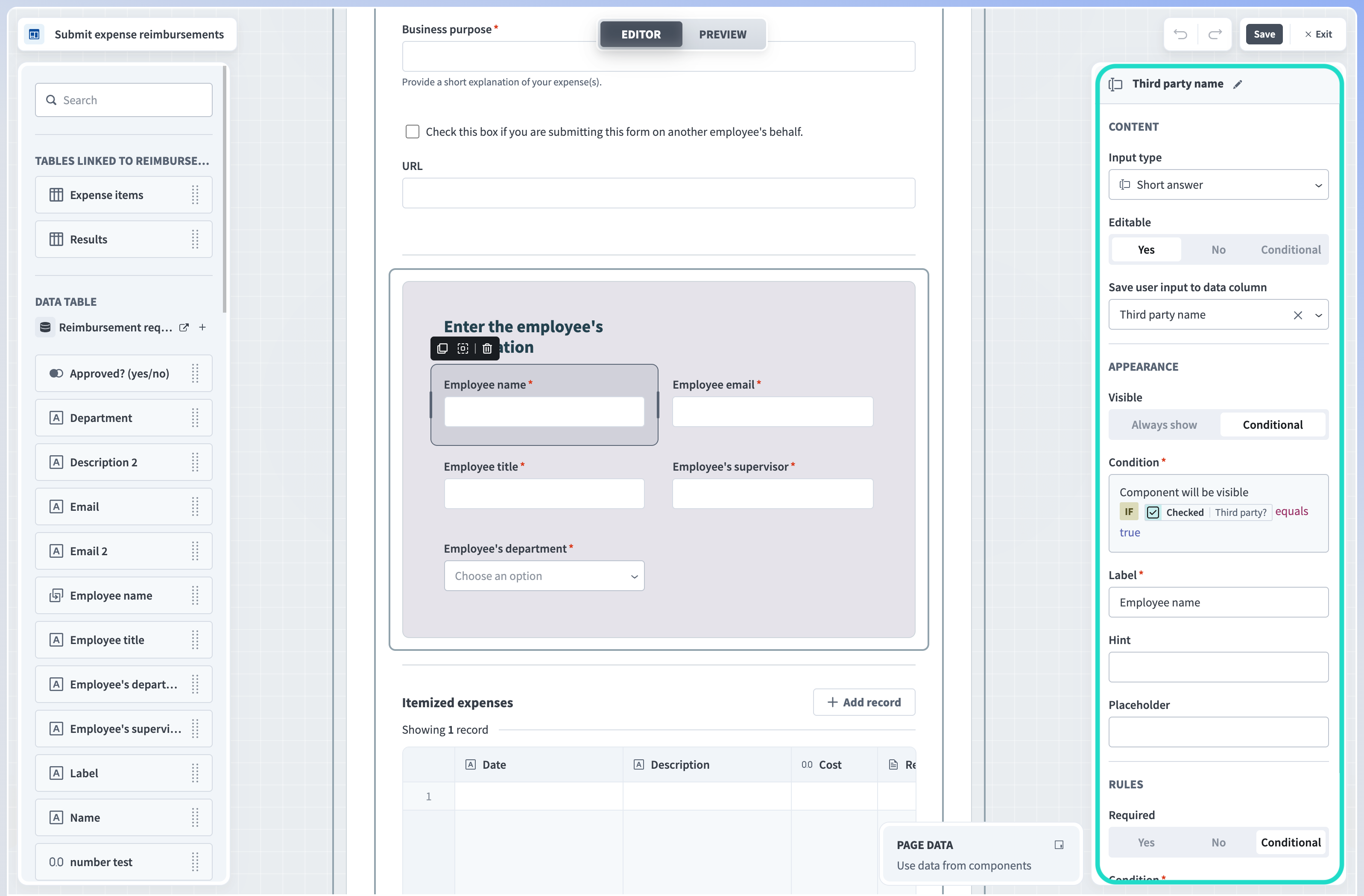
Page data
You can map datapills from the workflow request, application, or page components to create pages that change in response to user input, create dynamic URLs, and more.
Similar to the datatree in the recipe editor, page data is available in a modal at the bottom of the page editor. Drag and drop datapills into the properties panel to customize your pages. Additionally, use page data to configure IF conditions to control whether page components are editable, visible, or required only under conditions you specify.
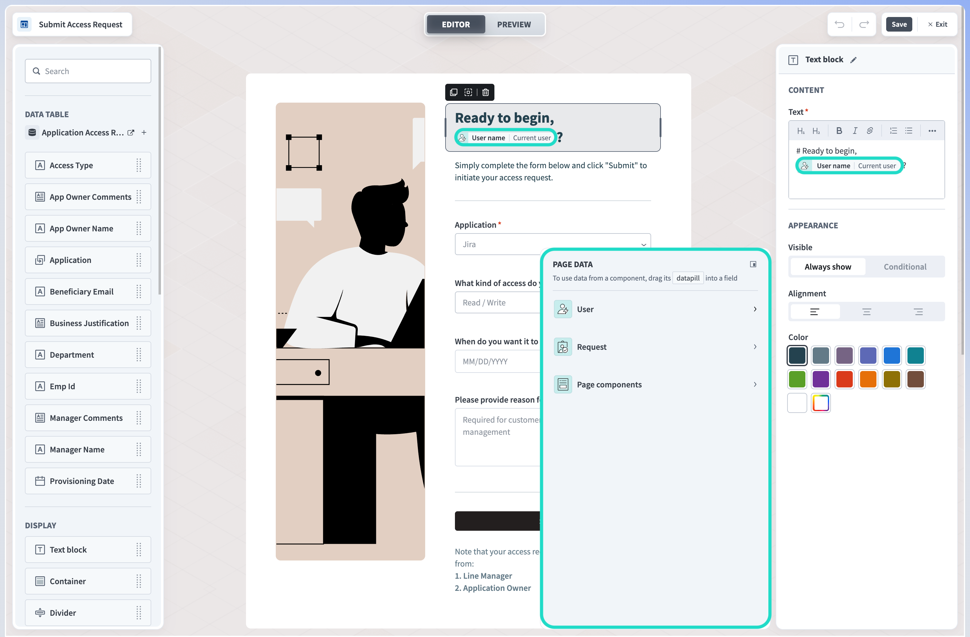 Map page data
Learn more about using datapills in pages.
Preview a page
The Preview button at the top of the Page editor switches your view to preview mode. Previewing a Page enables you to:
- Check how the page would look in the Workflow apps portal. Preview mode provides both mobile and tablet views.
- Check the data population of the components from the data columns they're linked to.
 Click the preview button to view your page outside of the page editor
Learn more about previewing a page.
FURTHER READING
Learn how to customize page components using the properties panel.
Last updated: