Page components
This guide describes the types of page components available in Workflow apps and how to customize each component type using the properties panel.
Workflow apps includes built-in validation of user input for many page components. This includes validation of all Contact components (email, phone numbers, and URLs), and Number components. Additionally, Workflow apps offers custom field validation for short-answer text components.
Additionally, you can duplicate existing components and reuse them within your page. This saves time during app development by allowing you to quickly reuse and modify components while maintaining design consistency across your page.
The left panel of the editor is the Content and Background panel. This panel allows you to add content to your page by dragging and dropping components onto the Page canvas and set the page background. It also contains a search bar which enables you to find components quickly and easily.
The right panel of the editor is the Properties panel. This panel enables you to configure components to customize the appearance and behavior of your page.
DASHBOARD PAGES
Dashboard pages do not support all content components and are limited to Chart components and Display components (container, divider, image, and text).
Conversely, the Chart component is only supported by dashboard pages and is not offered on approval, submission, and blank pages.
Content
Decide what content appears on your page. Workflow apps supports the following types of components:
| Component type | Description |
|---|---|
| Data table | Display data from your app's primary data table. Each column is treated as an individual component. This section is available only in applications that support request and approval functionality, which can be enabled when you create a new tab. |
| Tables linked from {App-name} | Display data from tables linked to your Workflow app's primary data table. This component enables you to display this data as a table, either in its entirety, or only the data columns you specify. You can create new linked data tables using view components. This section is available only in applications that support request and approval functionality, which can be enabled when you create a new tab. |
| Charts | Query data and display data visualizations. Only available for dashboard pages. |
| Display | Determine the look and feel of your application. |
| Text | Gather free form user input in the form of short answer or long answer text. Workflow apps supports custom form validation for short answer components with regex. Learn more about custom field validation. |
| Contact | Gather user contact information, such as emails, phone numbers, and URLs. Workflow apps validates user input and ensures it matches the type of user contact information you specify. |
| Number | Collect numerical values. Workflow apps validates user input and ensures all data entered into fields of this type are numerical values. |
| Date | Collect dates. Workflow apps validates user input and ensures it matches the format you specify (date or date and time). |
| Choices | Gather user input from a list of options or yes/no questions. Specific choice components support multi-value selection in pages. Drop-down components also support Run recipe and Reset/reload components actions. |
| View | Connect additional linked data tables to your Workflow app and display them in your application. This component enables you to display this data as a table, either in its entirety, or only the data columns you specify. Table components also support Run recipe and Reset/reload components actions. |
| Button | Enable user actions such as saving data to your app, completing tasks, or opening a URL. support Run recipe and Reset/reload components actions. |
| File | Upload or download files to/from your app. |
Data table
The Data tables section is available only in applications that support request and approval functionality, which can be enabled when you create a new tab.
This section contains components that correspond to a specific data column in your Workflow app's primary data table. Each column is represented as an individual component that you can drag and drop onto your page.
 Each component represents a column in your app's primary data table
Add columns to your primary data table
Add columns to this table in the page editor by clicking + (plus) next to the data table name. Alternatively, you can edit table content and schema in the Data tables interface by following the link to the data table.
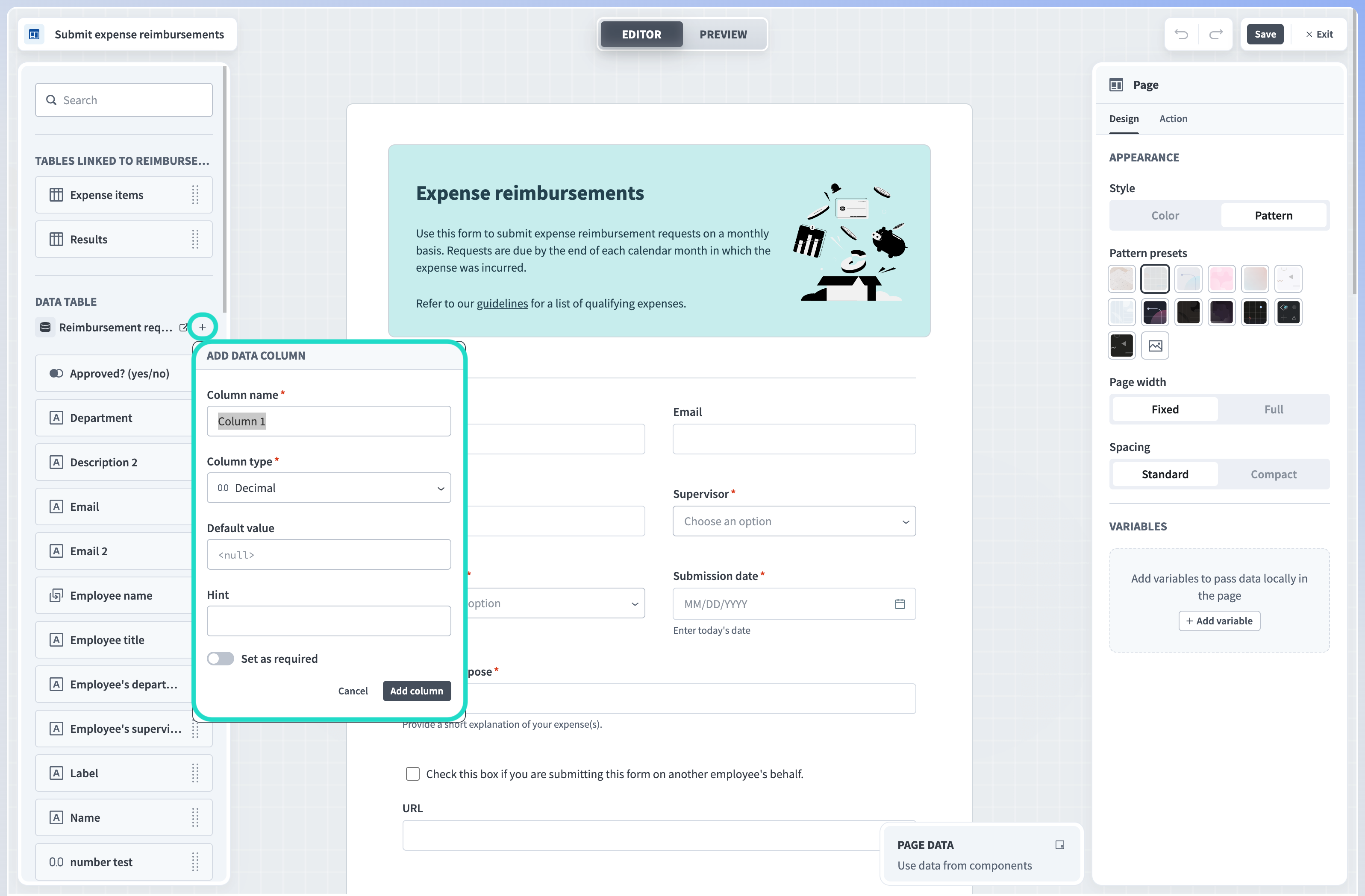 Add column from editor
When you add components to your page, you can elect to save user input to existing columns in your primary data table or create new columns in which to save the data.
See the Create a page section for more information on submission forms and how to submit data to a data table.
View data table properties
The properties available for data table components depend on the column type in the corresponding data table.
The following table describes the relationship between column types and page components:
| Column type | Page component | Component category |
|---|---|---|
| Short text | Short text, URL, email, or phone number | Text or Contact |
| Long text | Long text, URL, email, or phone number | Text or Contact |
| Integer | Number | Number |
| Decimal | Number | Number |
| Boolean | Checkbox | Choices |
| Multi-value | Multi-select | Choices |
| Date | Date | Date |
| DateTime | Date and time | Date |
| File | Upload file or download file | File |
| Link to a table | Tables linked to {Primary data table} | Tables linked |
Linked data tables
The Linked data tables section is available only in applications that support request and approval functionality, which you can enable when you create a new tab.
This section of the page editor displays all secondary data tables linked to your Workflow app's primary data table. Each secondary data table is represented as an individual component to enable you to display the entire table on your page.
 Display linked data tables in your pages
View linked data tables design properties
Use the properties panel to customize how these tables display on your page. For example, you can choose to display only a limited set of columns from this table, change column order, and filter columns.
Editable
Determine whether the table is editable, read-only, or editable only under the conditions you specify. This property is useful for gathering user input or creating read-only tables.
Yes
Select Yes for components that you plan to use to collect user input.
No
Select No for components that you plan to be read-only.
Conditional
Configure an IF condition to make this component editable only under the conditions you specify. You can chain multiple IF conditions using
ANDorOR. For example, you can configure this table to be editable by a specific user only during a specific workflow stage. Configuring an IF condition in Workflow apps is similar to adding an IF condition to a recipe workflow. Use the Page data modal to map data related to app users, requests, and page components into your IF condition.
Data source
This drop-down displays data tables that are already linked to your primary table and additional tables in your workspace. You can click + Create table to create a new table to display on your page. Once you select or create a table, follow the supplied link to edit table data or columns in the Data tables interface.
Column to filter records
Select a column that is linked to your primary data table to use to filter records for this table. By default, Workflow apps filters records using an auto-generated column called {Parent table} record. Alternatively, you can create a new column to use to filter records from the linked table.
Displayed columns
Choose which columns to display on your page. You can change column order by clicking a column and dragging and dropping it into a new order in the panel. You can also configure whether specific columns are read-only or editable by clicking the ... (ellipses) next to the column name and selecting
Make column read-onlyorMake column editable.Allow creating new record
Select
Yesto allow users to create new records when the table is editable or conditionally editable in the Workflow apps portal orNoto prevent users from creating records.Allow deleting record
Select
Yesto allow users to delete records when the table is editable or conditionally editable in the Workflow apps portal orNoto prevent users from deleting records.Title
Provide a title for the table you plan to display.
Add button label
When Editable is Yes or Conditional, a button appears on the table which allows users to add content to the table. Provide a label for this button.
Table height
When Editable is Yes or Conditional, use this field to determine the number of rows for display in your table. When read-only, the table dynamically adjusts its maximum height based on this field's value. The default height is
10rows.Visible
This property determines the visibility of table components. The following options are available.
Always show
When set to Always show, table components are always visible.
Conditional
Configure an IF condition to make this component visible only under the conditions you specify. You can chain multiple IF conditions using
ANDorOR. For example, you can configure a table to be visible to a specific user only during a specific workflow stage. Configuring an IF condition in Workflow apps is similar to adding an IF condition to a recipe workflow. Use the Page data modal to map data related to app users, requests, and page components into your IF condition.
View linked data tables action properties
Linked data tables components support Run recipe and Reset/reload components actions and have the following action properties:
Trigger
Read-only. This defines the trigger for the action.
Row is activeis pre-selected.Action
The action to run. The default state is
Do nothing.- Run recipe
- The Run recipe action enables you to retrieve or modify data in a third-party application and return it to your Workflow app.
Recipe
Select a recipe to run on component event. You can also create a new recipe.
Recipe input parameters
Define input parameters to use data from the Workflow apps page in your recipe. For example, you can use page data to search for relevant records in a third-party app.
Recipe output to set value
Use recipe output to set values for components and variables. Recipe output is defined in the New component event trigger.
Follow up action
You can configure a follow-up action after an initial run recipe action. If you don’t configure a follow-up action, the default follow-up action for all components is to Do nothing.
- Reset/reload components
- Configure a table to reset/reload components. Reset/reload components actions can be configured to clear the entire page or specific components, even if those components are not directly linked to a specific component action.
Chart
Add charts to visualize data from data tables, Workflow apps, and recipe job history. This component allows you to build tables, bar graphs, line graphs, pie charts, and KPI charts. It also enables you to perform the following queries on your data:
- Filter by
- Summarize
- Join to
- Sort by
- Row limit to
This component is only available on dashboard pages and is not available on submission, approval, or blank pages. Learn more in our Insights documentation.
Display
Display components allow you to customize the look and feel of your app.
 Display components and properties
Workflow apps supports the following display components:
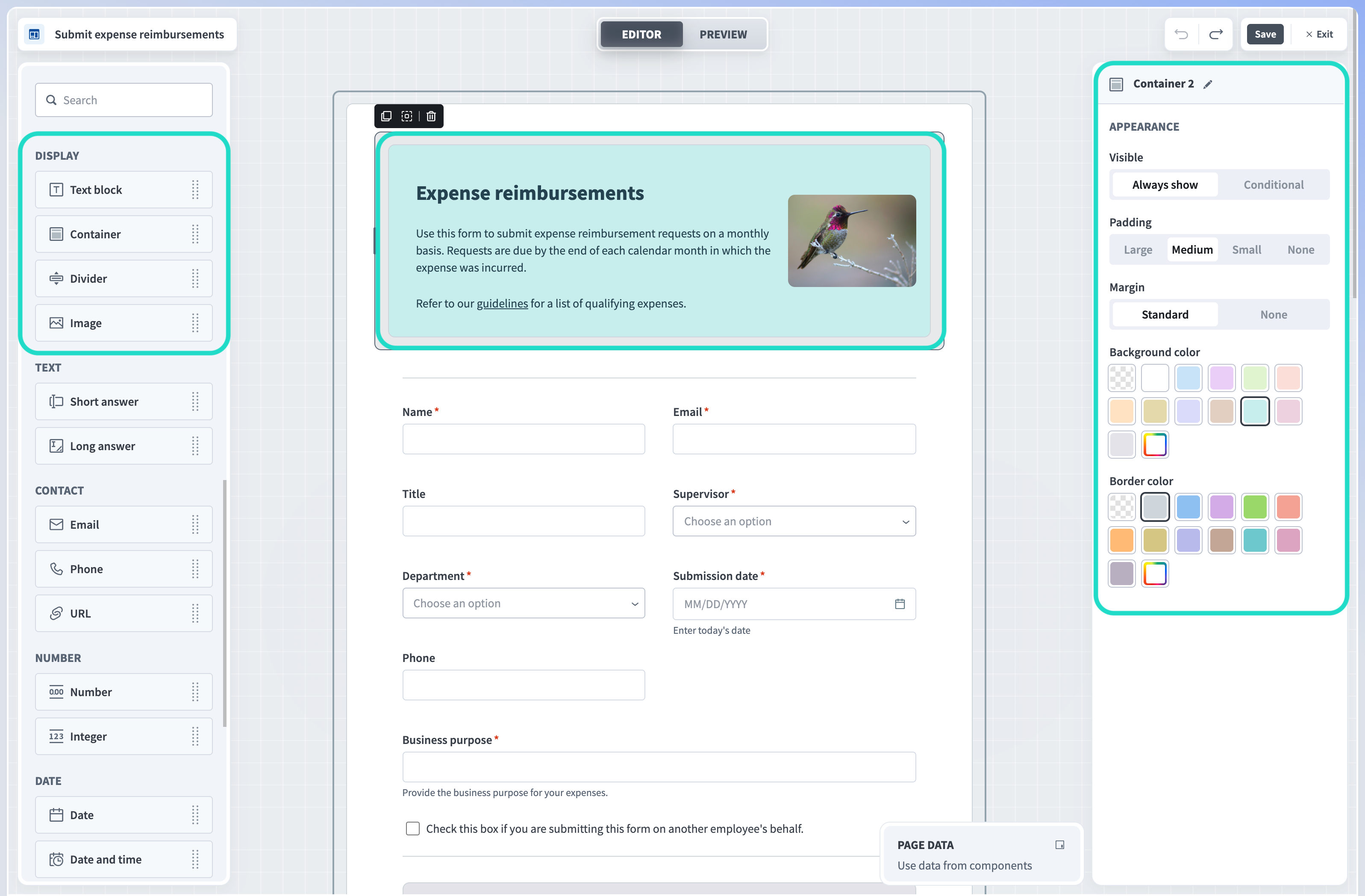
Container
Choose a container for your content. You can customize the container's background color, border color, and padding.
Divider
A horizontal line. Customize the divider's background color.
Image
Choose from a library of preset images, upload your own image, or provide a URL as the image source. Workato supports uploading
GIF,JPEG,PNG,SVG, andWEBPfile types.Text block
Static text. Customize the appearance to add title, subtitle, and paragraph text to your pages. Choose between preset and custom color values. Text block components support specific Markdown syntax.
View container properties
Background color
Select a background color for container components. Choose from a set of pre-defined options, create a custom color, or select none.
Border color
Select a color for the border of your container. Choose from a set of pre-defined colors, create a custom color, or select none.
Padding
Set the padding for your container. Choose between large, medium, small, and none.
Visible
This property determines the visibility of your container. Components that you nest within this container inherit the visibility property of their parent container. For example, if you set your container's visibility to Conditional, all components within the container are only visible when the condition is met. This saves you time, as you only need to configure an if condition for the container instead of for each component. The following options are available.
Always show
When set to Always show, container components are always visible.
Conditional
Configure an IF condition to make this component visible only under the conditions you specify. You can chain multiple IF conditions using
ANDorOR. For example, you can configure a container to be visible to a specific user only during a specific workflow stage. Configuring an IF condition in Workflow apps is similar to adding an IF condition to a recipe workflow. Use the Page data modal to map data related to app users, requests, and page components into your IF condition.
View divider properties
Color
Select a color for divider components. Choose from a set of pre-defined options, create a custom color, or select none.
Visible
This property determines the visibility of your divider. The following options are available.
Always show
When set to Always show, divider components are always visible.
Conditional
Configure an IF condition to make this component visible only under the conditions you specify. You can chain multiple IF conditions using
ANDorOR. For example, you can configure a divider to be visible by a specific user only during a specific workflow stage. Configuring an IF condition in Workflow apps is similar to adding an IF condition to a recipe workflow. Use the Page data modal to map data related to app users, requests, and page components into your IF condition.
View image properties
Source
Select Manual to use a pre-generated image provided by Workato or upload a custom image. Alternatively, select URL to specify an image source using an image URL. Image URLs support paths to files stored in Workato FileStorage and page datapills as input. FileStorage image URLs can be either a relative or absolute URL. Datapill input must be either an absolute URL or a path to an image stored in Workato FileStorage.
Choose an image/choose another image
Select an image to display on your page. Choose between a gallery of pre-generated images or upload a custom image. Workflow apps supports
GIF,JPG,JPEG,SVG, andWEBPfiles.
This option displays when you select Manual as the image Source.Image fitting
Decide how your image fits within its parent container.
Resize to fit
Resize the image so that the entire image fits within its parent container without cropping the image.
Expand to fill
Resize the image so that the image fills the entirety of its parent container. This may involve cropping the image.
Horizontal alignment
Choose between left, central, and right alignment.
Vertical alignment
Choose between top, central, and bottom alignment.
Visible
This property determines the visibility of image components. The following options are available.
Always show
When set to Always show, images are always visible.
Conditional
Configure an IF condition to make this component visible only under the conditions you specify. You can chain multiple IF conditions using
ANDorOR. For example, you can configure an image to be visible by a specific user only during a specific workflow stage. Configuring an IF condition in Workflow apps is similar to adding an IF condition to a recipe workflow. Use the Page data modal to map data related to app users, requests, and page components into your IF condition.
View text block properties
- Text
- Add static text. Text components support the following specific Markdown syntax:
| Markdown element | Markdown syntax |
|---|---|
| Heading level 1 | # |
| Heading level 2 | ## |
| Bold | **bold text** |
| Italic | *italic text* or _italic text_ |
| Link | [link text](https://www.example.com) |
| Ordered list | 1. First item1. Second item1. Third item |
| Unordered list | - First item- Second item- Third item |
Alignment
Choose between left, center, and right alignment.
Color
Select a color for text components. Choose from a set of pre-defined options or create a custom color.
Visible
This property determines the visibility of text. The following options are available.
Always show
When set to Always show, text components are always visible.
Conditional
Configure an IF condition to make this component visible only under the conditions you specify. You can chain multiple IF conditions using
ANDorOR. For example, you can configure text to be visible by a specific user only during a specific workflow stage. Configuring an IF condition in Workflow apps is similar to adding an IF condition to a recipe workflow. Use the Page data modal to map data related to app users, requests, and page components into your IF condition.
Text
Add fields to your pages to capture user input. Workflow apps saves all user input into a column you specify in your Workflow app's primary data table.
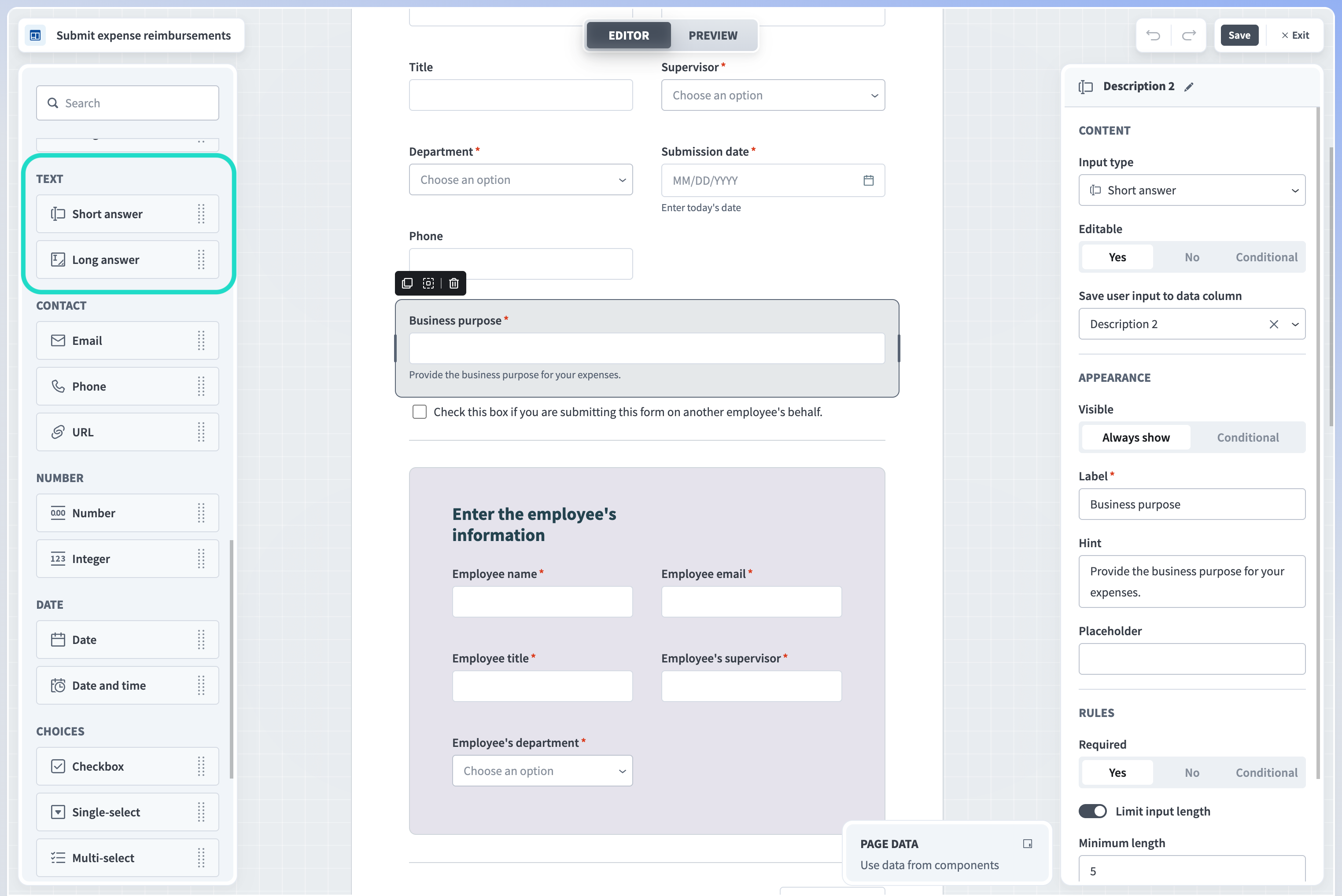 Text components and properties
Workflow apps supports the following text types:
Short answer
A single-line text field.
Long answer
A multi-line text area.
View text properties
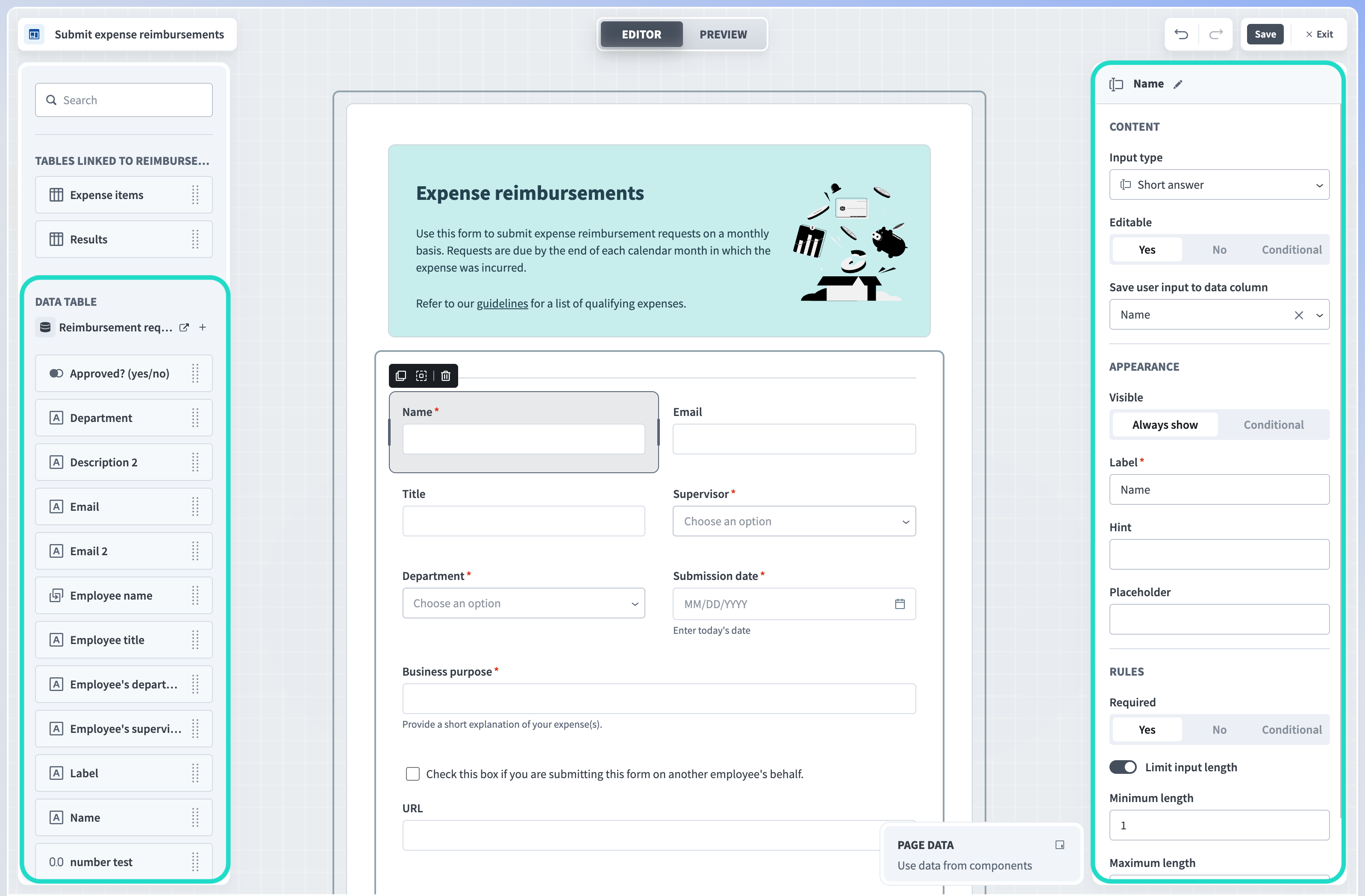
Editable
Determine whether the text is editable, read-only, or editable only under the conditions you specify. This property is useful for gathering user input or creating read-only fields.
Yes
Select Yes for components that you plan to use to collect user input.
No
Select No for components that you plan to be read-only.
Conditional
Configure an IF condition to make this component editable only under the conditions you specify. You can chain multiple IF conditions using
ANDorOR. For example, you can configure an input field to be editable by a specific user only during a specific workflow stage. Configuring an IF condition in Workflow apps is similar to adding an IF condition to a recipe workflow. Use the Page data modal to map data related to app users, requests, and page components into your IF condition.
Save user input to data column/ display from data column
When this component is editable, this property specifies which data column Workato uses to populate the input component and capture user input. When this component is read-only, this property specifies from which column Workato displays data. This property is available for apps with request and approval functionality only.
Visible
This property determines the visibility of input components. The following options are available.
Always show
When set to Always show, input components are always visible.
Conditional
Configure an IF condition to make this component visible only under the conditions you specify. You can chain multiple IF conditions using
ANDorOR. For example, you can configure input components to be visible to a specific user only during a specific workflow stage. Configuring an IF condition in Workflow apps is similar to adding an IF condition to a recipe workflow. Use the Page data modal to map data related to app users, requests, and page components into your IF condition.
Input type
This field allows you to change the type of user input you plan to collect. For example, if you add an Email component to your page, and later decide to collect phone numbers instead, this field enables you to do so without adding an entirely new component to your page.
Label
Determine a label for this input field.
Hint
Provide a hint to help users understand the type of input you plan to collect.
Placeholder
Provide a placeholder value for this input field.
Required
Determine whether users must provide input for this field. The following options are available:
Yes
When Yes, users must provide input for this field.
No
When No, providing input for this field is optional.
Conditional
Configure an IF condition to make this component required only under the conditions you specify. You can chain multiple IF conditions using
ANDorOR. For example, you can configure an input field to require user input by a specific user only during a specific workflow stage. Configuring an IF condition in Workflow apps is similar to adding an IF condition to a recipe workflow. Use the Page data modal to map data related to app users, requests, and page components into your IF condition.
Limit input length
Use this toggle to limit the amount of user input this component can accept. You can customize the minimum and maximum characters allowed.
Minimum length
Specify the minimum amount of characters this field can accept.
Maximum length
Specify the maximum amount of characters this field can accept.
Match regular expression
Use this toggle to create a rule that user input must match the regex (regular expression) you specify. This configuration option is only available for Short answer components.
Regular expression
Provide the regex that user input must match. Refer to our Custom field validation guide for more information.
Error message if expression not met
Enter a custom error message. Workflow apps displays this message to end-users when user input does not match the regex you specify.
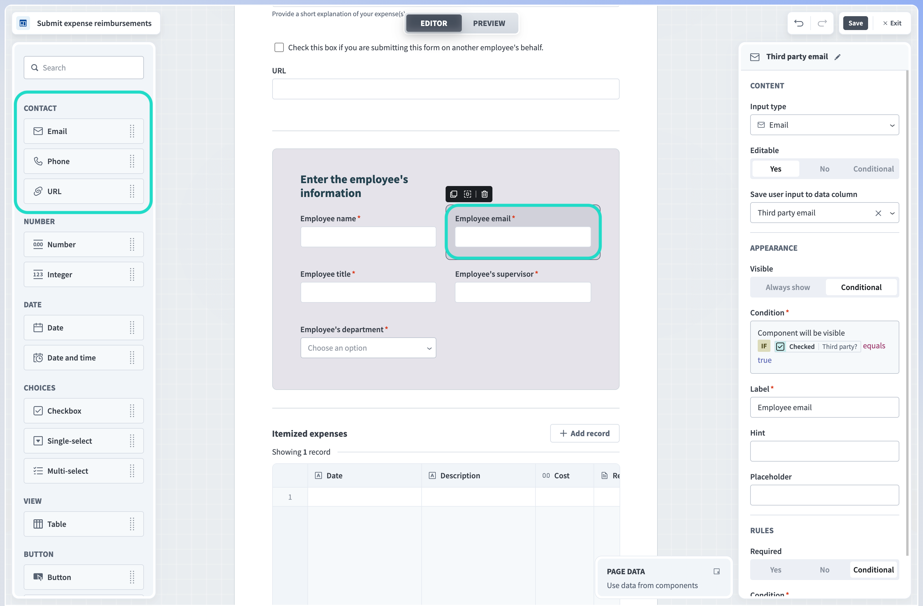
Contact
Gather user contact information, such as emails, phone numbers, and URLs. Workflow apps validates user input and ensures it matches the type contact information you specify. Workflow apps saves all user input into a column in your Workflow app's primary data table.
 Contact components and properties
Workflow apps supports the following contact components:
Email
A single-line field that accepts email addresses as input.
Phone
A single-line field that accepts phone numbers as input.
URL
A single-line field that accepts URLs as input.
View contact properties
Editable
Determine whether the component is editable, read-only, or editable only under the conditions you specify. This property is useful for gathering user input or creating read-only fields.
Yes
Select Yes for components that you plan to use to collect user input.
No
Select No for components that you plan to be read-only.
Conditional
Configure an IF condition to make this component editable only under the conditions you specify. You can chain multiple IF conditions using
ANDorOR. For example, you can configure an input field to be editable by a specific user only during a specific workflow stage. Configuring an IF condition in Workflow apps is similar to adding an IF condition to a recipe workflow. Use the Page data modal to map data related to app users, requests, and page components into your IF condition.
Save user input to data column/ display from data column
When this component is editable, this property specifies which data column Workato uses to populate the input component and capture user input. When this component is read-only, this property specifies from which column Workato displays data. This property is available for apps with request and approval functionality only.
Input type
This field allows you to change the type of user input you plan to collect. For example, if you add an Email component to your page, and later decide to collect phone numbers instead, this field enables you to do so without adding an entirely new component to your page.
Label
Determine a label for this input field.
Hint
Provide a hint to help users understand the type of input you plan to collect.
Placeholder
Provide a placeholder value for this input field.
Required
Determine whether users must provide input for this field. The following options are available:
Yes
When Yes, users must provide input for this field.
No
When No, providing input for this field is optional.
Conditional
Configure an IF condition to make this component required only under the conditions you specify. You can chain multiple IF conditions using
ANDorOR. For example, you can configure an input field to require user input by a specific user only during a specific workflow stage. Configuring an IF condition in Workflow apps is similar to adding an IF condition to a recipe workflow. Use the Page data modal to map data related to app users, requests, and page components into your IF condition.
Visible
This property determines the visibility of input components. The following options are available.
Always show
When set to Always show, input components are always visible.
Conditional
Configure an IF condition to make this component visible only under the conditions you specify. You can chain multiple IF conditions using
ANDorOR. For example, you can configure input components to be visible to a specific user only during a specific workflow stage. Configuring an IF condition in Workflow apps is similar to adding an IF condition to a recipe workflow. Use the Page data modal to map data related to app users, requests, and page components into your IF condition.
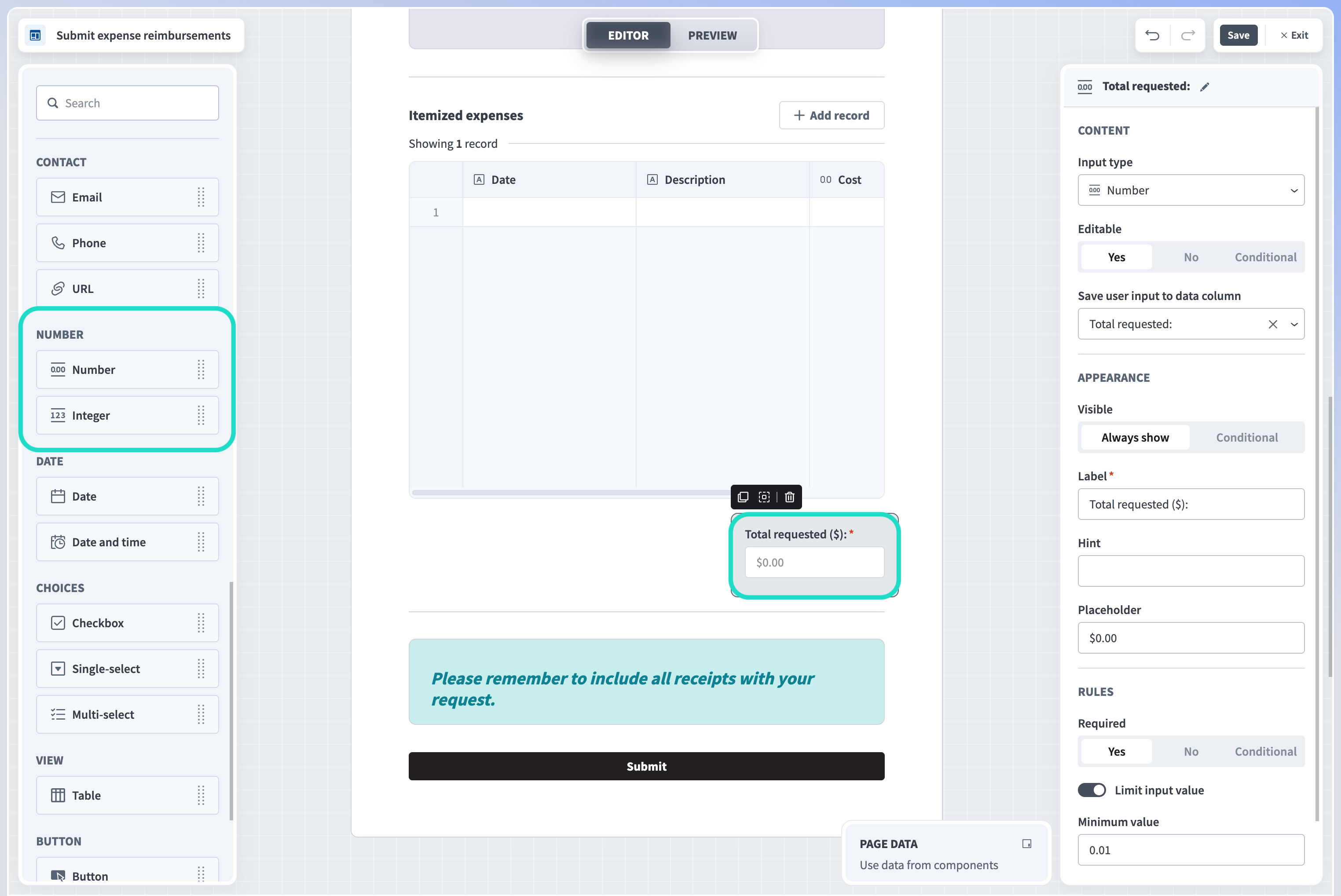
Number
Collect numerical values. Workflow apps validates user input and ensures all data entered into fields of this type are numerical values.
 Number components and properties
Workflow apps supports the following number component:
- Number
- A single-line field that accepts integers or decimals as input.
View number properties
Editable
Determine whether the component is editable, read-only, or editable only under the conditions you specify. This property is useful for gathering user input or creating read-only fields.
Yes
Select Yes for components that you plan to use to collect user input.
No
Select No for components that you plan to be read-only.
Conditional
Configure an IF condition to make this component editable only under the conditions you specify. You can chain multiple IF conditions using
ANDorOR. For example, you can configure an input field to be editable by a specific user only during a specific workflow stage. Configuring an IF condition in Workflow apps is similar to adding an IF condition to a recipe workflow. Use the Page data modal to map data related to app users, requests, and page components into your IF condition.
Save user input to data column/ display from data column
When this component is editable, this property specifies which data column Workato uses to populate the input component and capture user input. When this component is read-only, this property specifies from which column Workato displays data. This property is available for apps with request and approval functionality only.
Visible
This property determines the visibility of components. The following options are available.
Always show
When set to Always show, components are always visible.
Conditional
Configure an IF condition to make this component visible only under the conditions you specify. You can chain multiple IF conditions using
ANDorOR. For example, you can configure input components to be visible to a specific user only during a specific workflow stage. Configuring an IF condition in Workflow apps is similar to adding an IF condition to a recipe workflow. Use the Page data modal to map data related to app users, requests, and page components into your IF condition.
Input type
This field allows you to change the type of user input you plan to collect. For example, if you add an Email component to your page, and later decide to collect phone numbers instead, this field enables you to do so without adding an entirely new component to your page.
Label
Determine a label for this input field.
Hint
Provide a hint to help users understand the type of input you plan to collect.
Placeholder
Provide a placeholder value for this input field.
Required
Determine whether users must provide input for this field. The following options are available:
Yes
When Yes, users must provide input for this field.
No
When No, providing input for this field is optional.
Conditional
Configure an IF condition to make this component required only under the conditions you specify. You can chain multiple IF conditions using
ANDorOR. For example, you can configure an input field to require user input by a specific user only during a specific workflow stage. Configuring an IF condition in Workflow apps is similar to adding an IF condition to a recipe workflow. Use the Page data modal to map data related to app users, requests, and page components into your IF condition.
Limit input value
Use this toggle to limit the values this component can accept. You can customize the minimum and maximum values allowed.
Minimum value
Specify the minimum value this field can accept.
Maximum length
Specify the maximum value this field can accept.
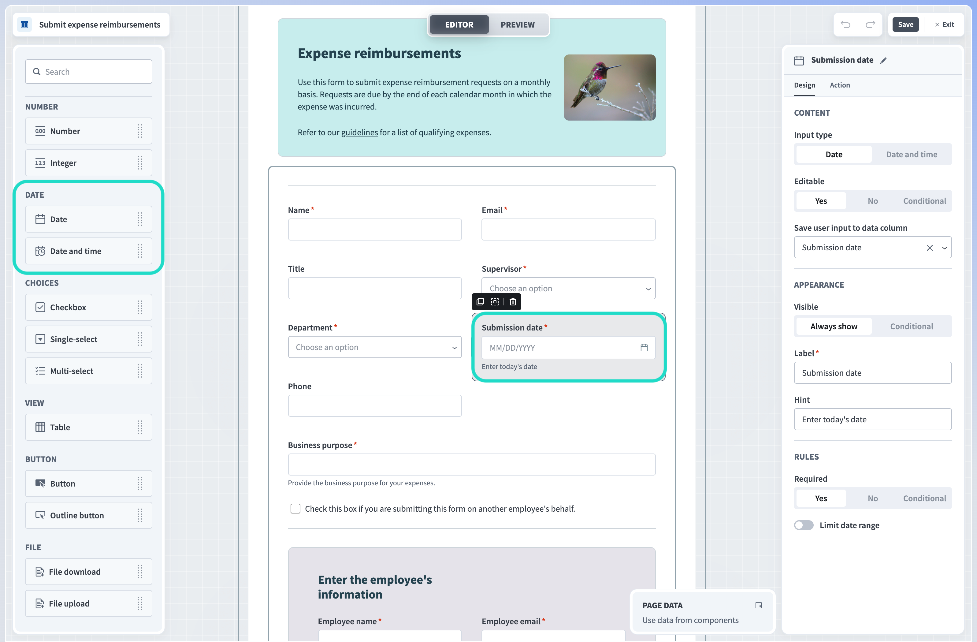
Date
Add fields to your pages to capture user input in the form of date and date and time. Workflow apps saves all user input into a column you specify in your Workflow app's primary data table.
 Date components and properties
Workflow apps supports the following date components:
Date
Input field for the date (day/month/year).
Date and time
Input field for the date (day/month/year) and time (hours/minutes).
View date and date and time properties
Editable
Determine whether the input is editable, read-only, or editable only under the conditions you specify. This property is useful for gathering user input or creating read-only fields.
Yes
Select Yes for components that you plan to use to collect user input.
No
Select No for components that you plan to be read-only.
Conditional
Configure an IF condition to make this component editable only under the conditions you specify. You can chain multiple IF conditions using
ANDorOR. For example, you can configure an input field to be editable by a specific user only during a specific workflow stage. Configuring an IF condition in Workflow apps is similar to adding an IF condition to a recipe workflow. Use the Page data modal to map data related to app users, requests, and page components into your IF condition.
Save user input to data column/ display from data column
When this component is editable, this property specifies which data column Workato uses to populate the input component and capture user input. When this component is read-only, this property specifies from which column Workato displays data. This property is available for apps with request and approval functionality only.
Label
Determine a label for this input field.
Input type
This field allows you to change the type of user input you plan to collect. For example, if you add an Email component to your page, and later decide to collect phone numbers instead, this field enables you to do so without adding an entirely new component to your page.
Hint
Provide a hint to help users understand the type of input you plan to collect.
Placeholder
Provide a placeholder value for this input field. This field is only available for short text and long text input types.
Required
Determine whether users must provide input for this field. The following options are available:
Yes
When Yes, users must provide input for this field.
No
When No, providing input for this field is optional.
Conditional
Configure an IF condition to make this component required only under the conditions you specify. You can chain multiple IF conditions using
ANDorOR. For example, you can configure an input field to require user input by a specific user only during a specific workflow stage. Configuring an IF condition in Workflow apps is similar to adding an IF condition to a recipe workflow. Use the Page data modal to map data related to app users, requests, and page components into your IF condition.
Visible
This property determines the visibility of input components. The following options are available.
Always show
When set to Always show, input components are always visible.
Conditional
Configure an IF condition to make this component visible only under the conditions you specify. You can chain multiple IF conditions using
ANDorOR. For example, you can configure input components to be visible to a specific user only during a specific workflow stage. Configuring an IF condition in Workflow apps is similar to adding an IF condition to a recipe workflow. Use the Page data modal to map data related to app users, requests, and page components into your IF condition.
Choices
Capture user input by providing users with choices. Workflow apps can save user choices in a column you specify in your Workflow app's primary data table. Saving to a column is optional and configurable based on your application's requirements.
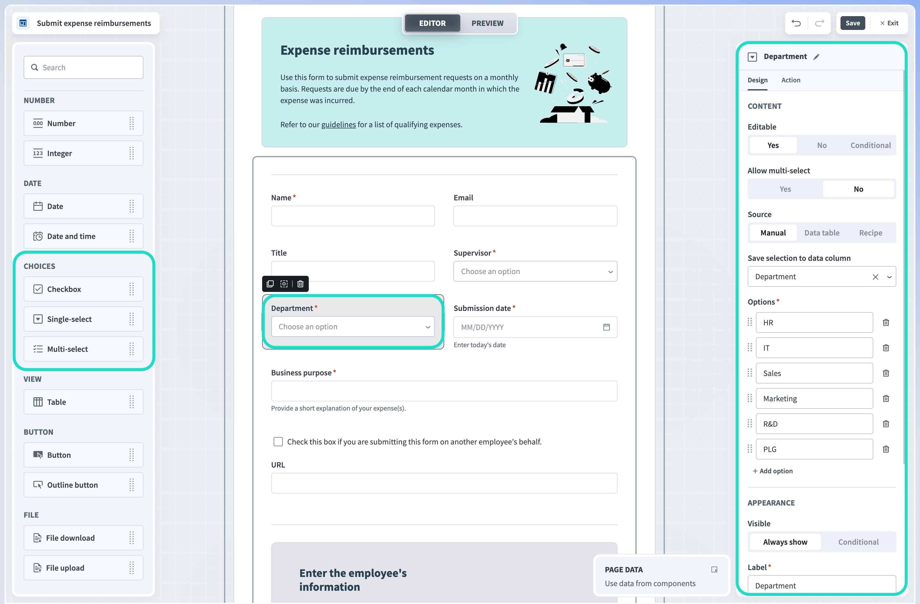 Choices components and properties
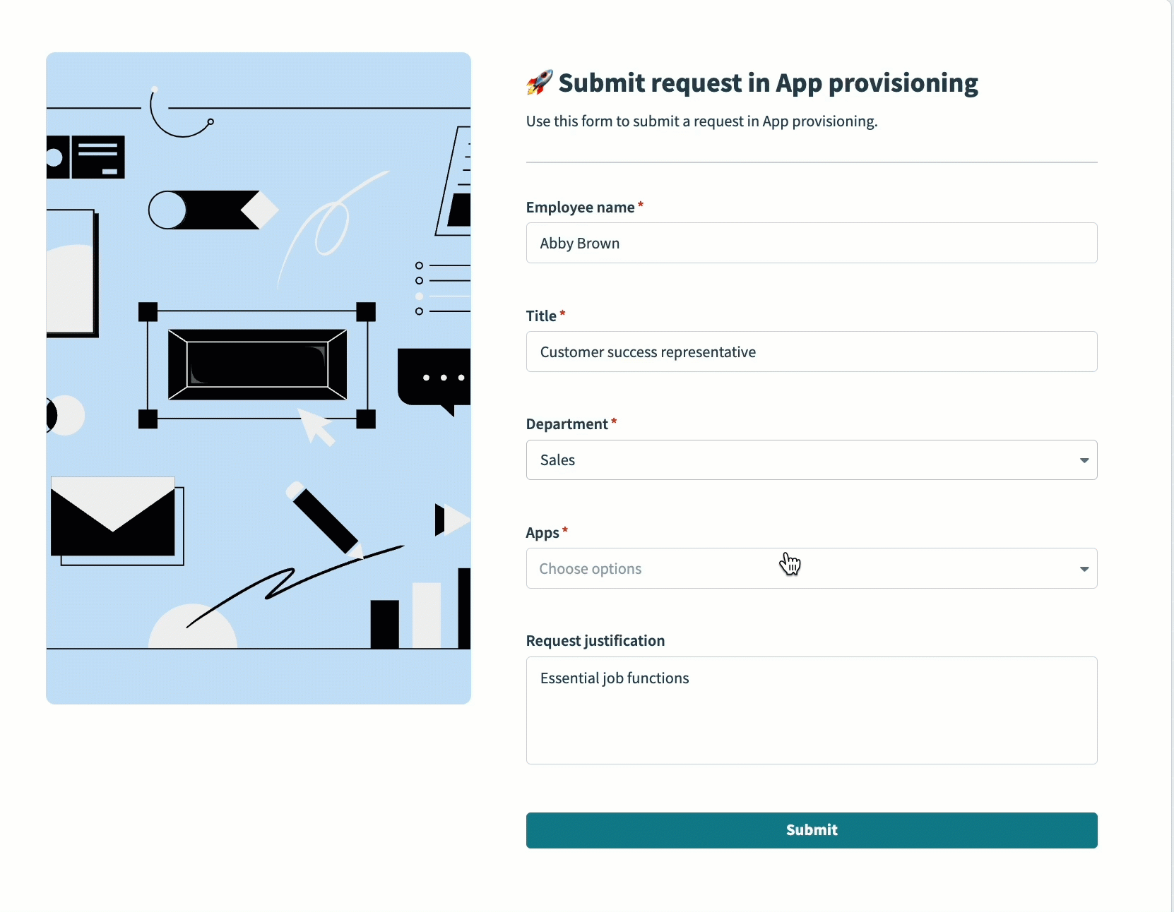 Multi-select choice component in the Workflow apps portal
Workflow apps supports the following choice components:
Checkbox
Boolean (yes/no) selection.
Single-select
A selection from a predefined set of values. Workato supports the following data sources for this component: A static list of values which you enter manually, content from a specific column in your app's primary data table, and recipes.
Manual
Provide a list of options that populate the drop-down component. You can save user selection to a data column in your Workflow app's corresponding data table.
Data table
Select a data column from your Workflow app's data table to use as a data source for your drop-down component. User selection is saved to the data column. The conditions Workato uses to search for records vary depending on the number of records in your data table. For example, if your data table contains fewer than 100 records, Workato searches by the contains condition, which means that the search looks for records where the specified field contains the search term anywhere within its value. If your table includes more than 100 records, Workato uses the starts with condition. This means that the search looks for records where the specified field starts with the search term. This approach helps optimize search performance by using a more efficient search method for larger datasets while maintaining flexibility for smaller datasets.
Recipe
Use a recipe as the data source for this component. This option lets you populate the drop-down component with data from your other applications, such as Salesforce, Jira, Okta, and more. You can create a new recipe or select from your existing recipes. Learn more about using a recipe as a data source for drop-down components.
Multi-select
A selection from a predefined set of values. Workato supports the following data sources for this component: A static list of values which you enter manually and recipes.
Manual
Provide a list of options that populate the drop-down component. You can save user selection to a data column in your Workflow app's corresponding data table.
Recipe
Use a recipe as the data source for this component. This option lets you populate the drop-down component with data from your other applications, such as Salesforce, Jira, Okta, and more. You can create a new recipe or select from your existing recipes. Learn more about using a recipe as a data source for drop-down components.
View checkbox component properties
Editable
Determine whether the checkbox is editable, read-only, or editable only under the conditions you specify. This property is useful for gathering user input or creating read-only fields.
Yes
Select Yes for components that you plan to use to collect user input.
No
Select No for components that you plan to be read-only.
Conditional
Configure an IF condition to make this component editable only under the conditions you specify. You can chain multiple IF conditions using
ANDorOR. For example, you can configure a checkbox component to be editable by a specific user only during a specific workflow stage. Configuring an IF condition in Workflow apps is similar to adding an IF condition to a recipe workflow. Use the Page data modal to map data related to app users, requests, and page components into your IF condition.
Save user input to data column/ display from data column
Optional. When this component is editable, this property specifies which data column Workato uses to populate the drop-down component and capture user input. When this component is read-only, this property specifies from which column Workato displays data. This property is available for apps with request and approval functionality only.
Label
Provide a label for the checkbox. This should be a yes or no question.
Visible
This property determines the visibility of checkbox components. The following options are available.
Always show
When set to Always show, checkbox components are always visible.
Conditional
Configure an IF condition to make this component visible only under the conditions you specify. You can chain multiple IF conditions using
ANDorOR. For example, you can configure a checkbox component to be visible to a specific user only during a specific workflow stage. Configuring an IF condition in Workflow apps is similar to adding an IF condition to a recipe workflow. Use the Page data modal to map data related to app users, requests, and page components into your IF condition.
View single-select component design properties
If you are including a single-select drop-down choice component, you must first determine the source of the options you include in the drop-down. You can choose between manual input, data table, or a recipe.
Editable
Determine whether the drop-down is editable, read-only, or editable only under the conditions you specify. This property is useful for gathering user input or creating read-only fields.
Yes
Select No for components that you plan to use to collect user input.
No
Select No for components that you plan to be read-only.
Conditional
Configure an IF condition to make this component editable only under the circumstances you specify. You can chain multiple IF conditions using
ANDorOR. For example, you can configure a drop-down to be editable by a specific user only during a specific workflow stage. Configuring an IF condition in apps is similar to adding an IF condition to a recipe workflow. Reference our IF condition to learn more.
Allow multi-select
Determine whether this component allows users to select multiple values from the drop-down.
Yes
Select Yes to enable multiple selections in this component, converting it from a single-select to a multi-select component.
No
Select No to restrict users to a single selection.
Save user input to data column/ display from data column
When this component is editable, this property specifies which data column Workato uses to populate the component and capture user input. When this component is read-only, this property specifies from which column Workato displays data. This property is available for apps with request and approval functionality only.
Source
Determine a data source to use for the drop-down options.
Manual input
Enter options for the drop-down manually. When you choose this source type, you must configure the following fields:
Save user input to data column: Optional. Choose where to store user input from a list of columns in your app's primary data table or add a new column in which to collect data. This property is available for apps with request and approval functionality only.
Options: Click + Add option to add one or more options to the drop-down list.
Data table
Choose a data column in your app's primary data table to use as the source for the drop-down list.
- Data column: Select a data column to use as the source for the drop-down options or click + Add column to add a new column from which to source drop-down options. Workflow apps also uses the column you select here to store user input.
Recipe
Use a recipe as the data source for this component. This option lets you populate the drop-down component with data from your other applications, such as Salesforce, Jira, Okta, and more. You can create a new recipe or select from your existing recipes. Learn more about using a recipe as a data source for drop-down components.
Label
Provide a label for the drop-down.
Hint
Provide a hint for the drop-down that helps users understand the type of information you plan to collect.
Placeholder
Provide a placeholder value for the drop-down.
Required
Determine whether selecting an option from the drop-down is required. The following options are available:
Yes
When Yes, users must select an option from the drop-down.
No
When No, selecting an option from the drop-down is optional.
Conditional
Configure an IF condition to make this drop-down required only under the circumstances you specify. You can chain multiple IF conditions using
ANDorOR. For example, you can configure a drop-down to require input from a specific user only during a specific workflow stage. Configuring an IF condition in apps is similar to adding an IF condition to a recipe workflow. Refer to our IF condition to learn more.
Visible
This property determines the visibility of drop-down components. The following options are available.
Always show
When set to Always show, drop-down components are always visible.
Conditional
Configure an IF condition to make this drop-down visible only under the circumstances you specify. You can chain multiple IF conditions using
ANDorOR. For example, you can configure a drop-down to require input from a specific user only during a specific workflow stage. Configuring an IF condition in apps is similar to adding an IF condition to a recipe workflow. Refer to our IF condition to learn more.
View multi-select component design properties
If you include a multi-select drop-down choice component, you must first determine the source of the options you include in the drop-down. You can choose between manual input or a recipe.
Editable
Determine whether the drop-down is editable, read-only, or editable only under the conditions you specify. This property is useful for gathering user input or creating read-only fields.
Yes
Select No for components that you plan to use to collect user input.
No
Select No for components that you plan to be read-only.
Conditional
Configure an IF condition to make this component editable only under the circumstances you specify. You can chain multiple IF conditions using
ANDorOR. For example, you can configure a drop-down to be editable by a specific user only during a specific workflow stage. Configuring an IF condition in apps is similar to adding an IF condition to a recipe workflow. Refer to our IF condition to learn more.
Allow multi-select
Determine whether this component allows users to select multiple values from the drop-down.
Yes
Select Yes to enable multiple selections in this component.
No
Select No to restrict users to a single selection, converting it from a multi-select to a single-select component.
Save user input to the data column or display from the data column.
When this component is editable, this property specifies which data column Workato uses to populate the component and capture user input. When this component is read-only, this property specifies from which column Workato displays data. This property is available for apps with request and approval functionality only.
Source
Determine a data source to use for the drop-down options.
Manual input
Enter options for the drop-down manually. When you choose this source type, you must configure the following fields:
Save user input to data column: Optional. Choose where to store user input from a list of columns in your app's primary data table or add a new column in which to collect data. This property is available for apps with request and approval functionality only.
Options: Click + Add option to add one or more options to the drop-down list.
Recipe
Use a recipe as the data source for this component. This option lets you populate the drop-down component with data from your other applications, such as Salesforce, Jira, Okta, and more. You can create a new recipe or select from your existing recipes. Learn more about using a recipe as a data source for drop-down components.
Label
Provide a label for the drop-down.
Hint
Provide a hint for the drop-down that helps users understand the type of information you plan to collect.
Placeholder
Provide a placeholder value for the drop-down.
Required
Determine whether selecting an option from the drop-down is required. The following options are available:
Yes
When Yes, users must select an option from the drop-down.
No
When No, selecting an option from the drop-down is optional.
Conditional
Configure an IF condition to make this drop-down required only under the circumstances you specify. You can chain multiple IF conditions using
ANDorOR. For example, you can configure a drop-down to require input from a specific user only during a specific workflow stage. Configuring an IF condition in apps is similar to adding an IF condition to a recipe workflow. Reference our IF condition to learn more.
Limit selections
Toggle Limit selections if you plan to impose limits on the number of values users can select. By default, Workflow apps limit you to 20 simultaneous selections.
Minimum number of selections
Determine the minimum number of selections your app users must make.
Maximum number of selections
Determine the maximum number of selections your app users must make. The default is 20, and the maximum is 20.
Visible
This property determines the visibility of drop-down components. The following options are available.
Always show
When set to Always show, drop-down components are always visible.
Conditional
Configure an IF condition to make this drop-down visible only under the circumstances you specify. You can chain multiple IF conditions using
ANDorOR. For example, you can configure a drop-down to require input from a specific user only during a specific workflow stage. Configuring an IF condition in apps is similar to adding an IF condition to a recipe workflow. Reference our IF condition to learn more.
View single-select and multi-select component action properties
Single-select and multi-select drop-down components support Run recipe and Reset/reload components actions and have the following action properties:
Trigger
Read-only. This defines the trigger for the action.
Value changedis selected.Action
The action to run. The default state is
Do nothing.- Run recipe
- The Run recipe action enables you to retrieve or modify data in a third-party application and return it to your Workflow app.
Recipe
Select a recipe to run on component event. You can also create a new recipe.
Recipe input parameters
Define input parameters to use data from the Workflow apps page in your recipe. For example, you can use page data to search for relevant records in a third-party app.
Recipe output to set value
Use recipe output to set values for components and variables. Recipe output is defined in the New component event trigger.
Follow up action
You can configure a follow-up action after an initial run recipe action. If you don’t configure a follow-up action, the default follow-up action for all components is to Do nothing.
- Reset/reload components
- Configure a button to reset/reload components. Reset/reload components actions can be configured to clear the entire page or specific components, even if those components are not directly linked to a specific component action.
View
This section enables you to connect one or more additional data tables to your Workflow app and display them in your application. You can connect an existing data table or create a new table using the properties panel.
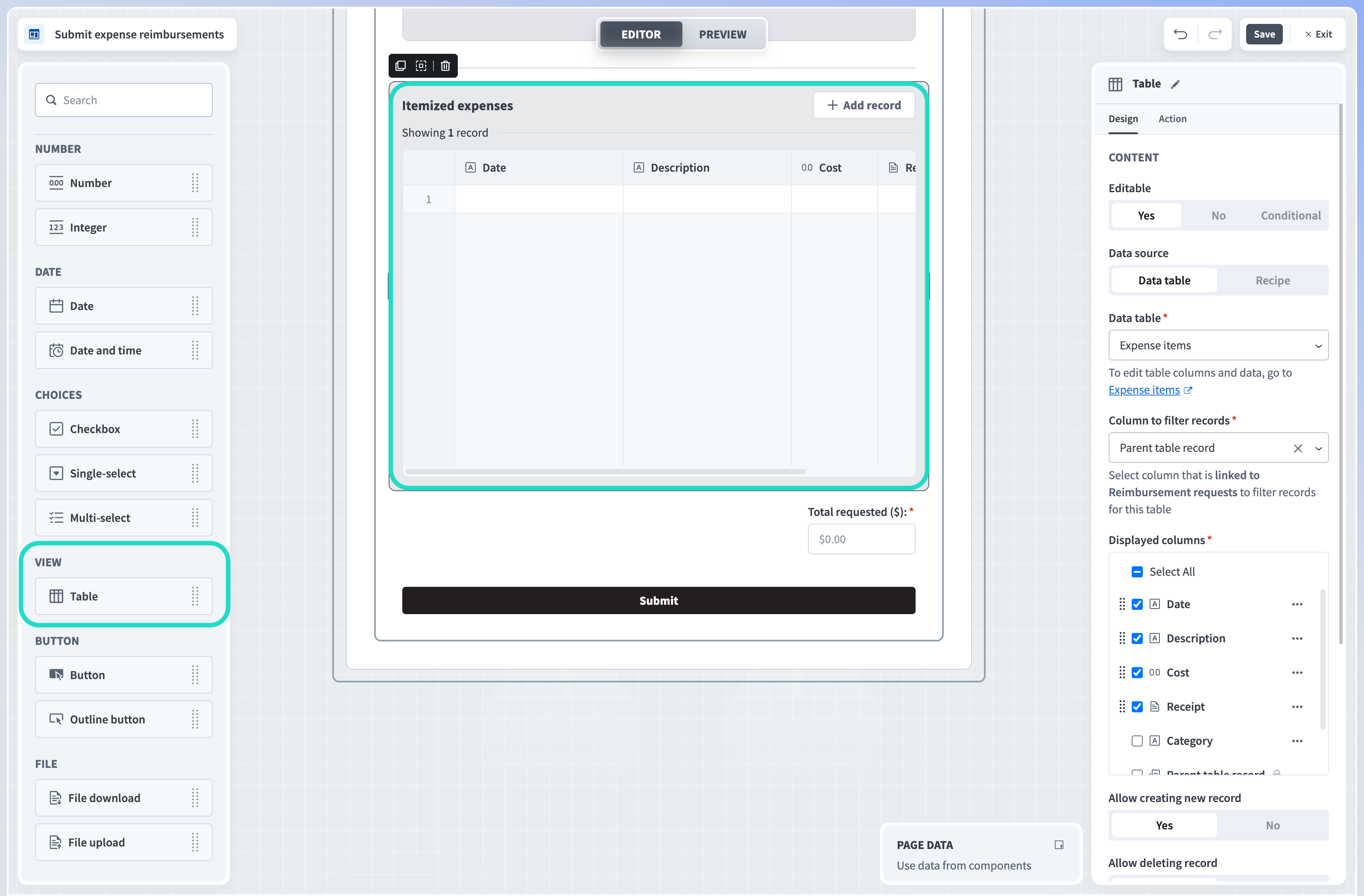 Table components and properties
View table design properties
Editable
Determine whether the table is editable, read-only, or editable only under the conditions you specify. This property is useful for gathering user input or creating read-only tables.
Yes
Select Yes for components that you plan to use to collect user input.
No
Select No for components that you plan to be read-only.
Conditional
Configure an IF condition to make this component editable only under the conditions you specify. You can chain multiple IF conditions using
ANDorOR. For example, you can configure a table to be editable by a specific user only during a specific workflow stage. Configuring an IF condition in Workflow apps is similar to adding an IF condition to a recipe workflow. Use the Page data modal to map data related to app users, requests, and page components into your IF condition.
Data source
Connect a data table to your Workflow app's primary data table. This drop-down displays data tables that are already linked to your primary table and additional tables in your workspace. Alternatively, click + Create table to create a new table. Once you select or create a table, follow the supplied link to edit table data or columns in the Data tables interface.
Column to filter records
Select a column that is linked to your primary data table to use to filter records for this table. By default, Workflow apps filters records using an auto-generated column called {Parent table} record. Alternatively, you can create a new column to use to filter records from the linked table.
Displayed columns
Choose which columns to display on your page. You can change column order by clicking a column and dragging and dropping it into a new order in the panel. You can also configure whether specific columns are read-only or editable by clicking the ... (ellipses) next to the column name and selecting
Make column read-onlyorMake column editable.Allow creating new record
Select
Yesto allow users to create new records when the table is editable or conditionally editable in the Workflow apps portal orNoto prevent users from creating records.Allow deleting record
Select
Yesto allow users to delete records when the table is editable or conditionally editable in the Workflow apps portal orNoto prevent users from deleting records.Title
Provide a title for the table you plan to display.
Add button label
When Editable is set to Yes or Conditional, a button appears on the table which allows users to add content to the table. Provide a label for this button.
Table height
When Editable is set to Yes or Conditional, use this field to determine the number of rows for display in your table. When read-only (Editable is No), the table dynamically adjusts its maximum height based on this field's value. The default height is
10rows.Visible
This property determines the visibility of data components. The following options are available.
Always show
When Always show, data components are always visible.
Conditional
Configure an IF condition to make this table visible only under the circumstances you specify. You can chain multiple IF conditions using
ANDorOR. For example, you can configure a table to be visible to a specific user only during a specific workflow stage. Configuring an IF condition in apps is similar to adding an IF condition to a recipe workflow. Reference our IF condition guide to learn more.
View table action properties
Table components support Run recipe and Reset/reload components actions and have the following action properties:
Trigger
This defines the trigger for the action.
Row is activeis pre-selected.Action
The action to run. The default state is
Do nothing.- Run recipe
- The Run recipe action enables you to retrieve or modify data in a third-party application and return it to your Workflow app.
Recipe
Select a recipe to run on component event. You can also create a new recipe.
Recipe input parameters
Define input parameters to use data from the Workflow apps page in your recipe. For example, you can use page data to search for relevant records in a third-party app.
Recipe output to set value
Use recipe output to set values for components and variables. Recipe output is defined in the New component event trigger.
Follow up action
You can configure a follow-up action after an initial run recipe action. If you don’t configure a follow-up action, the default follow-up action for all components is to Do nothing.
- Reset/reload components
- Configure an action to reset/reload components. Reset/reload components actions can be configured to clear the entire page or specific components, even if those components are not directly linked to a specific component action.
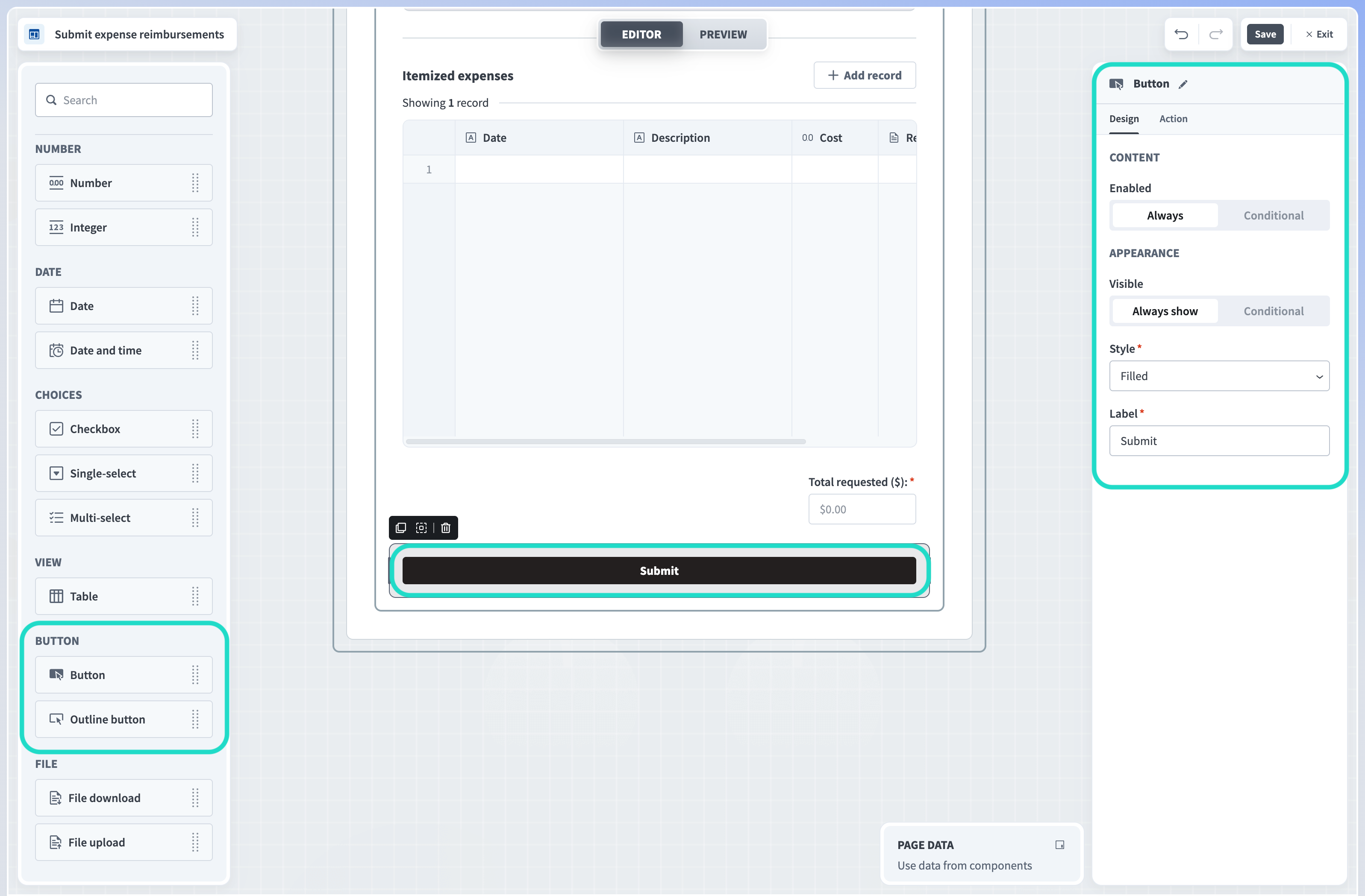
Button
Add buttons to your pages. In Workflow apps, all buttons are tied to an action. This enables you to determine what happens when a user clicks a button. Buttons can save data to a table, complete a task, or open a URL. Button components also support Run recipe and Reset/reload components actions.
 Button components and properties
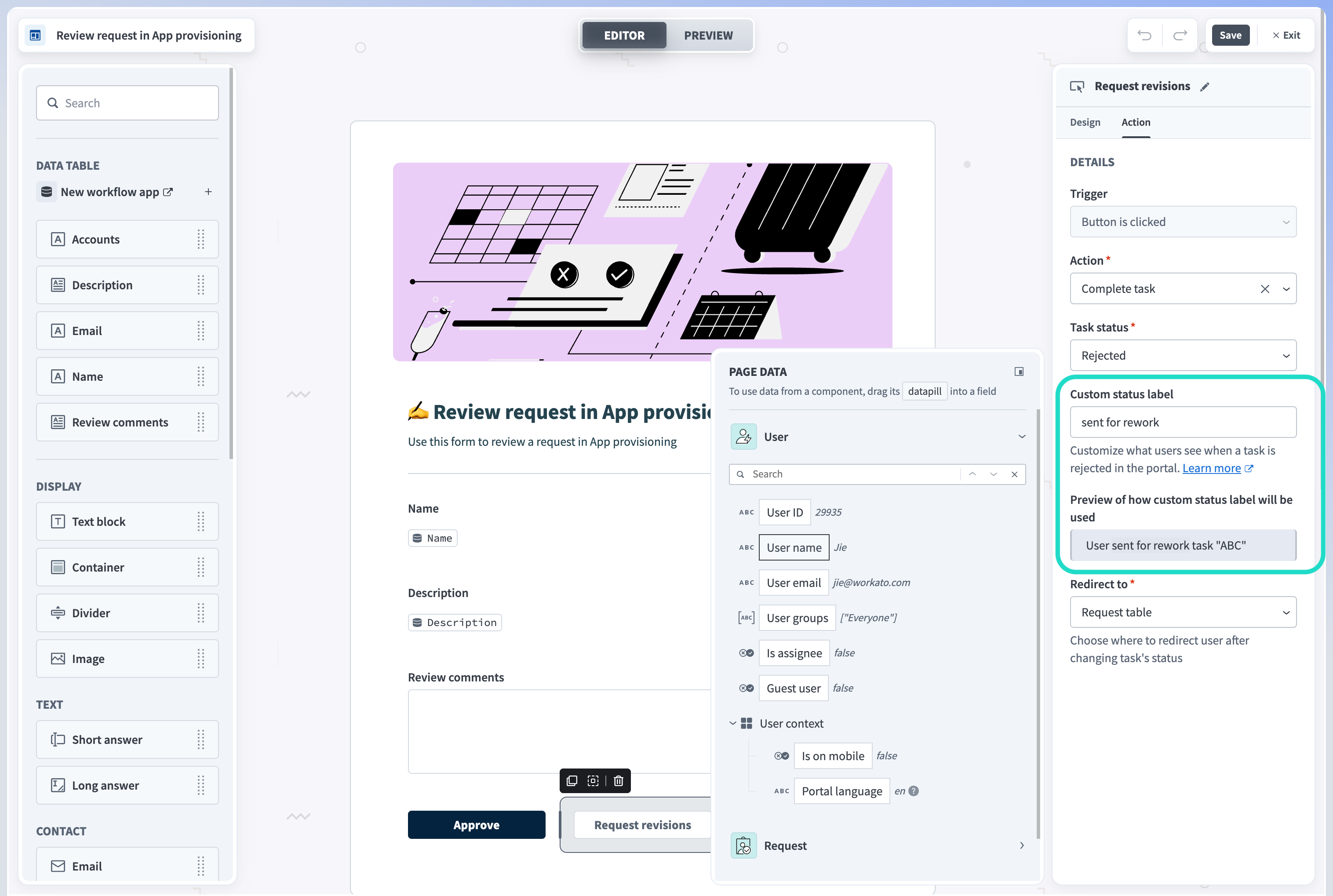 Button component with complete task action and custom status label
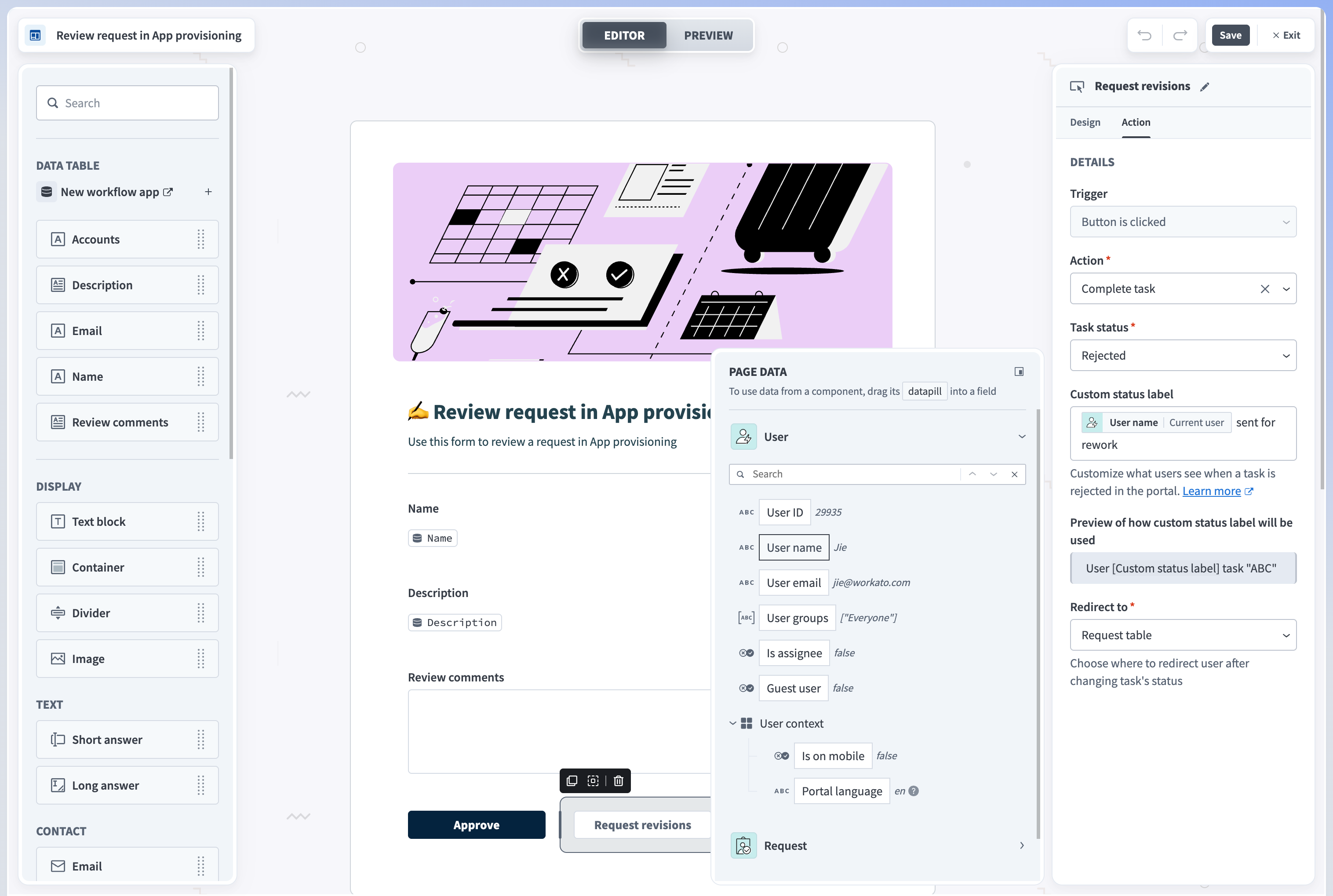 Button component with complete task action and custom status label with datapill
View button design properties
Style
Determine the appearance of your button from the following options:
Filled button:
A button filled with brand color, useful for primary action(s) on the page.
Outline button:
A button for secondary action(s).
Label
Provide a name for your button.
Visible
This property determines the visibility of buttons. The following options are available.
Always show
When set to Always show, button components are always visible.
Conditional
Configure an IF condition to make this button visible only under the circumstances you specify. You can chain multiple IF conditions using
ANDorOR. For example, you can configure a button to be visible only during a specific workflow stage. Configuring an IF condition in apps is similar to adding an IF condition to a recipe workflow. Reference our IF condition to learn more.
View button action properties
Action
This property specifies what a button does. Button actions include the following options:
Save data to a table:
Save user input as a new or updated record in the data table, which was specified when the table was created. A button with this action is required to use public forms and collect guest submissions. This property is available for apps with request and approval functionality only.
Complete task:
Completes the current task with an Approved, Rejected, or Completed outcome. You can optionally provide a Custom task status label to customize what users see when a task is Approved, Rejected, or Completed in the portal. For example, you can use a custom task status such as
sent for reworkto accompany arejectedstatus to communicate why the request was rejected and indicate that a revision is required. When left empty, the label is the same as the task status. See the Complete workflow task programmatically action for more information. Additionally, this field supports datapill input, allowing you to surface the name of the user who approved, rejected, or completed the task in the portal.Open a webpage:
Provide a webpage URL. When clicked, this URL opens in a new browser tab.
Run recipe
The Run recipe action enables you to retrieve or modify data in a third-party application and return it to your Workflow app.
Reset/reload components
Configure a button to reset/reload components. Reset/reload components actions can be configured to clear the entire page or specific components, even if those components are not directly linked to a specific component action.
Follow up action
You can configure a follow-up action to reset/reload components after an initial component action. If you don’t configure a follow-up action, the default follow-up action for all components is to Do nothing.
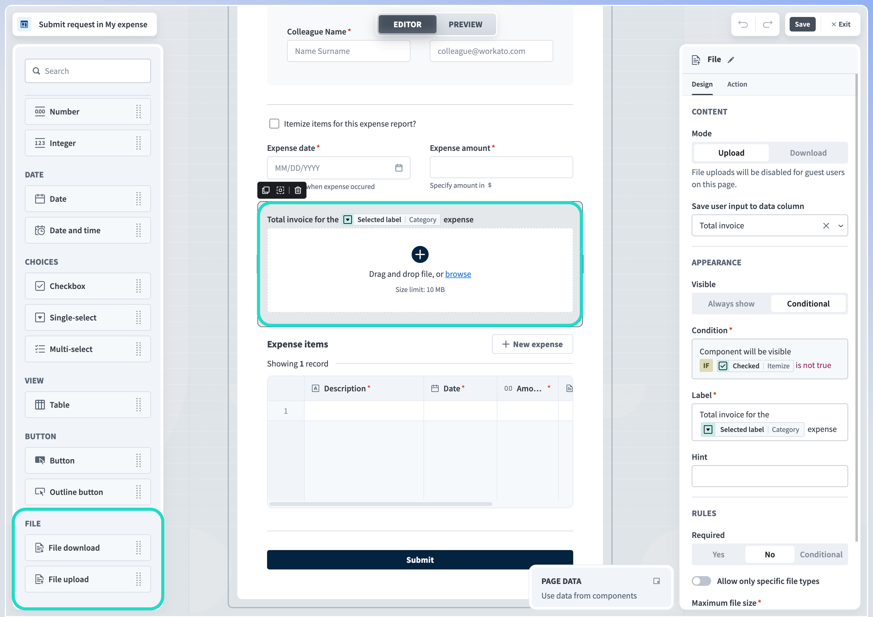
File
Components in this section enable you to upload and download files to/from your pages. The available properties vary depending on whether you choose to enable file uploading or downloading. This component is useful when you plan to gather files from users, such as receipts for expense reimbursement requests.
MALWARE SCANNING FOR PUBLIC SUBMISSION FORMS
Workato performs malware scanning for all files uploaded through public submission forms. Refer to the public submission forms documentation for more information.
 Upload/download file components and properties
View file upload properties
Mode
Determine whether you plan to Upload or Download files to/from your page.
Save user input to data column
Select a data column from the drop-down or click +Add column to create a new data column to store your files. This property is available for apps with request and approval functionality only.
Label
Provide a name for this component. This label appears above the component on your page.
Hint
Provide a hint to help users understand how to use this component. The hint appears below the component on your page.
Required
Determine whether uploading files is mandatory. The following options are available:
Yes
When Yes, users must upload files to your page.
No
When No, uploading files to your page is not mandatory.
Conditional
Configure an IF condition to make uploading files required only under the circumstances you specify. You can chain multiple IF conditions using
ANDorOR. For example, you can configure your page to require file content from a specific user only during a specific workflow stage. Configuring an IF condition in apps is similar to adding an IF condition to a recipe workflow. Reference our IF condition to learn more.
Validation
Toggle Allow only specific file types to control the type of files users can upload to your page. If you choose to allow only specific file types, you must select from the following options:
Documents
doc,docx, andpdfImages
gif,jpg,jpeg,png, andsvgCustom file types
When you choose this option, you must supply the type of files you plan to accept.
Maximum file size
Specify the maximum file size your forms can accept. The default value is
10MBand the maximum size is 500 MB for standard pages and 100 MB for public pages. Workflow apps displays the maximum file size you choose in the body of the component.Visible
This property determines the visibility of this component. The following options are available.
Always show
When set toAlways show, file upload components are always visible.
Conditional
Configure an IF condition to make this component visible only under the conditions you specify. You can chain multiple IF conditions using
ANDorOR. For example, you can configure the file upload component to be visible to a specific user only during a specific workflow stage. Configuring an IF condition in Workflow apps is similar to adding an IF condition to a recipe workflow. Use the Page data modal to map data related to app users, requests, and page components into your IF condition.
View file download properties
Mode
Determine whether you plan to Upload or Download files to/from your page.
Display from data column
Select a data column from the drop-down or click +Add column to create a new data column from which to display content.
Label
Provide a name for this component. This label appears above the component on your page.
Visible
This property determines the visibility of file components. The following options are available.
Always show
When set to Always show, file components are always visible.
Conditional
Configure an IF condition to make this component visible only under the conditions you specify. You can chain multiple IF conditions using
ANDorOR. For example, you can configure the file download component to be visible to a specific user only during a specific workflow stage. Configuring an IF condition in Workflow apps is similar to adding an IF condition to a recipe workflow. Use the Page data modal to map data related to app users, requests, and page components into your IF condition.
Saving a page
Before you save a page, ensure that all components with the save to data column property (Choices and Inputs components) are linked to a column in your data table. Otherwise, Workato displays the error message:
There are errors in widgets configuration. Select data source.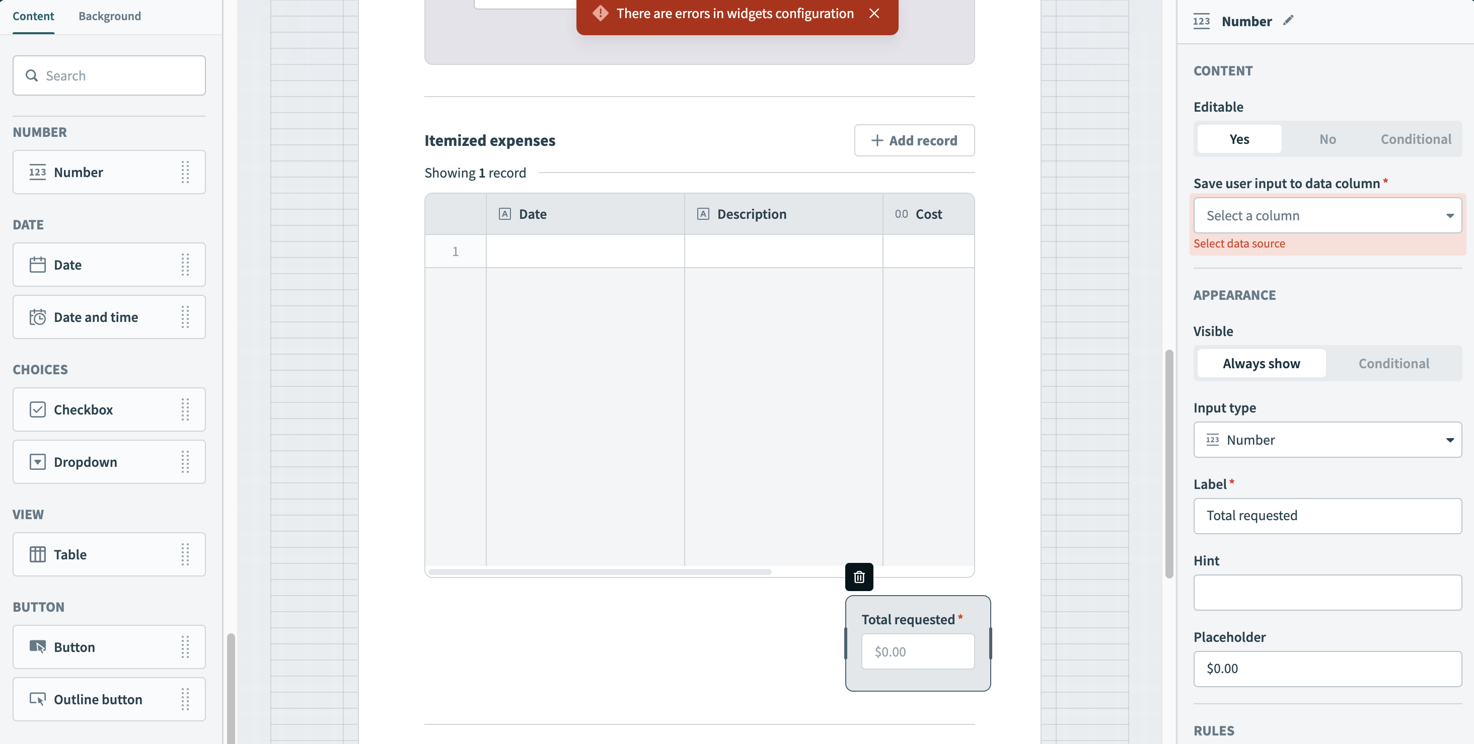 You must link Choices and Inputs components to a data column
Background
Determine the background style of your application. You can choose between a colored or patterned background. Workato provides several preset color and pattern options.
Alternatively, you can choose a custom color or upload a custom pattern. Workato supports gif, jpeg, png, and svg file types.
Advanced functionality
Custom field validation
Specific page components support custom field validation. This ensures data accuracy, prevents errors, and enhances workflow efficiency.
The following table describes which page components are compatible with each custom validation type:
| Custom validation type | Compatible components |
|---|---|
| Limit input length | Short answer |
| Limit input value | Number |
| Pattern matching with regex | Short answer |
Refer to our How to prefill forms guide to learn more.
Set default values in pages
Specific page components enable you to pre-configure default values using URL parameters. This enables you to pre-fill form content and is useful in scenarios where the recipients of your forms must review pre-populated information, make necessary updates, and add additional details if required.
This functionality is compatible with the following page components:
- Checkbox
- Date
- Date and time
- Decimal
- Description
- Drop-down
- Integer
- Text
Refer to our How to prefill forms guide to learn more.
FURTHER READING
Last updated: