# Quickstart
This quickstart guide demonstrates how to create a dashboard from start to finish, using an example scenario. An Integration Lead is tasked with creating a strategic ROI dashboard to help senior leadership understand the impact of automation adoption at their company.
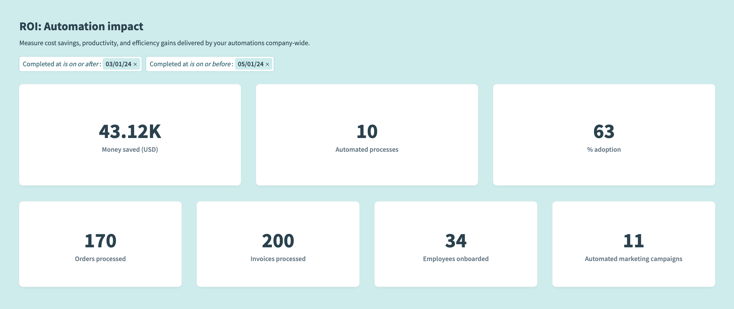
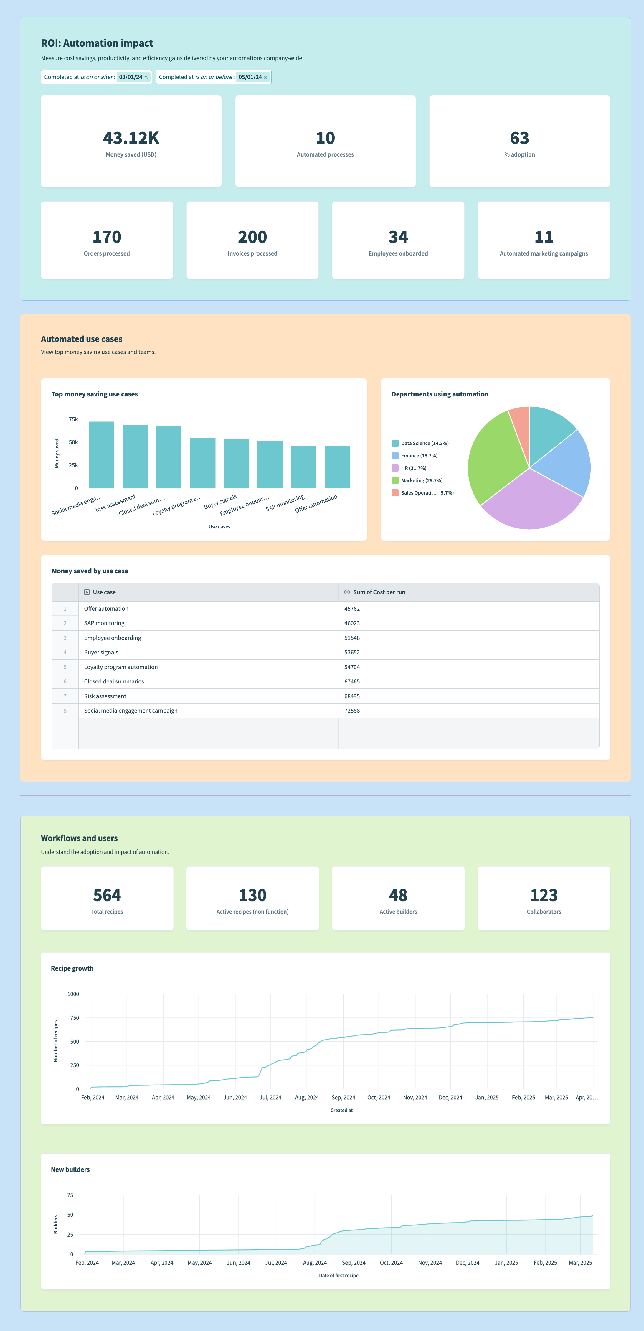 Completed ROI dashboard
# Plan your dashboard
You must define your audience, audience needs, and determine the high-level purpose of your dashboard. You can also define the key business questions your dashboard must answer.
In our example scenario, the Integration Lead has identified the following audience and business questions.
The next steps are to identify the metrics and dimensions required to answer your questions and ensure you're prepared to capture these values effectively.
# Identify your metrics and dimensions
The following table demonstrates how you can analyze your business questions to identify your metrics and dimensions.
| Question | Metric | Dimension |
|---|---|---|
| How many integrations have been built company-wide? | Count of recipes | Time (week, month, or year) |
| How many are actually being used? | Count of active recipes | Time (week, month, or year) |
| How much money has the company saved? | Sum of money saved | Time (week, month, or year) |
| Which use cases are saving the most money? | Sum of money saved | Use cases |
| Which departments are using Workato the most? | Count of active recipes | Departments |
| How has automation contributed to efficiency gains? |
| Time (week, month, or year) |
This analysis enables you to conceptualize the sections to include in your dashboard. In our example, we also plan to include filter groups to allow our dashboard viewers to drill-down into specific subsets of our reports so that they can segment the data as required.
# Set up data sources
Now that you've identified the key metrics and dimensions you plan to analyze, ensure you're set up to capture the necessary data. This can involve entering records in data tables, customizing job reports, and more.
# Add records to data tables
Use the Data table connector in your recipes to create, update, or upsert records in a data table. This enables you to log meaningful workflow events which you can use in your data analysis.
In this example, the Integration Lead is assessing the effectiveness of an automated resume screening workflow to evaluate efficiency gains driven by automation. They must log information obtained from a job application, such as the application ID, candidate ID, and job ID, during key stages of the process, such as when a new application is submitted. They must create a data table to store business events and add a step to their recipe to log events from Greenhouse in the table.
Set up your data table
You must create a dedicated data table with the necessary columns before adding records to data tables in your recipe.
Complete the following steps to create a data table:
Go to the project that contains the recipe you plan to capture details from.
Click Create and select Data table.
Provide a unique name for your data table, such as Resume screening.
Click Start building.
Click + to create a new column.
Go to the Column name field and supply a unique name, such as application_id.
Use the Column type menu to select Short text.
Go to the hint field and enter Greenhouse application ID.
Click Add column.
 Add a data column
Repeat this process to create the following additional columns:
| Column name | Data type | Hint text |
|---|---|---|
| candidate_id | Short text | Greenhouse candidate ID |
| job_id | Short text | Greenhouse job ID |
| department | Short text | Hiring department |
| recruiter | Short text | Recruiter name |
| task_name | Short text | Workflow stage |
Add a Create record in a data table step to your recipe
This example recipe automates the process of evaluating job applications submitted in Greenhouse, generates scorecards using OpenAI, and logs the results in a data table for further review. This example captures details after a new application is submitted in Greenhouse.
Complete the following steps to log business events in a data table:
Click + Add step and select Action in app after the business event you plan to log. In this example, we add it to Step 4.
 Click Add step > Add action in app
Search for Data tables and select it as your app.
Select the Create record action.
Use the Data table menu to select Resume screening.
Complete the following actions in the New record fields section:
Map the Application ID Step 1 datapill to the application_id field.
Map the Candidate ID Step 1 datapill to the candidate_id field.
Map the Job ID Step 1 datapill to the job_id field.
Map the Candidate ID Step 1 datapill to the candidate_id field.
Map the Department Step 2 datapill to the department field.
Map the First name Step 1 and Last name Step 1 datapills to the recruiter field.
Enter Application submitted in the task_name field.
Your configuration should look as follows:
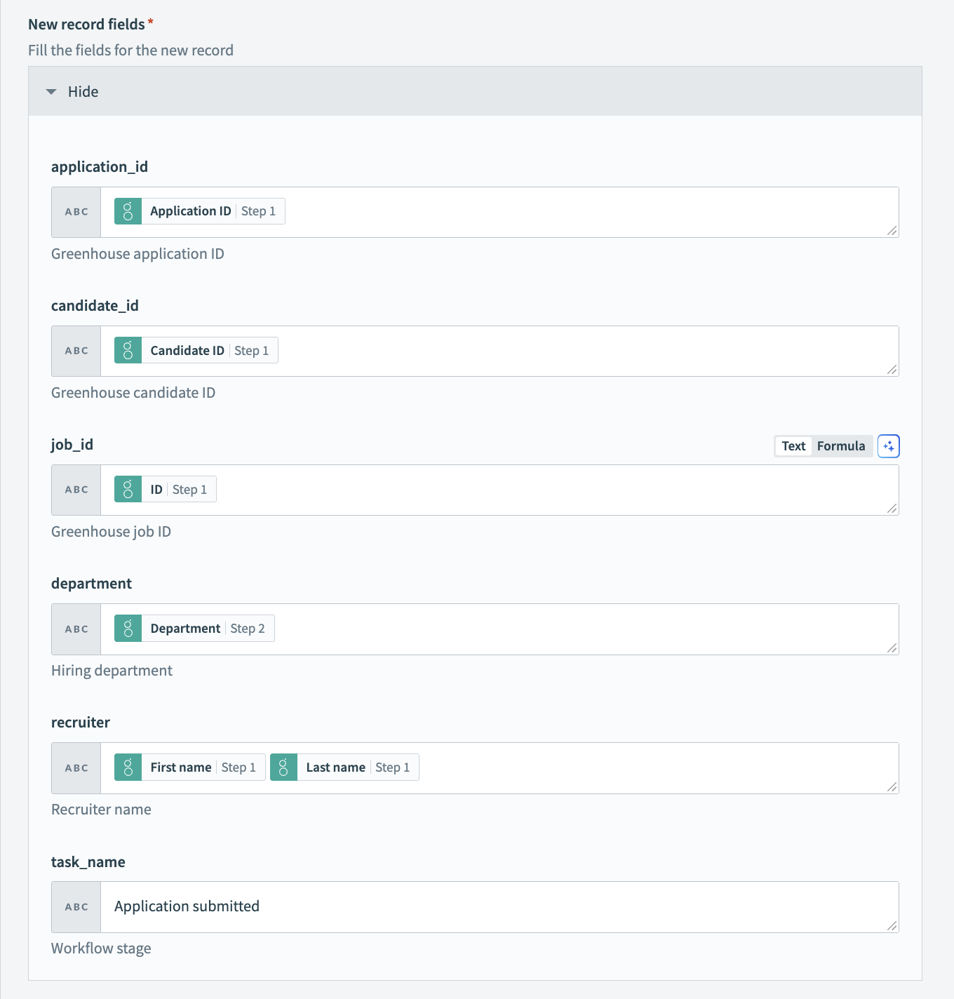 Map datapills from meaningful business events in other applications to create a record in a data table
Click Save.
You can also create and update records manually using the Data tables interface.
# Customize job reports
Customize your job reports to surface meaningful information from your recipes. You can add up to 10 additional columns and custom job report columns support datapill input. Job reports are subject to your workspace's data retention policy.
In this example, the Integration Lead is assessing the effectiveness of an automated order processing workflow to evaluate efficiency gains driven by automation. They plan to surface data from the order, such as the order ID, fulfillment status, name, item quantity, and price in their job reports.
Customize your job report
Select a recipe job report to customize. Your recipe must be inactive to customize its job report.
Go to the Jobs tab.
Click the ... (ellipsis) and select Customize job report.
Click + Add a new column.
Create the following custom columns:
Go to the Column name field, type Item name, and map the Name Step 2 datapill to the Column value field.
Go to the Column name field, type Quantity, and map the Quantity Step 2 datapill to the Column value field.
Go to the Column name field, type Price, and map the Price Step 2 datapill to the Column value field.
Go to the Column name field, type Order ID, and map the Order ID Step 1 datapill to the Column value field.
Go to the Column name field, type Fulfillment status, and map the Name Step 1 datapill to the Column value field.
Your configuration should look as follows:
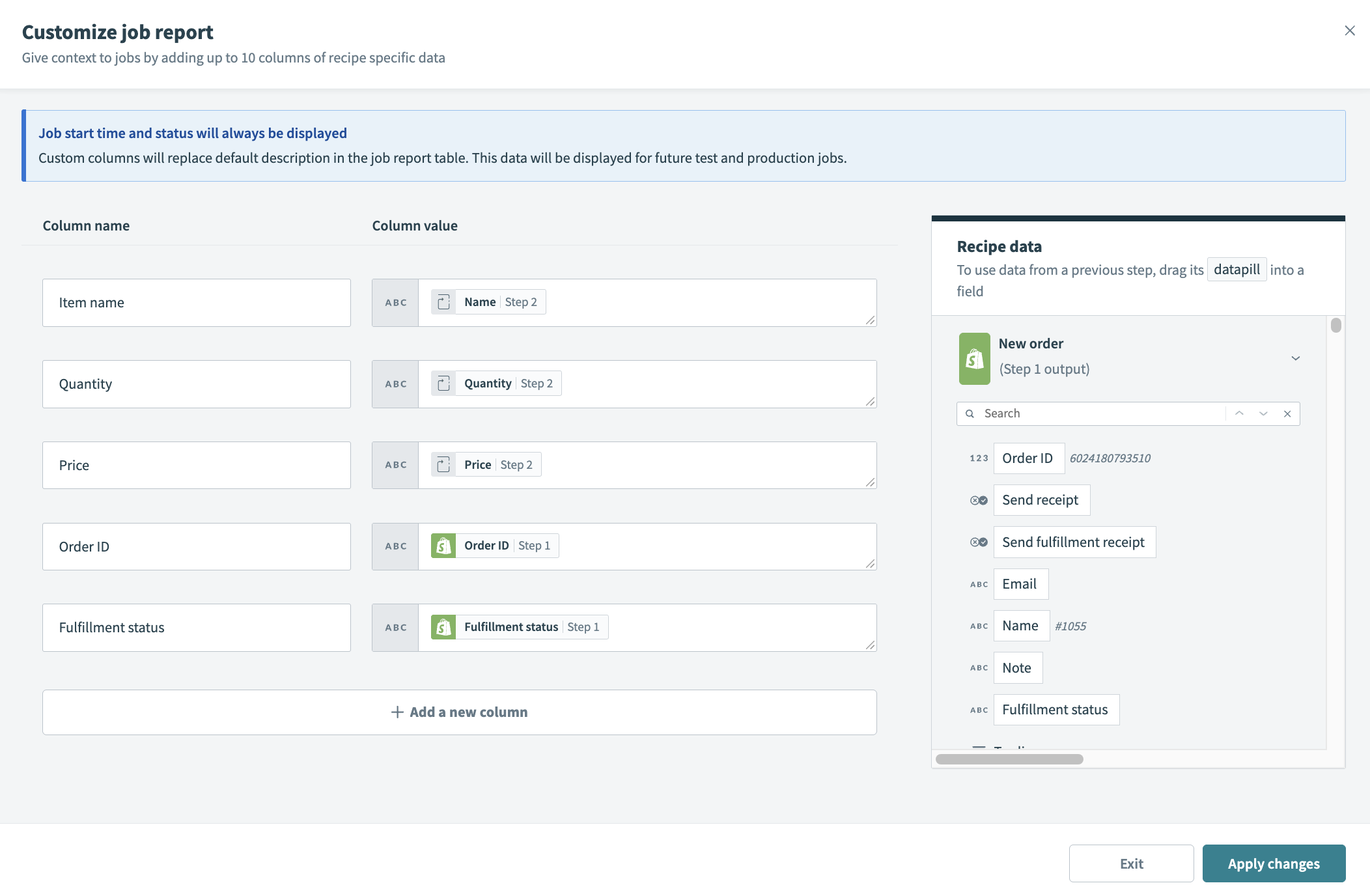 Map datapills to custom columns in your job reports
Click Apply changes.
# Build your dashboard
Building a dashboard involves designing the dashboard layout and creating custom reports and visualizations with your data.
# Design your dashboard
Before you begin manipulating, querying, transforming, and visualizing your data, it's worth spending some time to ensure that your visual layout represents your data well. You can start with one of our dashboard templates or create a dashboard from scratch.
Design your dashboard layout
Complete the following steps to design your dashboard layout. This example uses a blank template.
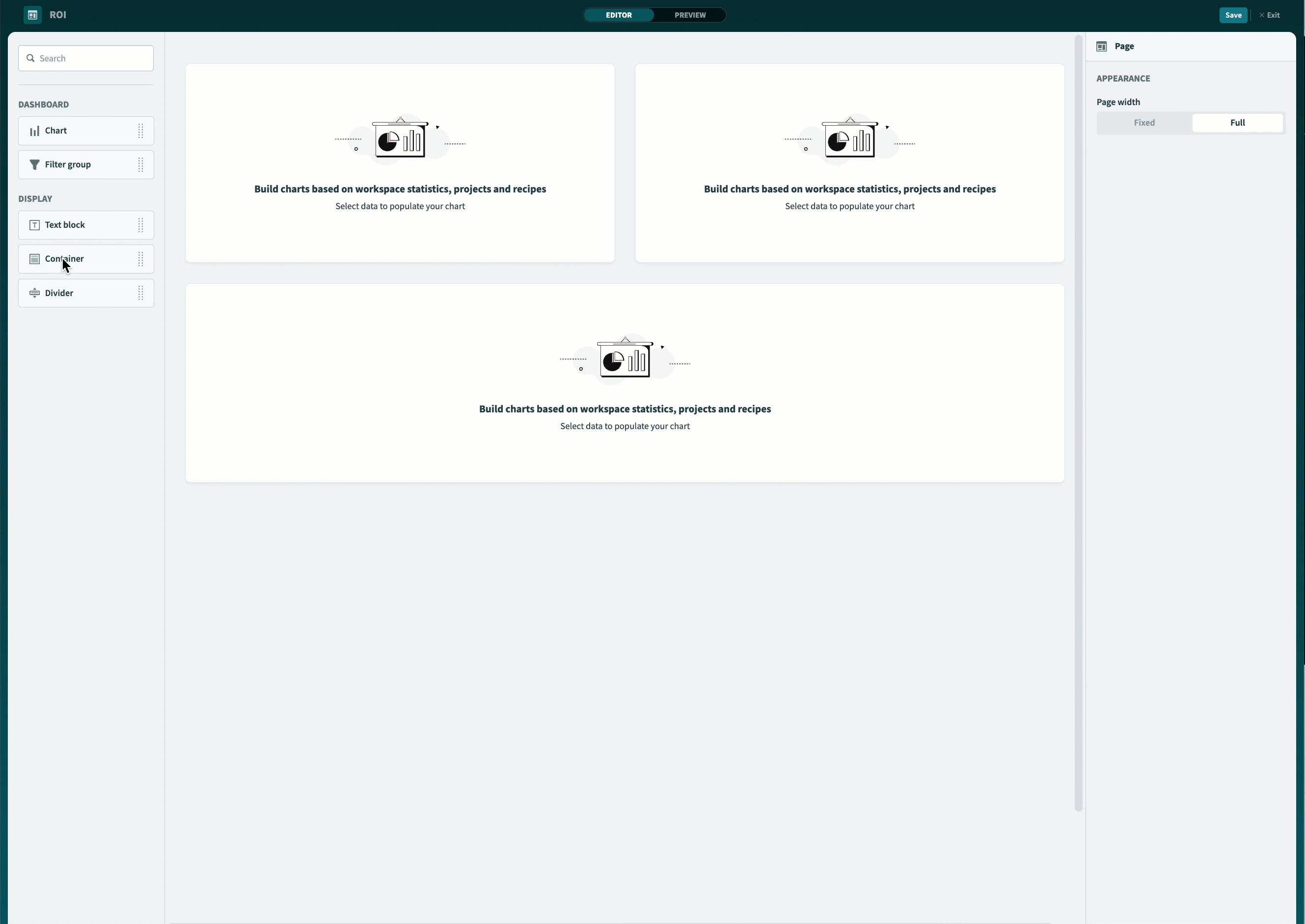
Determine the width of your dashboard. Insights supports Full and Fixed width options.
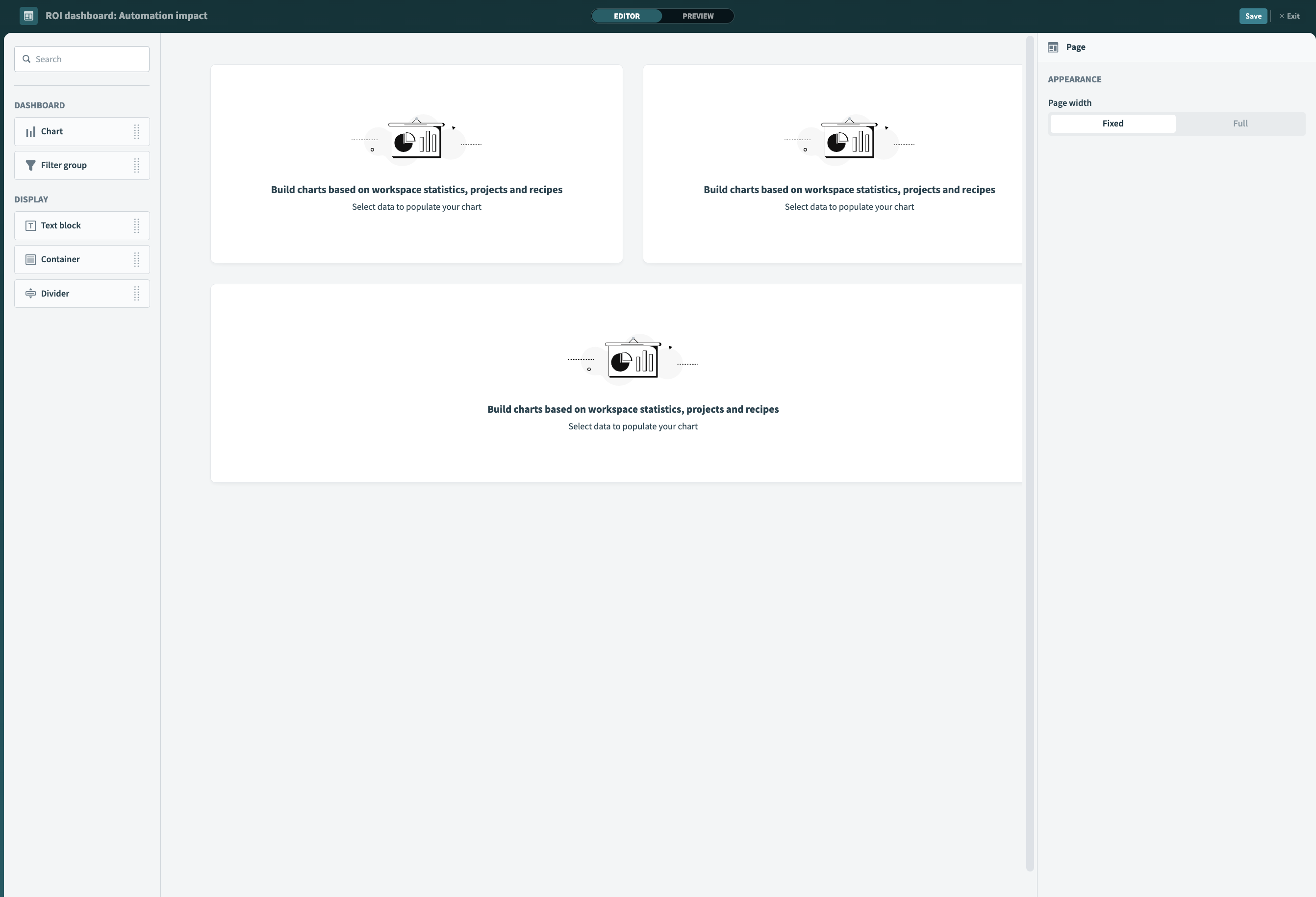 Determine the width of your dashboard
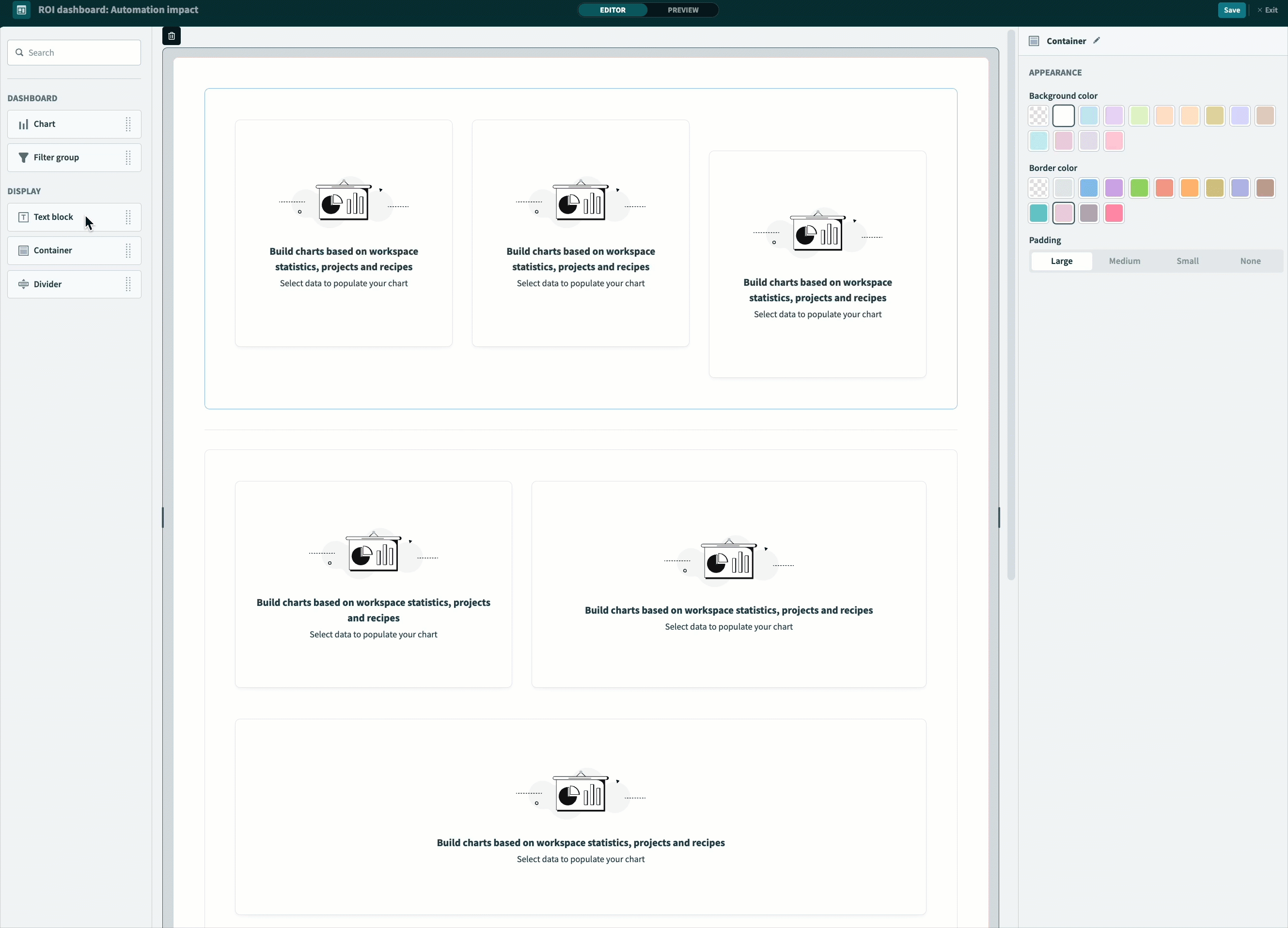
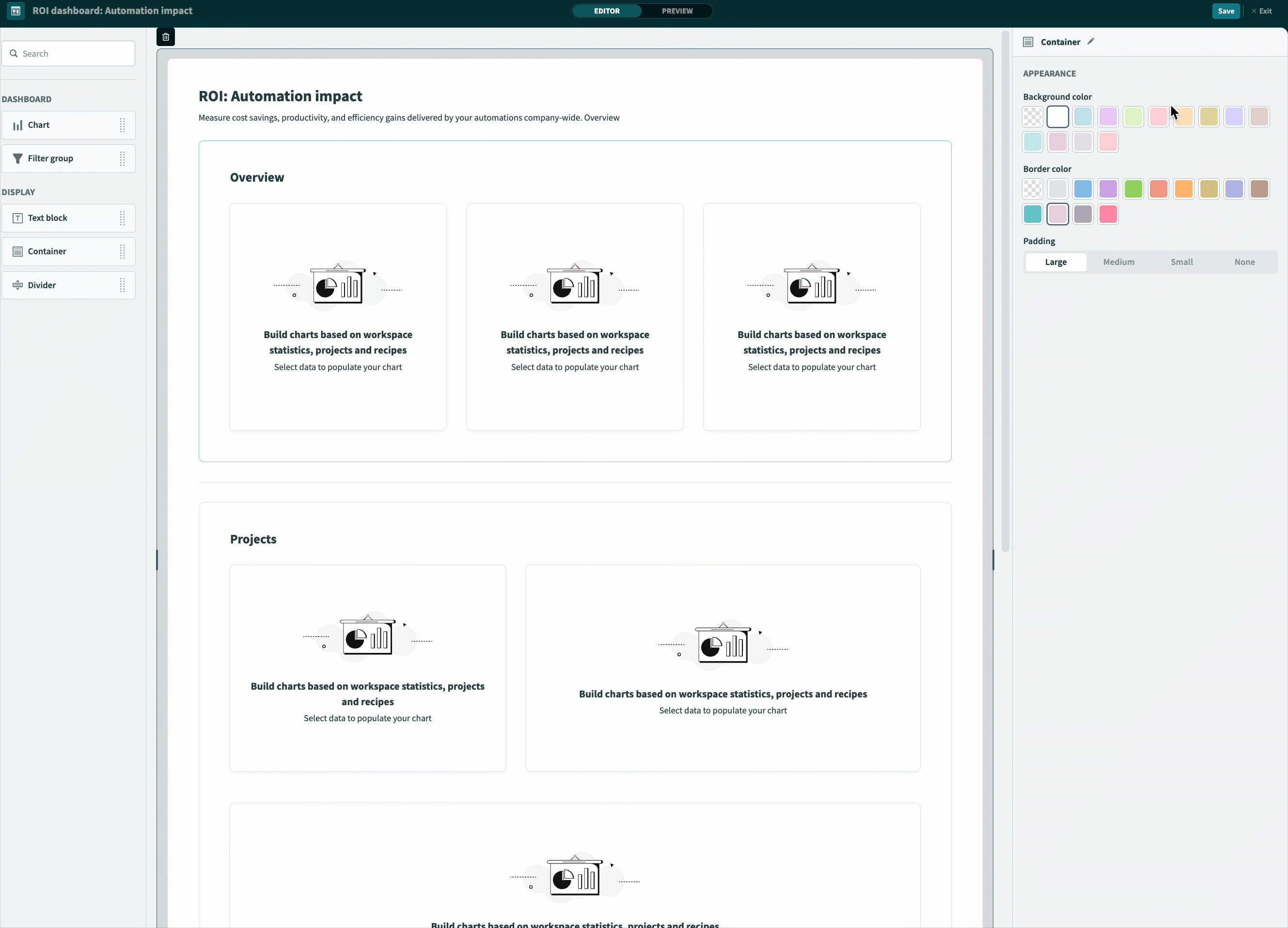
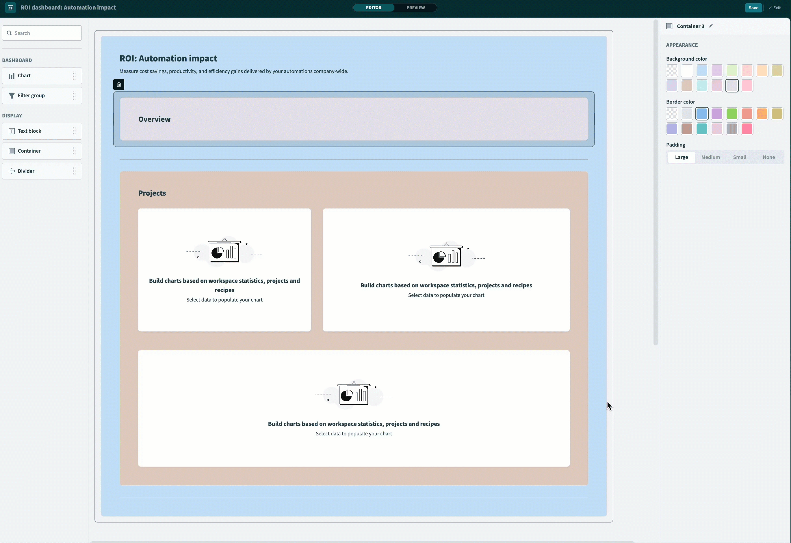
Add containers to define your layout. You can click and drag the edge of the container to resize it.
 Customize containers
Add a title and additional text components to your dashboard as necessary. We recommend applying headings to containers in your dashboard to help categorize your visualizations.
 Add and customize text
Customize container colors on your dashboard as necessary. We recommend using color strategically throughout your dashboard to convey meaning. For example, choose white or a neutral color to maximize contrast between the background and your charts. Alternatively, choose a color to sync with your brand.
 Customize container colors
Add a divider. You can place dividers in between containers to create a visual separation between different groups of charts.
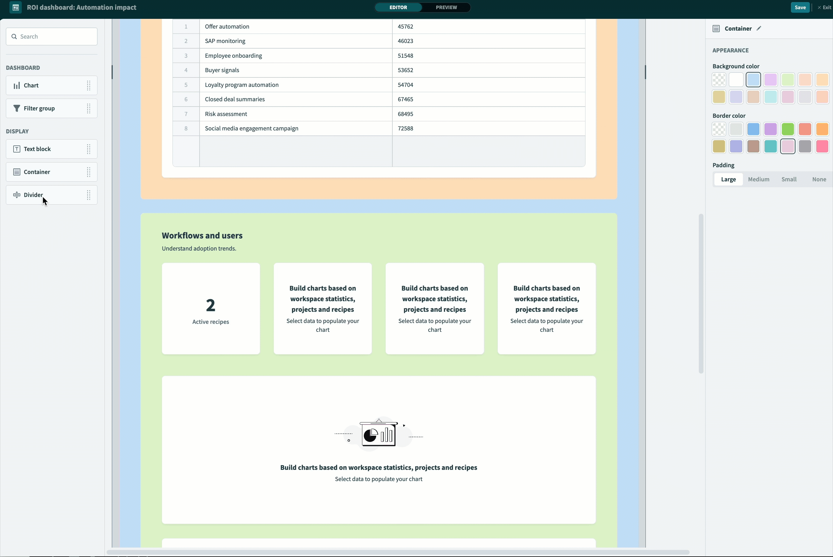 Add and customize dividers
Add chart components to your dashboard.
 Add charts to your dashboard
# Create custom reports and visualizations
The next step in the dashboard building process is to build your charts. During the querying and chart building process a table displays by default.
Complete the following steps to build charts in your dashboard. This example demonstrates how to create a chart that displays the top money saving use cases. Refer to the Metrics for additional charts section for guidance on completing additional charts.
Go to the dashboard editor, select a chart component, and click Edit.
Select a data source
Go to the Use data from field and select Workspace data as the Source type, and Job history as the Data source.
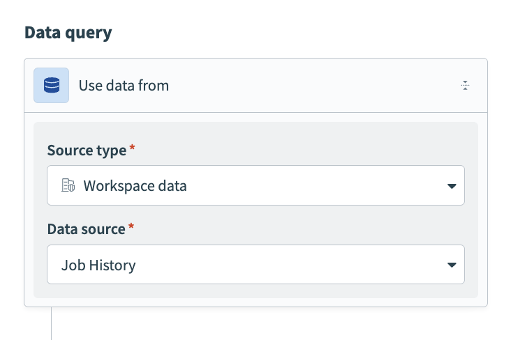 Select a data source
Click + (plus) and select Join from the query builder.
 Select Join
Configure the join step
This step joins job history data to data in a lookup table, ROI lookup. The ROI lookup table maps each recipe to its automated use case and associated cost savings.
Use the Join type menu to select Inner join, use the Source type menu to select Data tables, and set the data source to ROI lookup.
Use the Current result drop-down menu to select Recipe ID and use the ROI Lookup drop-down menu to select Recipe ID.
Preview your data in the Results table. This table displays job history data joined to data in ROI lookup.
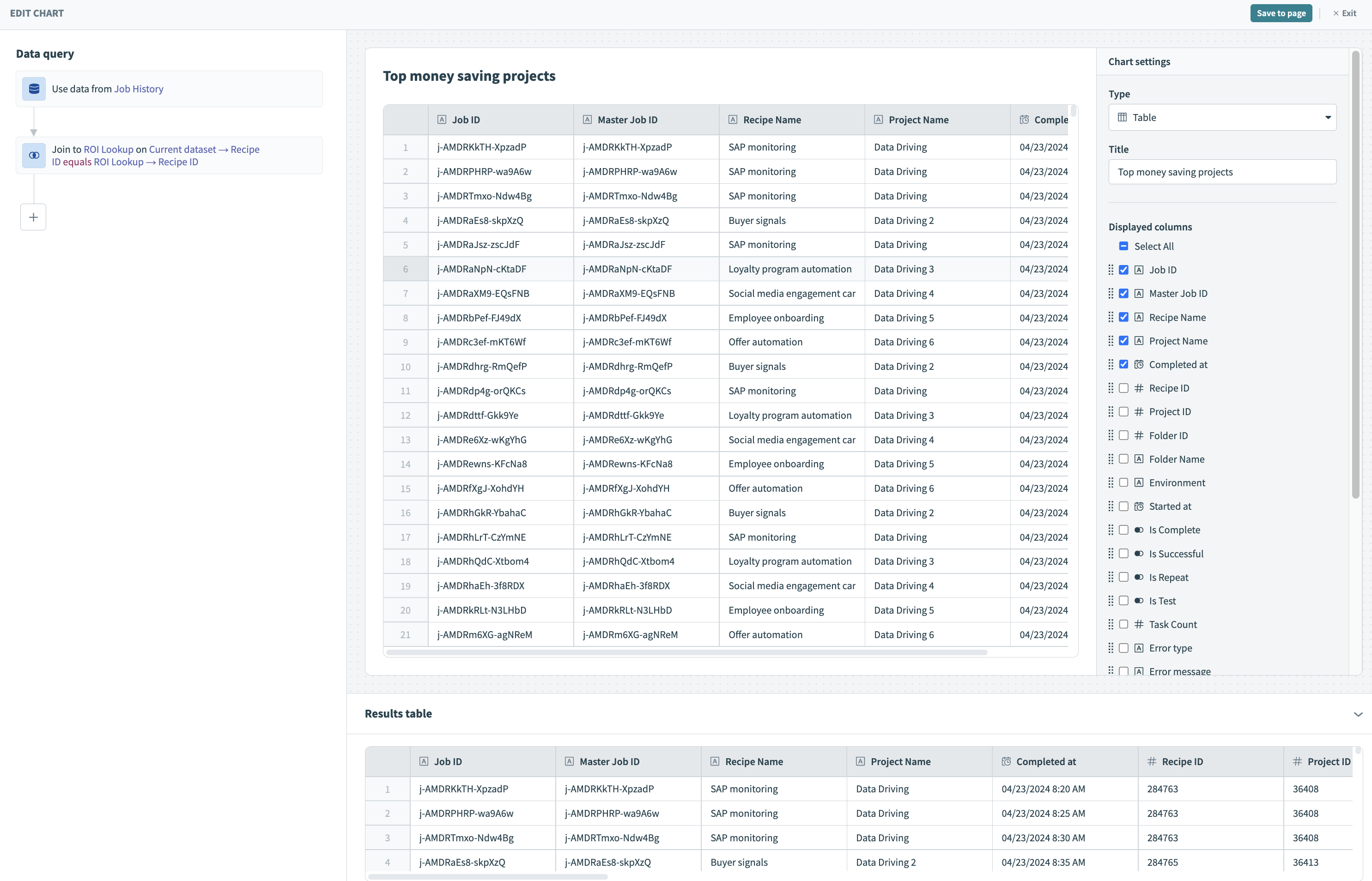 Preview your data in the Results table
Click + and select Summarize from the query builder.
Select Summarize
Configure the summarize step
Use the Metrics drop-down menu to select Sum of and use the Data column drop-down menu to select Money saved.
Use the Data column drop-down menu to select Use case.
Preview your data in the Results table. This table displays use cases and the amount of money saved by each.
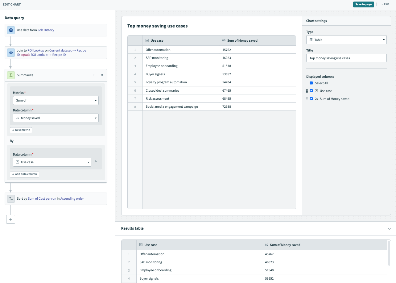 Preview your data in the Results table
Click + (plus) and select Sort from the query builder.
Select Sort
Configure the sort step
Use the Data column drop-down menu to select Sum of Money saved and the Order drop-down menu to select Descending.
Preview your data in the Results table. This table displays use cases sorted by the amount of money saved.
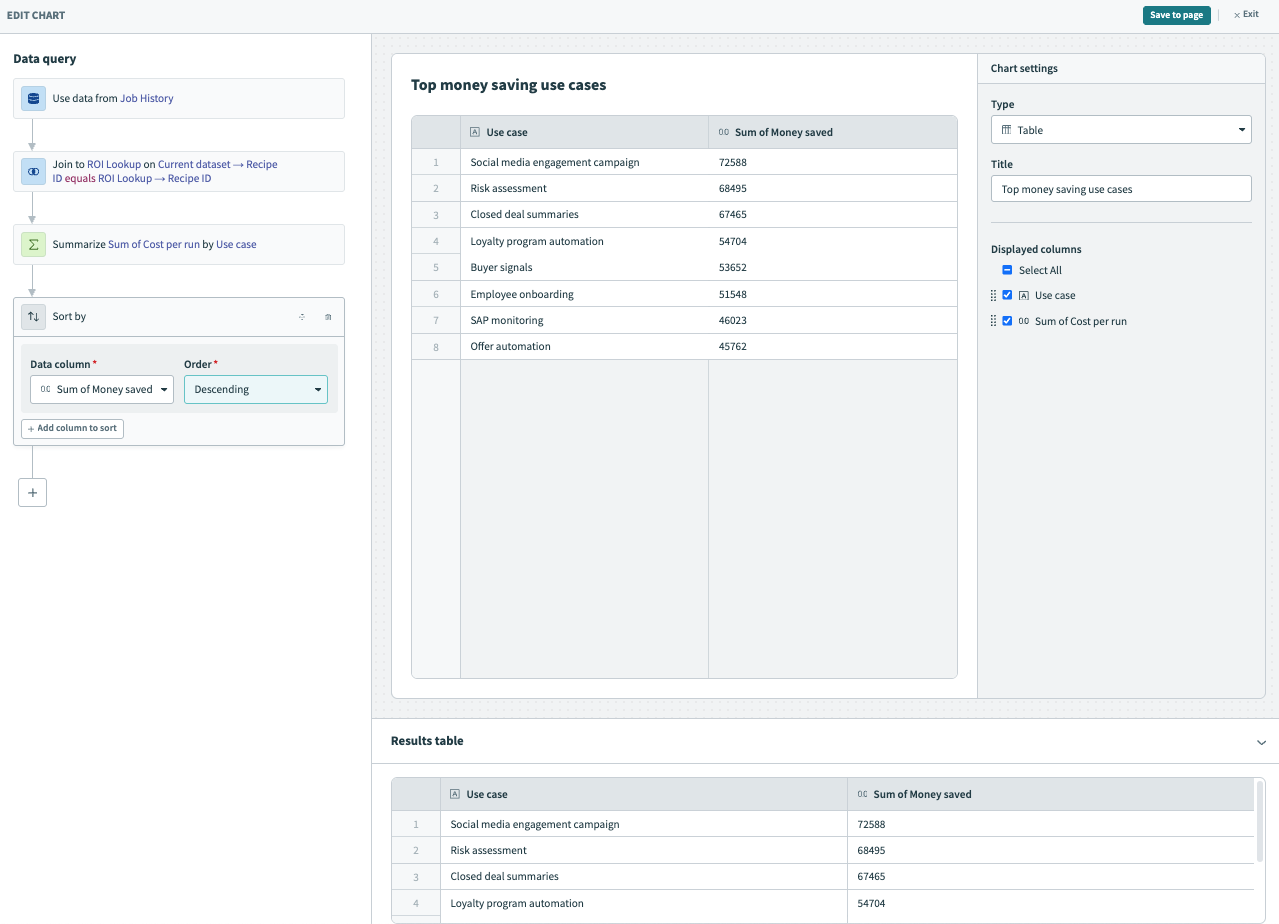 Preview your data in the Results table
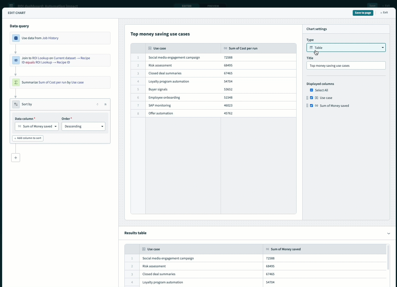
Visualize your data
Use the Chart settings panel to visualize your data and customize your chart.
Use the Type drop-down menu to select Bar.
Enter a title, such as Top money saving use cases.
Use the Data column drop-down menu to select Use case as the X-axis.
Use the Data column drop-down menu to select Sum of Money saved as the Y-axis.
Optional. Provide a unique label for the X and Y axes, such as Use cases and Money saved. Otherwise, Insights uses the column names for the axes labels.
 Visualize your data
Click Save. You must also save your work at the dashboard level for your changes to persist.
Create additional charts as necessary. Refer to the tables in the Metrics for additional charts section for more information.
Click Exit to return to your dashboard.
Click Save to save your work.
# Metrics for additional charts
The following tables contain the metrics required to create the additional charts in this example dashboard.
# Add filters
Add filters to your dashboard to allow dashboard viewers to explore specific subsets of data. You set a default condition and view during the design stage, but viewers can modify filters, select different conditions, and see the dashboard update dynamically.
Add filters
Complete the following steps to add a filter to your dashboard. This example adds two filters that enable users to filter your report based on time.
Select Filter group and drag and drop it inside of a container within your dashboard. This allows you to apply a filter to a group of charts. Alternatively, you can apply a filter globally to all charts on your dashboard.
Go to the properties panel and click + Add filter.
Set Data source to Job history and Data column to Completed at.
Configure the Default value: Select is on or after and a date, for example 03/01/2024.
Optional. Provide a custom label for your filter.
Click Done.
Go to the properties panel and click + Add filter.
Set Data source to Job history and Data column to Completed at.
Configure the Default value: Select is on or before and a date, for example 05/01/2024.
Optional. Provide a custom label for your filter.
Click Done and then Save to apply the filter to your dashboard.
Click Exit.
View filter behavior on the Insights homepage.
 View filter
# View your completed dashboard
Your dashboard is now complete and can be accessed from the Insights homepage.
Completed ROI dashboard
Last updated: 9/18/2025, 6:41:03 PM